Hisense is a Chinese multinational with expertise in consumer electronics and home appliances. Its journey began as a small factory to produce radios but has become a global brand. Hisense has a rich product portfolio comprising televisions, air conditioners, refrigerators, mobile devices, and washing machines. The brand name comprises two words: “Hi” as a greeting and “Sense” as a feeling.
The Hisense logo has undergone a few changes, and these iterations reflect the brand’s journey from a local Chinese manufacturer to a global force in consumer electronics. The article delves into the various logo changes for Hisense, among other details of the company.
The Genesis of the Hisense Logo (1969 – 1979)
The original avatar of Hisense, the Qingdao No. 2 Radio Factory, had a logo that featured a stylised red lantern, the very first product of the company. Also, the radio stations appeared horizontally in red and yellow against a blue background. Incidentally, there was no logotype accompanying the graphical emblem.
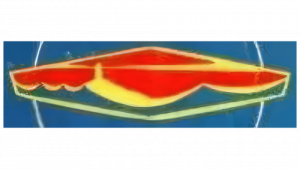
(1970s – 1979)
In another logo iteration, there was an emblem comprising the image of a handsaw in gold and burgundy. The brand name was written in the centre, followed by the image of a lantern. The logo looked solid and stable, thanks to the thick gold outlines of the emblem.
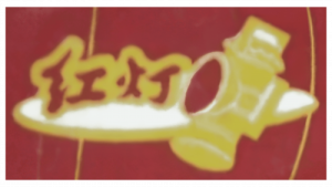
(1979 – 1993)
The logo during this period featured a minimalist black-and-white rhomboid emblem with the image of a lighthouse and waves. Black strokes were used to draw the image against a white background. Interestingly, there was no inscription accompanying the emblem.

(1993 – 1999)
By 1993, the logo comprised a circular emblem in red and blue, accompanied by the brand name in black and rendered using a traditional sans-serif typeface. Also, the letters “H” and “S” appeared in uppercase. Incidentally, the logo, especially the emblem, was somewhat similar to the Pepsi logo, which made it untenable for the company.

(1999 – 2012) (International), (1999 – 2013) (China)
Devoid of any emblem, the logo iteration of 1999 saw the logotype in a title case. Rendered in green and paired with an orange accent, the logo looked saturated but bright. The first letter “H” had a tiny but thick orange accent to the top left of its vertical bar. The letters were elongated and had traditional curves, especially with the letter “s”.

(2012 – Present) (International), (2013 – Present) (China)
Hisense modernised its visual identity once again in 2012 to reflect its rise as a global market leader. The current logo retains the clean custom sans-serif “Hisense” wordmark but without the orange accent. It has opted for a single shade of teal to embody simplicity, memorability, and a focus on brand recognition. The choice of colour emphasises the technological nature of the company and its inventiveness.
The Elements of the Hisense Logo
Font
The wordmark of the Hisense logo contains highly legible letters and is rendered using the popular sans-serif typefaces.
Colour
The colour palette of the latest Hisense logo comprises a light shade of teal or green.
Finally
The logo evolution of Hisense reflects the journey of a company, especially from emblematic simplicity to a globally unified wordmark. The logo embodies its ongoing push for technological relevance, brand consistency, and broad international appeal.