Hewlett-Packard (HP) is a renowned American IT company that has played a significant role in shaping the global tech industry. Founded in 1939, HP has been a pioneer in the technology landscape. Its premier quality products range from computers to printers, other accessories, and software. The identity of HP, or Hewlett-Packard, has evolved alongside its iconic logo.
In fact, the logo reflects the transformation of the company, right from its founding in a garage to its division into two entities. The Hewlett-Packard logo has undergone several transformations over the years. The changes reflect the growth and adaptation of the company to keep up with the changing market dynamics. The article traces the history and evolution of the logo over the years, among other details of the company.
The Genesis of the Hewlett-Packard Logo (1939 – 1954)
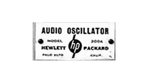
The original Hewlett-Packard logo was introduced in 1939. It had a simple yet distinctive design featuring the name of the company in a bold, sans-serif typeface. The letters “hp” in the logo represented the names of the founders: Hewlett and Packard. The logo was rendered in monochrome and displayed white and italicised lowercase letters placed within a black circle. The inscription of Hewlett-Packard was mentioned on either side of the logo in a strong typeface. The logo design was straightforward and represented the company’s no-frills approach to engineering and technology.
(1954 – 1960)
In 1954, Hewlett-Packard saw its first major logo change. The new logo retained the sans-serif typeface but introduced a stylized version of the company’s initials, “HP.” The same was enclosed within a white circle with a thick black outline. This design change marked a shift towards a more modern and recognisable brand identity. The circular emblem represented the company’s commitment to innovation and progress.

(1960 – 1964)
This was a refinement of the previous iteration where the logo elements were made bolder and thicker. Also, the vertical bars of the letters “h” and “p” were made shorter.

(1964 – 1981)
The logo design of the era saw the return of the “Hewlett-Packard” lettering. The emblem comprised a slanted rectangle wherein the letters “HP” were positioned in the middle of a white circle. The additional lettering comprising the founders’ names appeared in an italicised classy serif font.

(1979 – 2008)
In 1979, HP unveiled a new logo that would become iconic in the tech industry. The design featured the initials of the company in a sleek and stylized font. The design saw the seamless merging of letters “h” and “p” together. The colour palette of the logo was a combination of striking blue, white, and black. The lettering consisting of “h” and “p” was painted blue and placed inside a white circle. And on the right side of the white circle, the lettering “Hewlett-Packard” was positioned in two levels and written in a bold sans-serif font. This modernised logo reflected HP’s commitment to cutting-edge technology and design.

(1999 – 2012)
This particular logo redesign was executed by Siegel and Gale Design Bureau. This terse version of the logo consisted of a rectangle with rounded corners with the letters “hp” placed in the middle of a white background.

(2007 – 2012)
Launched on November 15, 2007, this logo iteration featured the circular background in various shades of blue with a gradient, which gave it a 3D effect. Written in a custom Futura typeface, the vertical bars of the letters “h” and “p” were not visible beyond the circular background.

(2008 – 2014)
In 2008, HP introduced another logo update with a more minimalist approach. The new logo had the iconic “HP” initials but came with a simplified design. In fact, it opted for a cleaner and more streamlined look. The green colour was replaced with a deep blue colour to convey a sense of trust and reliability. The logo redesign marked HP’s transition into an era of innovation and adaptation to the ever-evolving tech landscape.

(2009 – 2014)
This logo iteration executed in 2009 had pale blue as the colour of the circle.

(2012 – 2022) (2023 – 2025)
Created by Siegel + Gate, the 2012 logo iteration saw the colour palette of the circular background getting brighter. It embraced a welcoming and more soothing light sky blue colour. The rest of the elements remained untouched.

(2016 – Present)
HP uses this particular logotype in some instances, especially on premium products. Developed by Moving Brands Studio, this logo comprised four oblique black strokes.

(2022 – 2023)
The 2022 logo iteration saw the typeface of the brand name being changed to Forma DJR and the background turned pitch black.

(2025 – Present)
The current HP logo continues to feature the wordmark in a custom Forma DJR typeface, while the circular background is changed to cyan-blue. The colour represents reliability and intellect.
The Elements of the Hewlett-Packard Logo
Symbol
The Hewlett-Packard (HP) logo is a minimalist design that features the initials of the founders of the company represented by the letters’ “H” and “P” in an italicized sans-serif font. The logo is set against a light blue circular background, where the extensions of the letters appear to extend beyond the boundaries of the circle.
Font
The typeface used in the wordmark depicting the HP logo is custom Forma DJR.
Colour
The colour palette of the HP logo has evolved over the years. Initially, it was a simple black-and-white design. However, over the years, it has changed to a deep blue colour palette. Interestingly, the most recent update saw the blue colour being changed to a brighter shade of cyan-blue. At the same time, the wordmark is depicted in white.
Finally
From the simple beginnings of a basic typeface to the modern, minimalist design, the HP logo and its various iterations have carried a distinct identity and meaning. The logo changes have represented the technological advancements of HP as well as its ability to adapt and remain a prominent player in the tech world. The impact of these logo changes on brand identity cannot be overstated. They have become symbolic representations of HP’s values, innovation, and dedication to excellence.