Hero, or Hero MotoCorp Limited, is an Indian brand known for being the largest motorcycle manufacturer in the world. Founded by entrepreneur Brijmohan Lal Munjal, it also produces two-wheelers, such as scooters and electric bicycles. The Hero logo is one of the most recognisable symbols in India’s automotive industry.
It embodies strength, progress, and a spirit of reliability. Over the decades, the logo has evolved with a single change. It reflects the brand’s growth from a local manufacturer into a global two-wheeler giant. This article explores the journey of the Hero logo, among other details of the company.
The Genesis of the Hero Honda Logo (1984 – 2011)
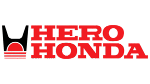
The first Hero logo appeared in 1984, the year that marked the launch of the Hero Honda partnership between India’s Hero Cycles and Japan’s Honda Motor Company. The logo featured the wordmark “Hero Honda” in two levels and rendered in bold, uppercase serif letters.
To the left of the wordmark was a stylised “H” in black on top of a red semicircle. It represented the rising sun (an homage to Honda’s Japanese origins), with three horizontal lines in red beneath it. These symbolised the tracks of two-wheelers and reflected dynamism and progress. The colours of the logo evoked passion, energy, and strength.
(2011 – Present)
In 2011, the Japanese company Honda decided to leave the brand, which necessitated a change in the corporate identity of the company. To design the new logo, the London-based Wolff Olins, which is renowned for its strategic brand designs, was taken on board. The new logo debuted in London on August 9, 2011, during a high-profile cricket match between India and England.
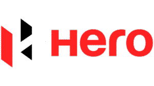
It featured an emblem and the brand name. The emblem depicted a modern, geometric, stylised, yet fragmented letter “H” rendered in red, black, and white. The “H” appears three-dimensional and is formed by a red parallelogram on the left, a black trapezoid and triangle on the right, and a floating connecting bar offering a sense of continuity.
To the right of the emblem appears the wordmark “Hero” written in a clear, sans-serif font in lowercase letters with a capital “H.” The colour red conveys confidence, passion, and continuity, while black reflects power and stability. White as a background reflects modernity and clarity.
In terms of symbolism, the angular, fragmented “H” is designed to convey energy, progress, and independence. The sharp corners and geometric precision of the logo reflect robust engineering and a forward-looking approach. Further, the tagline “Hum Mein Hai Hero” (“There is a Hero in Us”) reinforced the company’s positioning as a brand for the everyday hero.
The Elements of the Hero Logo
Font
The wordmark used in the Hero logo features letters in the title case and is rendered in a sans-serif typeface. The font used to write the wordmark is similar to Harabara. The rounded letter “r” makes the whole wordmark appear sleek and modern.
Colour
The colour palette of the Hero logo is red, white, and black. Here, black conveys strength, while red depicts beauty.
Finally
The history and evolution of the Hero logo shows the trajectory of the company itself. It includes steady beginnings, a transformative split, and an energetic push into the future. What began as a symbol of partnership and reliability has become an emblem of confidence, movement, and independence. These qualities continue to drive the Hero brand forward.