Heineken is arguably one of the most popular and quality-consistent brewing companies in the world. Founded in 1864 in the Netherlands by Gerard Adrian Heineken, the brand now owns over 250 sub-brands and has a massive footprint spanning the world. The Heineken logo is one of the most recognisable symbols in the global beverage industry. It evolved from a detailed, word-heavy label to a minimalist icon. It reflects the brand’s adaptation to changing times and its commitment to tradition. The article explores the evolution of the Heineken logo over the years, among other details about the company.
The Genesis of the Heineken Logo (1864 – 1884)
The first Heineken logo was quite wordy and design rich. It featured a black oval with the text “Heineken’s Bierbrouwerij Maatschappij Amsterdam” in bold white uppercase around the edge with a black background. The centre of the oval in grey had the imagery of the brewery and a few words describing the product.

(1873 – 1884)
The next logo iteration retained most of the features of the previous logo. However, it featured a beige oval with a wide red edge and black outline. The text along the edge remained the same, but the imagery of the brewery at the centre was removed. Also, the word “Heineken’s” in black uppercase appeared at the centre, flanked by coats of arms on the sides.

(1884 – 1889)
By 1984, green colour was chosen to make its bottles stand out from the typical brown beer bottles of the era. The five-pointed star, a wide black horizontal ribbon at the centre with curled edges, and an ornate design at the bottom became dominant features. The first product name, “Pilsner Beer”, in white uppercase, appeared on the black ribbon. Also, the text “Heineken’s Amsterdam-Rotterdam” in white uppercase featured along the green edge to celebrate the birthplace of the beer.

(1889 – 1930)
The logo redesign of 1889 saw the green colour along the edge getting more intense. At the centre of the logo, especially the upper part, were red texts around the five-pointed star with a black outline. The lower part of the logo, especially below the black horizontal ribbon, showed two coins with a few details in monochrome.

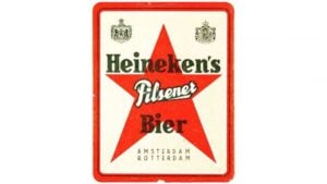
(1930 – 1954) (The Netherlands Version)
The 1930 logo saw two versions, one for the Netherlands and another for the global market. The version for the Dutch market featured a large red star within a rectangle with thick red edges and rounded corners. At the top left and right of the rectangular emblem were shown two old coats of arms. The words “HEINEKEN’S, PILSNER, AND BIER” in uppercase appeared across the red star, while “AMSTERDAM-ROTTERDAM” appeared below in smaller size.
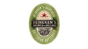
(1930 – 1951) (International Version)
The international logo variant featured the oval with the inscriptions “Heineken’s Lager Beer” and “Amsterdam-Rotterdam” in white uppercase set along the green edges. At the centre appeared the wordmark “Heineken’s Brewed in Holland” in two levels on a black horizontal ribbon. Besides, the star in the upper part of the oval appeared in red.
(1951 – 1954)
After the Second World War, the association of the red star with communism prompted a design change. So, in 1951, Heineken switched the star from red to white with a black outline to avoid political connotations. Also, the outer framing of the oval had a long text in red. The rest of the elements in the logo remained the same. This adaptation illustrates the brand’s sensitivity to global contexts and its ability to maintain a universal appeal.

(1954 – 1974)
A key moment came in 1954, when Alfred “Freddy” Heineken, the founder’s grandson and a marketing visionary, redesigned the label for the Dutch market. He introduced several key changes. For instance, the green oval export label became standard in the Netherlands. The black horizontal ribbon at the centre featured only the Heineken name.
The wordmark with gothic-style features was softened as well. Finally, the logo saw the introduction of the distinctive “smiling e”. The letter was given a subtle backward slant to create a friendlier appearance. These refinements established a consistent and approachable brand identity that would serve Heineken well as it expanded globally.

(1974 – 1991)
One of the 1974 logo variants saw the continuation of the previous design, albeit refined with more distinct lines. The green colour along the edges of the flatter oval became more pronounced. Some of the text was removed, while the brand name on the slightly extended black ribbon was enlarged. The inscription at the centre, including the two coins, appeared in red. Also, the outer white framing was circled with a green outline.

(1974 – Present)
The 1974 logo saw the introduction of the brand name in green with a bevelled “e”. The typeface used was a soft sans-serif with mild boldness.

(1991 – Present)
In 1991, Heineken introduced the “Star-Heineken” logo in red. It was a modern design that preserved the brand’s heritage while embracing a contemporary aesthetic. This iteration featured the brand name written in a Heineken Serif typeface. Developed by Eden, it had the signature “smiling e”. Also, to the left of the brand name appeared a bold 5-pointed star in red.

(2011 – Present)
The latest design depicts the logo of the overall company. It retains the characteristics of the 1991 iteration but with subtle differences. The contours of the red star are shown on the upper left corner of the brand name in deep green.

The Elements of the Heineken Logo
Font
The Heineken logo uses the Heineken Serif corporate typeface, which has a bevelled letter “e”.
Colour
The colour palette used in designing the Heineken logo has green, white, and red colours.
Finally
Heineken’s logo is not just a mark of quality beer; it is a case study in the power of consistent, adaptable branding. The evolution of its logo reflects broader trends in design and marketing. Its universal recognition is a testament to the brand’s global reach and cultural significance. The Heineken logo, with its distinctive green, red, and white palette and “smiling e”, stands as a symbol of both tradition and innovation. It remains an enduring emblem in the world of beer.