Grayscale Investments is one of the world’s largest and most influential digital asset managers. It specialises in cryptocurrency-based investment products that are designed for traditional investors. Founded in 2013 by Barry Silbert, the company was created to make it easier for individuals and institutions to gain exposure to Bitcoin and other cryptocurrencies without the challenges of direct ownership, custody, or security.
The visual identity of Grayscale has evolved considerably since the company’s founding in 2013. The article delves into the evolution of the Grayscale logo, among other details of the company.
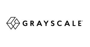
The Genesis of the Grayscale Logo (2013 – 2023)
The original Grayscale logo consisted of a graphical emblem as well as a wordmark in black. The graphical emblem used a geometric mark, that is, a hexagon or diamond-like shape, to project trust, stability, and resilience. It reassured investors about the often-volatile crypto market. Besides, the interlocking hexagon looks similar to digital blocks or chain links, a subtle nod to blockchain technology. The wordmark to the right or below the emblem was a clean and uppercase one written using a sans-serif typeface.

(2023 – Present)
The most significant transformation in Grayscale’s visual identity occurred in 2023, and it coincided with the tenth anniversary of the company. This comprehensive rebrand was developed in partnership with Elephant, a creative agency within the IPG network.
The centrepiece of the 2023 rebrand was the introduction of a distinctive triangular motif representing interconnected Shares. The triangular emblem modified the wordmark, written in a custom sans-serif typeface, wherein some letters received triangular cuts or stylisation.
This new visual element consisted of triangles that fold into and out of one another. The triangles created a dynamic and flexible design system that could adapt across various applications. The triangular emblem represented the connected nature of Grayscale’s investment.

The Elements of the Grayscale Logo
Font
The wordmark of the Grayscale logo uses a custom sans-serif typeface to convey clarity and strength. The letters of the wordmark are geometric with clean edges and balanced proportions. They convey a sense of stability and forward motion.
Colour
The colour palette of the Grayscale logo comprises black, grey, and white. Here, black conveys authority and professionalism, while grey represents balance, neutrality, and trustworthiness. White is used as negative space to ensure crisp visibility.
Finally
The evolution of the Grayscale Investments logo represents more than just a visual refresh. It chronicles the journey of the company and the broader cryptocurrency investment industry. Its latest triangle-motif logo design reflects how the company underwent transformation from a pioneering startup to an established leader in digital asset management.