Grado Labs is a family-owned audio manufacturer in the USA that is known for its hand-built headphones and phono cartridges. It was founded in Brooklyn, New York, in 1953 by Joseph Grado, master watchmaker. The company quickly became a pioneer in analogue audio by inventing the first stereo moving coil phono cartridge. This laid the foundation for its longstanding reputation for precision and innovation in sound reproduction.
The evolution of the Grado Labs logo reflects the company’s longstanding identity as a family-run, artisanal audio manufacturer based in Brooklyn since 1953. And despite being a prominent name among audiophiles, Grado Labs’ visual branding has been understated for most of its existence. The article explores the Grado Labs logo, among other details of the company.
The Genesis of the Grado Labs Logo (1953 – 2019)
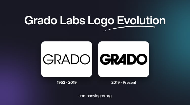
The original Grado Labs logo was introduced around the company’s establishment in 1953. Simple and utilitarian, the logo did not have any graphic element but a minimalist wordmark. It featured the word “GRADO” in bold, uppercase, and using a classic serif typeface.
Interestingly, the horizontal arm of the letter “R” is short. The logo relied on straightforward typography to highlight trust and professionalism. In fact, the minimalist and aesthetic wordmark valued substance and sound quality over ornamental design.

(2019 – Present)
By 2019, Grado Labs introduced a formalised logo to coincide with new packaging and modernised branding efforts. The next logo iteration retained the honesty and simplicity that characterised the brand and depicted the wordmark “GRADO” in a clean, bold, geometric, modern, and thick sans-serif font.
The letterforms are connected to each other, especially the first three and last two in a distinct combination. Also, the left vertical leg of the letter “A” is slanted, unlike the right one. Besides, the typically black-coloured wordmark against a white background provides high contrast and easy readability.

The Elements of the Grado Labs Logo
Font
The current Grado Labs logo utilises a distinctive and modern sans-serif typeface for its wordmark to emphasise clarity and simplicity. The font offers subtle, geometric cues that project precision and timelessness. The font seems to be inspired by the ITC Avant Garde Gothic typeface.
Colour
The Grado Labs logo is usually rendered in black or dark grey to project a sense of minimalism and seriousness. The colour choice reinforces Grado Labs’ reputation for quality, transparency, and classic Brooklyn authenticity.
Finally
The evolution of the Grado Labs logo reflects the company’s dedication to craftsmanship, authenticity, and timeless design. While Grado has modernised its visual identity over the years, it has consistently preserved its vintage charm and artisanal spirit.
The logo’s clean typography and understated aesthetics show the brand’s focus on sound purity and engineering excellence rather than flashy marketing. Ultimately, the Grado Labs logo stands as a symbol of tradition meeting innovation. It represents a family-run company that has remained true to its legacy of handcrafted audio excellence.