Google, the popular search engine, now a part of Alphabet Inc., was established in 1998 by Sergey Brin and Larry Page as BackRub. This American corporation specialises in a host of activities, such as internet search, cloud computing, and advertising technologies, among others. It offers several tools and services beyond its search functionality. These include Google Chrome OS, Android Operating System, Picasa Graphic Editor, Gmail Webmail, Hangout Messenger, etc.
The ubiquitous Google logo has a fascinating history and is arguably one of the most popular visual identities of any product or organisation worldwide. It remained pretty much constant throughout the history of the company, except for the first two years, when Google was known as BackRub. The article traces the history and evolution of the Google logo over the years.
The Genesis of the Google Logo (1996 – 1998)
In the early days of the World Wide Web, a research project at Stanford University called BackRub went on to fundamentally influence (and change) the way people navigated the internet. The first logo of this project was a simple wordmark in red that depicted the name “BackRub” with two capital letters. The name referred to the process of receiving backlinks to grow website traffic.
The wordmark was rendered in a bold sans-serif font that was similar to the Impart Family fonts and PF Fusion Sans Pro Black. This logo remained the visual identity of the company for two years, until it was changed to Google.

(1997 – 1998)
In 1997, BackRub was renamed Google. With this change came a new logo with the wordmark “Google” rendered in title case and in a multicolour font. While this logo designed by Carl P may seem rudimentary by today’s standards, it marked the first step towards creating the iconic brand we know. Incidentally, the logo was used to represent the beta version of Google when it was merely a pilot project at Stanford.

(1998)
As Google changed from being a research project to a company, the need to have a more polished logo was felt. The new logo was created by Sergey Brin, using the popular open-source image editor GIMP (GNU Image Manipulation Program). The colours used in the logo were red, blue, green, and yellow. There is speculation that Google chose such colours after being inspired by the Lego tower that housed the first server of the company.
This version retained some elements of the previous design, including the Baskerville Bold typeface. Also, the wordmark was given a 3D effect and a grey shadow. It was a DIY effort that showed the hands-on approach of the founders and their vision to make Google a success. This logo was very short-lived and was replaced the same year in October.

(1998 – 1999) (2025)
Designed by Larry Page, the logo was changed again and made a bit smaller just a month later. In this version, the first letter “G” was coloured blue from the previous green, and the shading was given a little depth. The end of the Google wordmark had the “!” mark, which was probably borrowed or a subtle jab at the rival Yahoo! search engine.
This particular logo was reused as a nostalgic Doodle on September 27, 2025 to celebrate 27 years of the company.

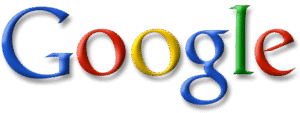
(1999 – 2010)
With time, the company recognised the need to have a more professional approach to branding. So, a renowned designer, Ruth Kedar, was engaged to create a logo that would elevate the status and appearance of Google logo. The designer was renowned for designing sets of playing cards. Kedar produced several concepts, some of which contained imagery to express the core components of the Google experience. However, the company ultimately decided to simplify the design and chose a more minimalist approach.
According to this approach, the basic colour scheme was retained, but the typeface was updated to the Catull BQ serif, which Google continued to use for over a decade. Besides, the two “Os” were given a slight orientation to the left and each letter of the wordmark had shadows emanating from it. Thus, the contribution of Ruth Kedar marked a key moment in the journey of the Google brand.
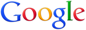
(2010 – 2013)
A decade later the Google logo was changed, and the new variant was designed by Ruth Kedar. Although the typeface was identical to the previous version (Catull BQ serif), the letter “o” was rendered using a more distinct orange colour. The letters were brighter and more intense. Also, the shadow effect was reduced to a greater degree.
(2013 – 2015)
In 2013, the logo was redesigned with a flat logotype to achieve minimalism. The colour shades were subtle and refined, and the letters were more distinct than what appeared in the previous iterations.
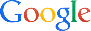
(2015 – Present)
In 2015, Google unveiled its current logo, which ushered in a new era of modern branding. This design features a clean, sans-serif typeface created specifically for Google called Product Sans. The colours appear to be vibrant and playful and reflect the innovative spirit of Google. The letters “O” did not have any left orientation like the previous version and are perfect circles in their appearance.
The simplicity and versatility of the logo have allowed it to integrate seamlessly across various platforms. These include desktop computers, mobile devices, and even physical products. It has become an instantly recognisable symbol that represents not only a search engine but an entire suite of products and services.
Today, the Google logo is more than just a brand identifier. It has become a cultural icon that has utility beyond its original purpose. So, whether conducting a quick search, navigating with Google Maps, or using one of the many offerings of the company, the logo reminds of Google’s mission to organise information and make it universally accessible.

(2015 – 2025)
Another logo in the form of a favicon was designed the same year on September 1, especially for users of mobile devices. This favicon, short for favourite icon, can be typically found in the bookmark, address bar, hotkeys, or web tabs. Here, instead of the whole brand name, only the first letter “G” was redesigned in a different yet brighter and more consistent colour palette. Besides, the colours on the favicon were displayed in the tetradic colour palette, which gave a vigorous feel to the design. The iconic G favicon made the logo standout in the digital space and acted as a kind of unifying power.
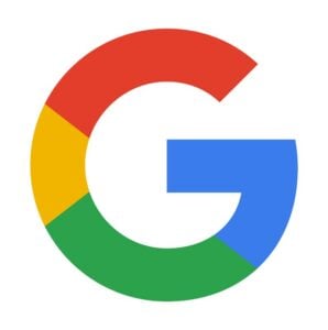
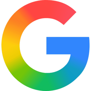
(2025)
After almost a decade, Google has updated its iconic favicon “G”. Although the typeface of the favicon remains the same as earlier (Product Sans), the colour scheme has been changed. The new logo in the form of a favicon uses a gradient design instead of the solid colours – red, yellow, green, and blue. In the new design, the colours have been arranged more organically. Exuding depth, the new colour distribution has added more balance to the favicon. The new design is arguably to reflect a greater focus of Google on AI.
Google Search Console Logo (2025)
Google has introduced a new logo for its Search Console toolkit. It is similar to an analytics logo, but with a magnifying glass. The colour palette of the new logo icon is blue, green, yellow, and a small touch of red. The inclusion of the bar chart is the highlight of the new logo design. According to Google, the magnifying glass is about helping users identify issues and opportunities on their sites. The grey-coloured wordmark “Google Search Console” appears to the right of the logo in title case.
The Elements of the Google Logo
Font
Before 2015, the Google logo underwent several upgrades based on the Catull font. However, the present logo, designed in 2015, introduced a fresh, new typeface called Product Sans. A distinctive feature of the present logo is the presence of a slanted line on the letter “e.” It symbolised the unconventional and innovative spirit of the company.
Colour
The wordmark forming the Google logo can be said to be a kaleidoscope of colours. Each letter of the wordmark is painted in a contrasting shade of red, green, blue, or yellow. This bold and attractive colour palette has become firmly associated with Google’s products and reflects the playful and creative essence of the brand.
Finally
The Google logo has come a long way from its humble beginnings as a research project at Stanford University. Over the years, it has evolved to represent both a search engine and a global brand known for innovation and creativity. So, from the early days of BackRub to the modern and minimalist design, the Google logo has gone through a remarkable transformation. It reflects the growth of the company and its adaptation to the ever-changing digital landscape.