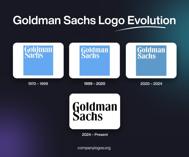
Goldman Sachs is a US-based financial institution started by Marcus Goldman and Samuel Sachs. It provides a wide range of services, such as investment banking, credit cards, securities underwriting, asset management, securities trading, risk arbitrage, financial research, and others, to institutions, corporations, government agencies or authorities, and individuals. The Goldman Sachs logo has remained almost the same since its inception in 1970, which is a testimony to its stability and effectiveness. The article delves into the evolution of the Goldman Sachs logo over the years.
The Genesis of the Goldman Sachs Logo (1970 – 1999)
In 1970, the famous blue square logo was designed by Lippincott & Margulies and featured a sky-blue square with the company’s name in a classy white serif font in two levels. The typeface was inspired by Bodoni and included distinctive ligatures. These connected the “G” and “S” as well as the “c” and “h”. This minimalist design was chosen to project confidence, trustworthiness, and clarity, and it quickly became one of the most recognisable marks in global finance.

(1999 – 2020)
In 1999, the blue square logo was subtly redesigned. The shade of blue became darker, and the wordmark in a white serif typeface was placed on the left upper part of the blue square. Some of the letters had curved tails and sharp serifs.

(2020 – 2024)
The logo underwent another update in 2020 and was led by the Dalton Maag type design studio. The blue background was made slightly duller, and the ligatures connecting the “G” and “S” and the “c” and “h” were separated to enhance legibility at smaller sizes. At the same time, Goldman Sachs introduced its own bespoke typeface, “Goldman Sans”, which was designed to unify the brand’s visual identity across all platforms.

(2024 – Present)
In August 2024, Goldman Sachs reverted to a design that reconnected the “G” and “S” and the “c” and “h” ligatures. However, some elements from the 2020 update, such as the pointed serifs on the “A” and “C”, were retained. This latest evolution in black is a blend of tradition and modernity.

The Elements of the Goldman Sachs Logo
Font
The Goldman Sachs wordmark in lowercase is written using a custom typeface combining both serif and sans serif letters. Further, for various media, fonts such as Sabon, Univers, and Roboto are used.
Colour
The colour scheme used to design the Goldman Sachs logo uses both light blue and white. Here, blue conveys the optimistic attitude of the company towards life and work, while white stands for purity, fairness, and lawfulness.
Finally
The Goldman Sachs logo stands as a symbol of stability, consistency, reliability, and adaptability—qualities that have defined the firm’s identity through generations. Besides, the minimalism displayed in the logo conveys a feel of the logo being clean and uncluttered. The logo changes reflect a renewed emphasis on the firm’s legacy and partnership culture.