Globe Telecom is one of the leading telecommunications service providers in the Philippines, which is known for its plethora of communication services. Established in 1935 as Globe Wireless Limited by the Robert Dollar Company from California, the present-day Globe Telecom has become a key player in the sector with a focus on developing innovative solutions in broadband, mobile, and financial services.
The logo of Globe Telecom has undergone several changes in its design since its inception. The evolution of the logo reflects the company’s growth, technological advancements, and commitment to innovation. The article explores the various logo changes and their timelines, among other details of the company.
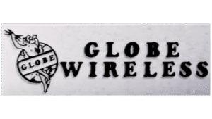
The Genesis of the Globe Telecom Logo (1934 – 1965)
The first Globe Telecom logo featured a human figure, “Zeus”, holding three lightning bolts against the backdrop of a globe. To its right was mentioned “Globe Wireless” in uppercase and in a sans-serif typeface. This design symbolised power, enlightenment, and global connectivity and emphasised the mission of the company to provide fast and efficient communication services. The imagery highlighted the dynamic capabilities of telecommunications during this period.
(1965 – 1974)
During this era, Globe Telecom operated under the name Globe-Mackay ITT. The logo featured the name in black uppercase against a white background. The word “GLOBE-MACKAY” was written in italics, while “ITT” was written in a bigger size with extended serifs. For this design, the original logo was changed to a simpler design to reflect the growing focus of the company on international telecommunications.

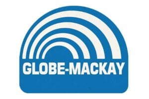
(1974 – 1980)
The logo underwent further simplification while retaining its emphasis on global connectivity. It uses a colour palette consisting of thin blue and thick white to form multiple arches against a white backdrop. The arches are placed within a white square with a thick blue outline and rounded corners. The brand name “Globe-Mackay” in thin white uppercase is placed at the bottom of the square against a band of blue. This period marked the company’s gradual shift toward modern branding practices.
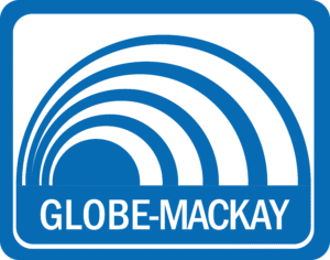
(1980 – 1991)
In this phase, Globe-Mackay introduced the previous design, but without the blue square outline. The brand name was written below the multiple arches in thick white uppercase, but on the upper side of a wide blue rectangular background. This design was in line with the technological advancements in telecommunications.
(1991 – 2004)
In 1991, Globe-Mackay merged with Clavecilla Radio Corporation to form GMCR, Inc., which later adopted the trade name “Globe Telecom”. The logo featured a globe-like figure in blue with multiple swirl-like elements in white to symbolise global reach and connectivity. To the right of this globe emblem appeared the new brand name “GLOBE TELECOM” in a slanted thick black uppercase serif-style typeface.

(2004 – 2007)
During this period, the period logo design was continued, but with subtle differences. For instance, the colour of the globe was changed to a lighter shade of blue, while the letters of the brand name were made slightly thin.

(1994 – 1996)
In 1994, the logo iteration saw a horizontal rectangle divided into two colour sections – a bigger red above and a smaller black below. The upper red section featured the bigger wordmark “HANDYPHONE” in a combination of white uppercase and lowercase letters using a sans-serif typeface. Similarly, the lower black section featured the smaller wordmark “The Next-Generation Cellular” in a white cursive title case style of writing.

(1996 – 2007)
In 1996, the logo featured the wordmarks “Globe” and “HANDYPHONE” in white italics against a black rectangular background. The letter “o” in the word “Globe” was represented with a small globe in a light blue shade with a white gradient.

(2004)
The logo featured the wordmark “Globelines” in slanted blue against a white background. Featured in the title case, the wordmark had the letter “o” expressed in a shade of light green with a white gradient. Besides, the words “Globe” and “lines” were mentioned in bold and thin, respectively.

(2007 – 2013)
In 2007, Globe Telecom unveiled the logo to represent its diverse range of services. The logo featured a globe emblem in blue and white and a wordmark “Globe” in purple. The globe symbol nicknamed “Globe Life” was adorned with icons such as an envelope (text messaging), magnifying glass (internet browsing), speech bubbles (calling), a camera (MMS), a computer (broadband), and a music note (multimedia). This vibrant design emphasised interconnectivity and multimedia offerings.
(2013) (Prototype)
A prototype of the globe symbol was unveiled in 2013 in deep blue with a gradient. It featured minimal icons representing the products/services offered by the company. The word “Globe” in white was placed to the right, and the whole logo was enclosed within a light grey rectangular background with rounded corners.

(2013 – 2021)
The 2013 redesign retained the iconic globe symbol but streamlined its appearance for a cleaner look. The icons were updated to reflect newer technologies like social media and wireless internet connections. The typography also became more modern and rounded to symbolise accessibility and friendliness.

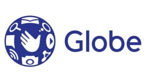
(2021 – Present)
In June 2021, Globe Telecom launched its current logo designed by FutureBrand in collaboration with Harrison. This iteration features a flat design that simplifies its visual elements while maintaining its iconic globe symbol in a dark blue shade. Each icon within the globe represents products and services offered by Globe Telecom to illustrate innovation and customer-centricity.
The Elements of the Globe Telecom Logo
Font
The Globe Telecom logo features a clean, modern look that reflects the brand’s innovative and customer-centric identity. The font used for the word “Globe” is a sleek, sans-serif typeface. It appears simple yet bold and emphasises clarity and approachability. The letters of the wordmark are slightly rounded to give a friendly and contemporary feel.
Colour
The Globe Telecom logo prominently uses blue to convey trust, reliability, and communication, which form the core themes for a telecommunications company. The blue is vibrant but not overly intense and helps strike a balance between energy and calmness. Also, within the globe-shaped graphic, various shades of blue and white are used. These include playful, dynamic icons like a hand, eye, and other abstract shapes to represent connectivity, creativity, and human interaction.
Finally
The Globe Telecom logo and its various iterations show the journey of the company from being a pioneering telecommunications provider to becoming a modern digital innovator. Each logo redesign reflects shifts in technology, branding strategies, and customer engagement priorities. The logo ensures that the company remains relevant in an ever-changing industry.