Gemini is an advanced artificial intelligence platform developed by Google DeepMind and is designed to power the next generation of intelligent digital experiences. It was introduced as the successor to Google’s Bard AI and integrates cutting-edge machine learning, natural language processing, and multimodal capabilities. These technologies allow it to understand and generate text, images, code, and more.
The platform is named after the twin constellation “Gemini” and reflects Google’s vision of combining reasoning and creativity. It projects the dual strengths of analytical intelligence and imaginative problem-solving. Built to integrate seamlessly across Google’s ecosystem, that is, from Search and Workspace to Android and Chrome, Gemini represents a major leap forward in Google’s AI evolution. It has set new standards when it comes to versatility, accuracy, and contextual understanding. The article explores the logo evolution of Gemini over the years, among other details.
The Genesis of the Gemini Logo (2023 – 2024)
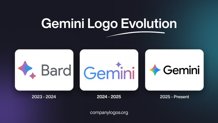
The forerunner of Gemini used to be Bard AI, which was an AI model developed by Google. Introduced in 2023, the Bard AI logo featured two star-like shapes with rounded ends, one bigger than the other, in purple and blue colours with a gradient.
To the right of these elements was placed the wordmark “Bard” in a sans-serif typeface in grey. The use of a colour gradient renders the logo with dynamism and creativity, qualities that are consistent with AI’s aim of generating novel content.

(2024 – 2025)
In early 2024, Bard AI was renamed Gemini. Its logo was developed by the internal design team of Google in collaboration with Koto, the branding agency. The star-like element of the Bard logo finds mention here (with sharp ends) as it is aligned with the zodiac sign of Gemini.
The wordmark “Gemini” in the logo is written using the proprietary typeface, Product Sans. The slightly rounded letterforms of the wordmark feature a gradient colour scheme that starts with a cool blue tone on the left and transitions to a violet red tone to the right. The star above the wordmark symbolises creativity, inspiration, and problem-solving.

(2025 – Present)
The current Gemini logo was introduced in early July 2025 as part of unifying Google products under a design system. In this logo the star symbol has soft round edges, a gentler form as opposed to the sharper version earlier. Besides, the star is depicted in Google’s signature colours of red, green, yellow, and blue.
The colour combination links the logo to the broader ecosystem of Google and ensures brand recognition and consistency. This has been done to make the logo universally adaptable across platforms and increase its visibility even at minimal sizes. The wordmark “Gemini” has retained its proprietary Product Sans typeface and appears in black.

The Elements of the Gemini Logo
Font
The wordmark in the Gemini logo uses the proprietary font, Product Sans. In this typeface, the letterforms are characterised by clean lines, friendly curves, and the absence of serifs.
Colour
The latest Google logo uses the signature colours of Google, namely, red, green, yellow, and blue. The use of multiple colours aligns Gemini with the broader brand identity of Google.
Finally
The evolution of the Gemini logo reflects the broader journey of Google towards creating a unified and human-centered AI identity. So, from its early minimalist blue-and-purple design during the Bard transition to the vibrant, multicolour symbol introduced in 2025, the Gemini logo has aligned itself with Google’s iconic visual language. The evolution of the logo shows AI’s own progress, that is, in becoming smarter, more adaptive, and more connected to the world it serves.