Galaxy Digital is a leading global financial services and investment management firm that deals with digital assets, cryptocurrency, and blockchain technology. Founded in 2018 by Michael “Mike” Novogratz, a former Goldman Sachs partner and prominent Wall Street investor, the company was created to bridge the gap between traditional finance and the rapidly emerging digital economy. Based in New York with offices worldwide, Galaxy operates across multiple business lines. These include trading, asset management, investment banking, principal investments, and mining and infrastructure services.
The Galaxy Digital logo has evolved through strategic rebranding that reflects the company’s growth from a crypto merchant bank to a holistic platform leader in digital assets and Web3. The article delves into the evolution of the Galaxy logo, among other details of the company.
The Genesis of the Galaxy Digital Logo (2018 – 2022)
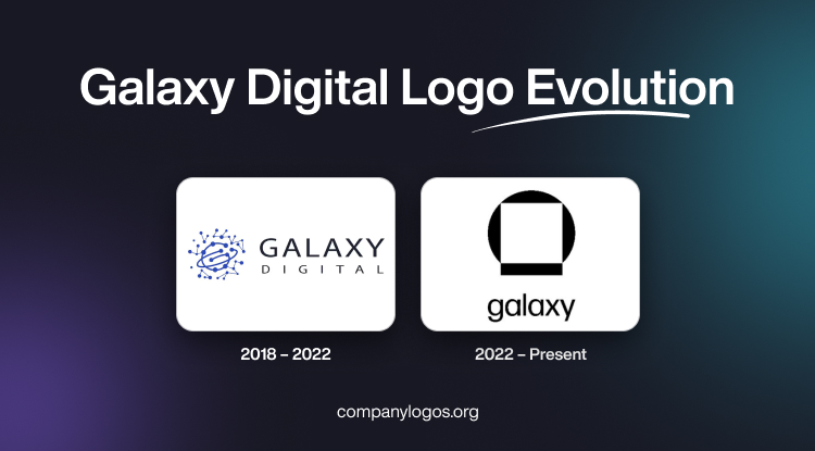
The original Galaxy Digital logo consisted of a graphical emblem and a wordmark. The wordmark featured the company name “GALAXY DIGITAL” or “GALAXY DIGITAL HOLDINGS” in two levels and written in a clean sans-serif typeface. The emblem in blue looked like a zigzag pattern of lines connecting the nodes. The core of the emblem looked like an abstract circle containing a series of dots or nodes and joined in a loop by thick blue lines.

(2022 – Present)
By mid-2022, the company launched a major rebranding initiative to reposition Galaxy as a central figure in shaping a digitally native economic paradigm. Consequently, the company shortened its brand name to “Galaxy” to signal broader ambitions and inclusivity. The updated logo was designed by Pentagram and has been crafted from the elemental forms of a square and circle.
It symbolises the combination of blockchain technology (square, representing blocks and infrastructure) and infinite possibility (circle, representing openness and the universe). These elements when combined also look like a “space helmet” to imply exploration, vision, and unity.
The logo is designed in a combination of black and white to reflect contrast and stability and to express clarity and differentiation. The wordmark accompanying the logo emblem is written using modern sans-serif typography to emphasise transparency and forward-thinking innovation.

The Elements of the Galaxy Digital or Galaxy Logo
Symbol
The Galaxy Digital logo has a graphical symbol resembling a square and circle. The two symbolises the combination of blockchain and the myriad potential of the company. The symbol of an astronaut’s helmet conveys the role of the company as a digital asset as well as an explorer and pioneer in blockchain.
Font
The wordmark in the latest Galaxy Digital logo is written using a new custom sans-serif typeface, which is geometric and modern. It complements the square-and-circle symbol of the logo. Besides, its rounded letterforms convey a professional tone and soften the corporate feel. The forward-looking typography aligns with the role of Galaxy Digital as a guide in digital finance.
Colour
Black and white are the colours of the current Galaxy Digital logo. The two colours convey light and shade, create differentiation and contrast, and ensure stability in design.
Finally
The evolution of the Galaxy Digital logo reflects the eventful journey of the company. The logo has moved from a straightforward financial services wordmark to a sophisticated, modular symbol for unity, exploration, and digital opportunity. The logo now supports its ambitions to lead in Web3 and digital asset finance.