Fujitsu is a leading information and communications technology (ICT) company based in Tokyo, Japan. It was set up in 1935 and has since become one of the largest providers of computing products, digital solutions, and IT services in the world. The company boasts a strong heritage in innovation and focuses on the latest cutting-edge technologies. These include cloud computing, artificial intelligence, high-performance computing, networking, cyber security, and industry-specific digital transformation solutions.
The company serves customers across a range of sectors, such as government, finance, manufacturing, retail, healthcare, and others. It helps customers in these sectors to modernise operations and create more sustainable and resilient digital ecosystems. Fujitsu is known for its emphasis on reliability, human-centric innovation, and cutting-edge R&D and plays a major role in shaping the future of global technology. The Fujitsu logo has changed four times over the years, and the article explores the same, among other details.
The Genesis of the Fujitsu Logo (1935 – 1962)
The first Fujitsu logo comprised a graphical emblem with the letters “F” and “S” intertwined with each other. This was so, as Fujitsu came about after the joint venture between Furukawa and Siemens. Besides, the overall design gave the impression of the dollar sign to signify profits.
The combination of these two letters used to be pronounced “Fuji”, which is also the highest mountain in Japan. So, the name “Fuji” meant being at the top, sustainability, and winning over competitors. The monogram was enclosed within a circle with a black outline to convey a sign of completeness.

(1962 – 1972)
In 1962, the company began manufacturing computers, in addition to telephones. Hence, the logo of the time depicted the direction the company had taken. It featured a rectangle with hieroglyphs made of squares and rectangles.
In fact, the hieroglyphs resembled the icons of a telephone exchange and a computer separated by a hieroglyph resembling a plus sign. At the top of the rectangle was mentioned the Japanese name of the company in hieroglyphs, while “Communications and electronics” figured in a fancy cursive English below.

(1972 – 1988)
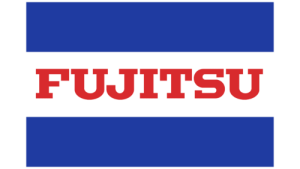
The 1972 logo resembled a flag consisting of two thick rectangular blue stripes at the top and bottom. These symbolised the environment of the island nation of Japan and how it is separated by water from the rest of the world. At the centre of the blue stripes appeared a rectangular white stripe with the brand name “Fujitsu” written in red uppercase. The name of the company in red signified the sun on the Japanese flag and how the company rose like the sun.
(1988 – Present)
Designed by Susumu Harada and Chris Hill for Praxcis, the logo redesign of 1988 features a serif inscription of the brand name in uppercase. Depicted in a scarlet red colour palette, the letters “J” and “I” had infinity sign over them. According to the designer, the sign symbolises a connection between the Sun and the Earth and shows the endless possibilities before the company.

The Elements of the Fujitsu Logo
Font
The custom, classic serif typeface used to execute the wordmark resembles the Friz Quadrata No. 2 D typeface. Besides, the tail of the letter “J” is extended downwards to the left.
Colour
The Fujitsu logo is designed using a scarlet red colour palette to convey love, passion, energy, and enthusiasm.
Finally
The Fujitsu logo and its various iterations show how the company changed course from being a telecommunications equipment manufacturer to becoming a global leader in information and communications technology. While the brand has modernised its visual identity over the decades, it has consistently maintained its distinctive wordmark and the iconic “J-I” infinity-like symbol. This has been done to represent connection, continuity, and innovation. The core elements of the logo highlight the brand’s heritage as well as its commitment to shaping the digital world with reliability and forward-thinking design.