Fox Sports is a prominent sports broadcasting division in the United States, which is owned by Fox Corporation. It was launched in 1994 with the acquisition of the NFL broadcast rights. Within its fold, Fox Sports encompasses several channels and digital platforms. These include the flagship Fox Sports 1 (FS1), Fox Sports 2 (FS2), and regional sports networks (until their divestment in 2019).
Fox Sports holds broadcasting rights to many of the nation’s most popular sporting events. These include the National Football League (NFL), Major League Baseball (MLB), college football and basketball, and international soccer tournaments like the FIFA World Cup. Over the decades, its logo has undergone several changes. Each logo variant reflects changes in branding trends, technology, and the network’s expanding presence in the sports world. The article describes the various logo changes undertaken by Fox Sports (United States), among other details, over the years.
The Genesis of the Fox Sports (United States) Logo (1994 – 1997)
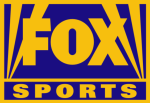
The first Fox Sports logo was introduced on August 12, 1994, and it coincided with Fox’s acquisition of the NFL broadcast rights. The logo featured a close-up of the wordmark “FOX SPORTS” (with “FOX” in the network’s signature wordmark) in dark gold against a purple rectangular background. The wordmark was flanked by two searchlights on either side in golden colour to evoke the cinematic heritage of Fox. Beneath the massive “Fox” wordmark in uppercase was mentioned “Sports” in small uppercase and written in a sans-serif typeface. Both wordmarks were separated by a thin golden line.

(1997 – 1999)
The 1996 logo variation was a refinement of the original logo. Here, the size of the wordmark “Fox” in uppercase was reduced, and the purple square background was given a golden outline.
(1998 – 2001)
By the late 1990s, the Fox Sports logo had shifted from a purple rectangular background to a deep blue oval. The oval was surrounded by a thick light grey outline with small white cuts at right angles. The wordmarks “FOX” and “SPORTS” appeared in two levels in white separated by a thin light blue line. The searchlights were also shown in light blue.
(2001 – 2012)
The 2001 logo replicated the 1998 logo design but without the searchlights and the deep blue background colour. The brand name was written in two levels in deep blue against a white background. The oval was given a thick blue outline with small white cuts at right angles.

(2012 – Present)
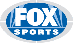
The present logo was crafted in 2012, and it featured the oval design with a blue and white outline. The brand name in deep blue was placed against a metallic background with a gradient. Besides, the thick blue outline was restricted to the left and right sides of the oval.

The Elements of the Fox Sports (United States) Logo
Font
The wordmark in the Fox Sports logo is written using a bold, geometric, and modern sans-serif typeface. The primary font used is the custom Sports FOX Sports UScore.
Colour
The Fox Sports logo predominantly uses a blue and white colour scheme, which has become a hallmark of its brand identity over the years. It also employs a metallic colour scheme as background colour.
Finally
The Fox Sports logo has evolved from a cinematic, searchlight-filled rectangle to a sleek, modern oval that adapts to digital and high-definition environments. However, despite numerous refinements and the introduction of property-specific branding, the oval logo remains the cornerstone of Fox Sports’ visual identity. It symbolises its enduring presence in American sports media.