ESPN, or Entertainment and Sports Programming Network, is a US-based sports broadcasting company owned by the Walt Disney Company and Hearst Corporation. It was founded in 1978 by Bill Rasmussen, Scott Rasmussen, and Ed Eagan. The ESPN logo is one of the most recognisable emblems in sports broadcasting. It symbolises energy, excitement, and the network’s commitment to delivering world-class sports content. Its evolution from inception to the present day reflects the latest design trends and ESPN’s own growth as a global brand. The article delves into the evolution of the ESPN logo, among other details, about the network.
The Genesis of the ESPN Logo (1979) (Pre-Launch)
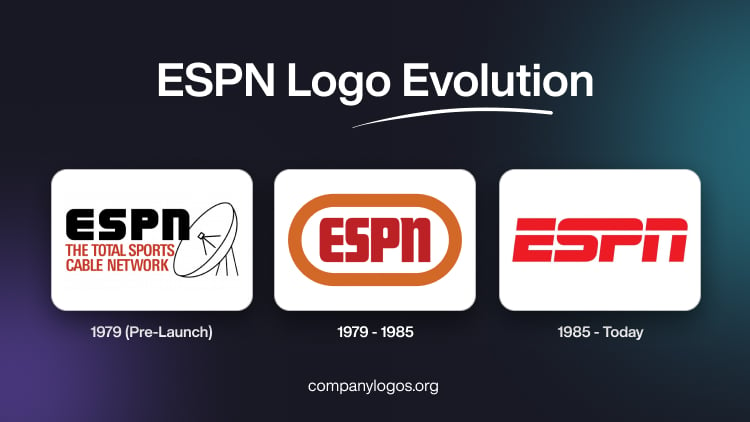
The pre-launch visual identifier of ESPN symbolised the promise the network made with respect to 24-hour sports coverage. The central part of the logo was the acronym “ESPN” in black, bold, uppercase, written using a sleek and slightly angular sans-serif typeface. The typeface highlighted the seriousness and professionalism of the network and established itself as the first sports network in the world that broadcasts round-the-clock.
The black colour of the wordmark represented confidence and authority, and the image of a satellite dish showed how cutting-edge technology is behind the broadcast. Beneath the acronym appeared the tagline “THE TOTAL SPORTS CABLE NETWORK” in red uppercase. It conveyed the core message of the brand being a comprehensive sports network.

(1979 – 1985)
The first ESPN logo featured the acronym “ESPN” in a muted red colour scheme set against a white background. It was encased within a thick orange border or oval. The colour choices were intentional. For instance, red symbolised passion and power, while orange was chosen for its psychological impact. These evoked excitement and anticipation, qualities ESPN wanted viewers to associate with sports.
The design itself was minimalistic, and it used bold uppercase letters in a straightforward, modern sans-serif font. The thick orange outline of the oval provided contrast and helped the logo stand out on screen. This logo was not just a visual identifier but a statement of ESPN’s intent to be a dynamic force in sports media.

(1985 – Today)
In 1985, ESPN introduced the logo that would become its enduring visual identity. This redesign marked a dramatic shift from the original, both in typography and overall style. The new logo, crafted with the Stop font designed by Aldo Novarese, featured bold, red letters slightly slanted to the right. It suggested forward momentum and progress, qualities that are synonymous with sports.
The most distinctive addition was a sweeping white line that cut horizontally through the upper part of the letters. This element was more than decorative, for it conveyed motion, speed, and the excitement of live sports action. At the same time, it also unified the acronym visually. The redesign eliminated the orange border and embraced a cleaner and more modern look that could adapt easily to various media formats.

The Elements of the ESPN Logo
Font
The latest ESPN logo is inspired by Stop, a typeface designed by Aldo Novarese, in 1971. The logo was built based on the white stroke on the letter “E”. The white stroke was continued to cover the rest of the letters. Besides, the glyphs were modified to fit into the new logo design. The typeface used in the logo is characterised by dynamism and modernity.
Colour
The colour palette used by the ESPN logo comprises a bright shade of red and white. The red colour draws the attention of the audience to attributes such as passion, strength, and intensity. The white colour, on the other hand, refers to perfection and purity.
Finally
The ESPN logo and the one change that it has undergone since its inception show the rise of the network from a cable startup to a global sports powerhouse. Its design choices, such as minimalism, bold colour, and dynamic typography, have helped it remain fresh and relevant for decades. The logo’s enduring appeal lies in its ability to communicate energy, excitement, and trustworthiness at a glance. This makes the logo a masterclass in effective brand identity design.