Ericsson is a Scandinavian company that manufactures telecommunications and networking devices and has a rich history dating back to 1876. Founded by Lars Magnus Ericsson in Stockholm, Sweden, the company used to be a repair shop for telegraph devices in its initial days. The growth of telecommunications, including mobile telephony, that we witness today can be credited in large measure to Ericsson.
In fact, the growth of the internet worldwide rode on the 3G and 4G networks developed by Ericsson. Over the years, the Ericsson logo has undergone several iterations, with each redesign reflecting the growth and evolution of the company. This article traces the history and evolution of the Ericsson logo over the years, among other details.
The Genesis of the Ericsson Logo (1876 – 1883)
After the company was founded in 1876 by spouses Lars Magnus and Hilda Ericsson, the company used an oval mark containing vital information: the name, location, and address. Initially, the company’s name and logo were simply the “L.M. Ericsson” wordmark. It was a straightforward representation of the founder’s initials and surname. This wordmark was used on company documents, products, and correspondence, thereby establishing the company’s brand identity in its formative years.
(1883 – 1918)
In 1883, a circular logo appeared in the form of a sun with triangular rays. Thin lines inside the logo indicated the field of activity of the company. Besides, the primary colours of the emblem were gold and red, which signified ambition and warmth. There was a central tower inside the circle emitting lightning, thereby symbolising the power of electrical communication. The symbol of a tower stood for progress, while the pointed rays of lightning meant the company was reaching to the edges of innovation.
(1918 – 1942)
After the merger of Stockholms Allmänna Telefonaktiebolag (SAT) and Telefonaktiebolaget L M Ericsson in 1918, a new logotype was created. In the iteration, designers placed a golden-coloured retro telephone within the circle and surrounded it with a dark blue band featuring the name of the company. The colour palette of the emblem was changed to brown, gold, and blue.
In 1919, Ericsson introduced its first emblem, which was a key milestone in the company’s branding history. The emblem featured the intertwined letters “LM,” accompanied by the name “Ericsson” in a distinctive typeface. This design was inspired by the founder of the company and served as a visual representation of the company’s commitment to quality and innovation.
(1942 – 1982)
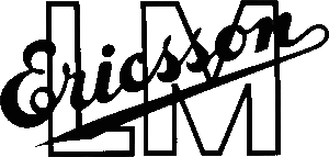
In the logo iteration of 1942, the emblem became monochromatic. The background of the emblem had the letters “LM” (short for Lars Magnus) written in a large font. Above the letters was placed the surname of the founder (Ericsson) in a cursive script diagonally. The emblem showed the contrast between the cursive script of the surname and the rigid letters of the initials to highlight a blend of innovation and tradition. The logo design showed a shift towards contemporary and underscored the simplicity of style.
(1982 – 2009)
In 1982, the logo acquired a modern style in which the company’s name was written in uppercase with three short parallel diagonal lines on the right. The wordmark “ERICSSON” appeared in a blue sans-serif font. The three short parallel lines suggest speed and connectivity, which aligned perfectly with the company’s role in the field of telecommunications.

(2009 – 2018)
In 2009, the three parallel diagonal lines were moved onto the word “Ericsson” to signify the growth of the company. The colour palette of the logo was changed from light blue to a darker navy blue. This accentuated the gravitas of the brand. The typeface of the wordmark had tighter spacing and increased weight, which represented reliability. Besides, the minimalist approach to design conveyed modernity and the company’s commitment to leadership in the field of telecommunications.

(2018 – Present)
In 2018, after several years of depicting uniformity in its logo, the company decided to change the logo to a more modern one. The current version represents the debut of the brand’s real visual identity. The Ericsson logo hints indirectly at the company’s field of activity and its adaptability in the world of technology. It symbolises innovation and a business-like approach to work, given that the telecommunications equipment manufacturer uses advanced technologies.
The Elements of the Ericsson Logo
Font
The wordmark used in the Ericsson logo is written in stark uppercase sans-serif typeface and accompanied by a graphic symbol with three broad and short lines. This monochromatic design symbolises practicality, which happens to be a trait that has become synonymous with the Ericsson brand.
Throughout its journey of evolution, the Ericsson logo was depicted in various font styles. Each style gave its own unique character to the overall visual identity. One of the most recognisable iterations featured the Frutiger Black sans-serif typeface, which was a creation of the renowned typographer Adrian Frutiger. This particular font was a gift to the company from the Stockholm design lab and referred to the collaborative spirit that has driven the design sensibilities of Ericsson.
Further, in a bold move to further establish its brand identity, Ericsson commissioned a custom typeface, aptly named Ericsson Hilda. It was based on Latin, Greek, and Cyrillic characters and represented a significant milestone in the design journey of the company. It even earned two prestigious Red Dot Awards for its innovative and cohesive approach.
Colour
The colour palette of the Ericsson logo features a rich, cornflower blue juxtaposed against a crisp white. This creates a striking visual dynamic that commands attention.
Finally
The history of the Ericsson logo is a testament to the company’s evolution and growth. Each change in the logo reflects a new chapter in the journey of the company, which is marked by significant milestones and achievements.