Ducati is one of the world’s most renowned motorcycle manufacturers. It is known for its Italian heritage, innovative engineering, and a legacy on both road and racetrack. Its story is one of technical evolution and resilience, marked by captivating milestones. Founded in 1926 and part of the Volkswagen Group, Ducati produces various motorcycle models, be it for touring, off-road cruising, or sports.
The motorcycles of the company are seen in prestigious racing championships, including MotoGP and World Superbike. The Ducati logo has evolved through the years, and each iteration reflects the durability, passion, and reliability of the motorcycles produced by the company. The article delves into the varied logos that were brought out by Ducati, among other details of the company.
The Genesis of the Ducati Logo (1926 – 1935)
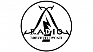
Ducati began as a radio technology company. The very first logo in monochrome featured the word “RADIO” in bold capital letters, which was highlighted by a lightning bolt threading through the “D” to represent innovation and energy. Besides, the logo elements constituted a circle with a thick black outline containing two crossed wires on two sides of the lightning bolt. Beneath it, “BREVETTI DVCATI,” where the letter “U” was replaced by “V,” appeared as a reference to patents and the company founders.
(1935 – 1949)
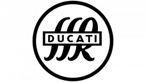
The 1935 logo variant showed the word “DUCATI” in black uppercase enclosed in a horizontal rectangle with a white background. It was set against the cursive initials “SSR,” where “SSR” stood for Societa Scientifica Radio. Also, every logo element was present inside a roundel with a black outline.
(1949 – 1967)
In 1949, Ducati shifted to motorcycle production, and the logo needed to stand out on fuel tanks. So, the logo featured the word “DUCATI” in white capital letters and rendered using a modern sans-serif typeface. Each letter of the logo had the outlines of black and grey lines.
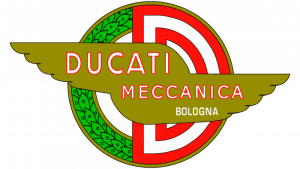
(1958 – 1959)
To celebrate its racing spirit, Ducati introduced a logo with a laurel wreath encircling a bold “D” in red and white stripes, two stylised wings in golden colour, and the inscription “Ducati Meccanica Bologna” in uppercase and in three levels. The wreath comprised a bright green and a red circle.
(1959 – 1967)
In 1959, the logo variant introduced an eagle, which is a powerful Italian symbol of freedom and dynamism. The eagle gripped a double-pointed flag emblazoned with “MOTO DUCATI” in red.

(1967 – 1977)
The 1967 variant became more minimalist, that is, a sleek black wing with white accents having the name “Ducati” in white italics. The emblem resonated with the iconic Scrambler bikes and was affixed as a metal plate rather than a decal. A version with a red outline around “Ducati” debuted on racing motorcycles and soon spread across the lineup.

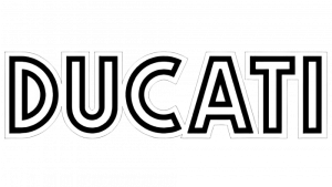
(1977 – 1985)
Designed by Giorgetto Giugiaro, the 1977 logo featured a geometric, all-caps “DUCATI” made with parallel double lines in black and white. This modernist logotype remained until 1985.

(1985 – 1997)
Cagiva, Ducati’s new owner, introduced a new identity. The logo now included a small elephant (Cagiva’s mascot) in grey and black above the Ducati wordmark by using Cagiva’s serif font. The wordmark was rendered in italicised bold serifs in grey and black.

(1997 – 2009)
With new ownership under TPG, Ducati dropped the elephant and developed a streamlined italic logo. Designed by Massimo Vignelli, it featured a bold red wordmark rendered in a Universe italic typeface with an emblem at the end. The emblem depicted a red circle with a white vertical line.

(2009 – Present)
In collaboration with the Landor agency, Ducati revealed its now-trademark red triangular shield, with a curve across it to symbolise speed and racing lines. The Ducati name appears boldly in white uppercase. This logo underscores passion (the red, Italy’s racing colour), performance, and the brand’s global status. The “Ducati Red” is instantly recognisable, and the curving stripe within the shield embodies both racetrack curves and the emotion of riding a Ducati.
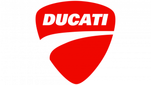
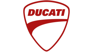
An alternate version of the above logo also exists in which the colours are reversed.
The Elements of the Ducati Logo
Font
The wordmark used in the Ducati logo uses a Universe Black Italic typeface. Created by Adrian Frutiger, the typeface is a strong and confident one.
Colour
The Ducati logo employs red and white colours, where red symbolises passion associated with high-speed motorsport. The colour red also represents victory, thereby affirming the quality of the motorcycles. The white-coloured lettering acts as a visual contrast for better legibility.
Finally
The Ducati logo has evolved over the years, and each logo iteration reflects the brand’s journey. Each logo iteration, which included emblems such as radio bolts, laurels, wings, eagles, elephants, dynamic italics, and the iconic shield, shows its ambitions and market focus at each era. Today, the proud Ducati logo combines its historic passion for speed with a modern global identity.