
Dove is one of the premium beauty products launched by the FMCG giant Unilever Plc. Founded in 1957 in the USA, Dove has created a niche for itself as a popular moisturising soap. A key part of this evolution has been its logo, the visual symbol that encapsulates Dove’s brand identity, values, and legacy. Over the decades, the Dove soap logo has undergone several refinements while staying true to its core elements. This article explores the history and transformation of the Dove logo, among other details, of the brand.
The Genesis of the Dove Logo (1955 – 1969)
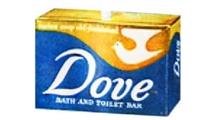
Created in 1955, the original Dove logo featured cursive lettering in white against a calm blue background. A tagline, “Bath and Toilet Bar”, in white uppercase, was placed underneath the brand name. Above the brand name and to the right was displayed a stylised white dove bird with wings spread upwards facing left against a gold background.

(1969 – 1996)
In 1969, the redesigned logo featured a golden dove against a white background. Beneath this appeared the brand name in blue with wider letters, but using the same typeface. The golden dove bird emblem faced right now and was redrawn to look sophisticated. It represented growth and movement.

(1996 – 2004)
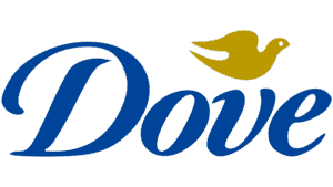
Designed by Joe Favata and Michelle Li for R. Bird & Co., the 1996 design saw the stylised golden dove bird facing left instead of right in the previous design. Besides, if the earlier design featured the bird’s eye in the form of a small white circle, this one did not feature any. The brand name was written in a similar style, but in a deep blue colour with thinner letters.

(2004 – 2012)
The 2004 logo design featured the golden dove emblem in gradient shades with white to appear more dynamic and voluminous. The new placement saw the right facing bird below the brand name, instead of the upper part of the logo in the previous variant. The brand name at the top was written using a new typeface with smoother lines and clean contours. The small letter “v” was changed as well and appeared more modern.

(2012 – Present)
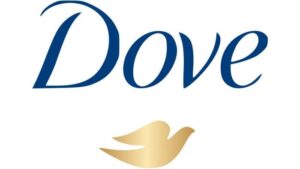
The 2012 logo continues to remain to date and replicates the previous design with subtle changes. For instance, the bird was given an intense golden shade, while the typeface for the brand name was modified. The combination of blue, gold, and white colours in the logo represented clarity, tenderness, and luxury.

The Elements of the Dove Logo
Font
The Dove logo uses a custom typeface designed by Ian Brignell, and it intends to convey a sense of elegance and sophistication. The typeface closest to the one used in the Dove logo is Civita Light Italic, TribunADFStd-Italic, Elicit Script SemiBold, or Australis Pro Swash Italic.
Colour
The colour palette used in the Dove logo combines both plain and dark shades of blue. There is also the bright gradient rose gold to display the bird. Among the colours, blue represents excellence and professionalism, while gradient rose gold evokes a sense of elegance.
The History of Dove
Dove soap was introduced in 1957 in the United States by Lever Brothers, which is now part of Unilever. The product was revolutionary for its time and offered a unique formula that included one-quarter moisturising cream. This formulation set it apart from traditional soaps that often left the skin dry. This innovation was based on a French patent for a mild, pH-neutral cleansing bar that Unilever acquired in 1952. After further development in the laboratories of Unilever, the Dove Beauty Bar was created to deliver a creamy lather and a signature fragrance.
Unlike traditional soaps, Dove was formulated from synthetic detergents rather than soap, which helped prevent the formation of soap scum and left skin feeling softer and smoother. The early advertising campaigns emphasised this point of difference, using taglines such as “Suddenly soap is old-fashioned!” and “Dove creams your skin while you wash.” The product’s novel curved shape and simple blue-and-gold packaging featuring the dove bird logo also helped it stand out on store shelves.
After its launch in the USA, Dove was introduced to Canada and briefly test-marketed in Europe during the 1960s. The brand’s market share initially remained modest, but in 1979, Unilever relaunched Dove with a medical marketing campaign. It highlighted the fact that dermatologists found it less irritating to skin than other soaps. This focus on mildness and skin care became Dove’s primary selling point, and by 1986, it had become the best-selling soap brand in the United States.
Dove’s rapid growth continued, and in 1989, the brand was launched in Europe, starting with Italy. By the early 1990s, Dove’s success helped Unilever surpass Procter & Gamble as America’s leading soap maker. Between 1991 and 1994, Dove expanded into 55 new countries, including Brazil, South Africa, the UK, India, China, and New Zealand. The brand evolved beyond the original bar and introduced deodorants, body washes, lotions, facial cleansers, and hair products from 1995 onwards.
Interesting Facts About Dove
- Dove Beauty Bar was launched in 1957 by Lever Brothers (now Unilever) as a revolutionary cleansing bar. It was not actually soap but made from synthetic detergents. This formulation was designed to be mild and pH neutral. It contained one-quarter moisturising cream to prevent skin dryness common with traditional soaps.
- One of the original motivations behind Dove’s formula was to eliminate bathtub rings or soap scum, a common nuisance in the 1950s when baths were more popular than showers. By using synthetic detergents instead of traditional soap, Dove helped save consumers the labour of scrubbing their tubs.
- Initially, Dove held only about 3% of the U.S. bar soap market and remained a niche product for over 25 years. The brand’s breakthrough came in 1979 with a medical marketing campaign that highlighted Dove being endorsed by dermatologists for its mildness. This campaign helped Dove become the best-selling soap brand in the U.S. by 1986.
- The Dove Beauty Bar traditionally contained a high percentage (around 47-49%) of sodium cocoyl isethionate (SCI), an expensive ingredient derived from coconut oil. It is this ingredient that contributes to its mildness and creamy lather. This ingredient initially gave the bar a strong coconut odour, which was later addressed by substituting SCI with sodium lauroyl isethionate to allow for fragrance-free options.
- Between 1991 and 1994, Dove expanded from the U.S. to over 55 countries worldwide. These included Brazil, South Africa, the UK, India, China, and New Zealand. This global rollout helped establish Dove as a leading personal care brand internationally.
- Starting in the mid-1990s, Dove extended its product range beyond the original beauty bar to include deodorants, body washes, lotions, facial cleansers, and hair care products. The brand also launched Dove Men+Care in 2010 and Baby Dove in 2017.
- Dove is widely recognised as one of the most dermatologist-recommended soap brands in the United States, Canada, and France, with a reputation for being gentle on sensitive skin.
- Dove has built its identity around challenging traditional beauty stereotypes and promoting real beauty and self-confidence.
- Dove does not associate itself with animal testing and is lauded by PETA for the same.
- From the outset, Dove’s packaging featured a simple yet elegant design with a blue-and-gold colour scheme and the iconic dove bird logo. It symbolised purity and gentleness. Although this design has evolved over time, the core has remained consistent to maintain brand recognition.
Finally
The Dove soap logo and its variations have undergone a steady and thoughtful evolution since 1957. While its design has adapted to new markets, digital platforms, and cultural shifts, its essence, that is, a dove symbolising softness and purity, remains intact. In a world of fleeting design trends, Dove’s ability to evolve while staying true to its core identity is a testament to the power of consistent, meaningful branding.