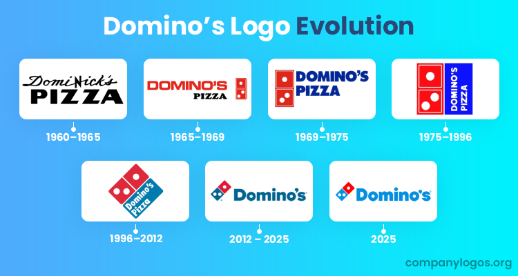
Domino’s is a world-renowned pizza chain that was started in 1960 by two brothers from Michigan, James and Tom Monaghan. In addition to delivering pizzas, the pizzeria chain also delivers chicken wings, pasta, sandwiches, and desserts. The evolution of Domino’s logo reflects the growth and adaptation of the brand over the decades. The logo has undergone several changes where each aligns with the expanding identity and market presence of the company. The article discusses the various logo changes that Domino’s had seen over the years.
The Genesis of the Domino’s Logo (1960–1965)
Before becoming Domino’s, the brand operated under the name “DomiNick’s.” The original logo featured a cursive handwritten font for “DomiNick’s” above a wordmark “Pizza” in bold, uppercase, and modern sans-serif font, set against a monochrome background. This design was simple and straightforward and reflected the identity of the local pizzeria.

(1965–1969)
After rebranding to Domino’s in 1965, the logo was redesigned to include a red wordmark with a bold and black “Pizza” tagline. The logo featured a red and white “Domino’s” with three dots in white set against two red dominos to symbolise the three original stores.

(1969–1975)
In 1969, the logo was updated to incorporate a bright blue colour alongside the existing red. The wordmark in a bold, sans-serif typeface in bright blue was now positioned to the right of the red and white domino emblem, which was also redesigned to be more prominent. This iteration marked a shift towards a more cohesive and recognisable brand identity.

(1975–1996)
In 1975, the logo underwent a significant transformation. The design featured a vertically oriented bright blue box with the company name written in white font and positioned alongside the domino emblem. This logo was rotated to fit a square format and resemble a pizza box. The colours were brightened, and the overall design became cleaner and more modern. The design reflected the growing popularity of the brand.

(1996–2012)
The 1996 redesign tilted the logo slightly and gave it a rhombus shape. The corners were rounded, and the font was updated to a more contemporary style. This version retained the red and blue colour scheme but introduced darker shades for a more sophisticated look. The logo’s orientation and design elements aimed to appeal to a broader audience as the brand expanded its menu beyond pizza.

(2012–2025)
In 2012, Domino’s made a strategic decision to drop “Pizza” from its logo to reflect its evolution into a broader food chain. The logo was simplified to feature a streamlined domino shape with three dots, which is now split between red and blue. The word “Domino’s” was prominently displayed next to the logo to emphasise the brand’s identity while catering to a wider range of food offerings. This design reflects a modern and efficient approach to branding, which is also aligned with the innovative spirit of the company.

(2025)
Domino’s has created a new branding after a decade, along with a new jingle, with help from Shaboozey, the 5X Grammy-nominated singer-songwriter. It imbued the brand with a modern look and sound and made it more playful. The logo colours of red and blue have been made brighter as a nod to the heat of a freshly baked pizza. A new, thicker, and doughier font, “Domino’s Sans,” is introduced to display the name. The company has also tweaked its name in some spots by calling it “Dommmino’s”. Domino’s has not changed its iconic identity but updated it as an evolution.


The Elements of the Domino’s Logo
Font
The Domino’s logo has introduced a new font called “Domino’s Sans” to execute its brand name. This bolder font is much thicker and doughier, with perfect circles and semi circles to symbolise pizza.
Colour
The iconic red and blue colours of the Domino’s logo has been made brighter and the hottest version of themselves. The colours represent the heat of a freshly baked pizza.
Finally
The history of the Domino’s logo showcases a thoughtful evolution that reflects the growth of the company from a small pizzeria store to a global food brand. Each logo redesign has been carefully crafted to maintain brand recognition. The enduring elements, such as the red, white, and blue colour scheme and the iconic domino symbol, continue to resonate with customers worldwide. These have made Domino’s a recognisable name in the food industry.