Disney+ is the flagship subscription video-on-demand streaming service of Walt Disney that was launched on November 12, 2019. Its rapid growth has made it a dominant force in the global streaming landscape. It has reshaped how audiences access Disney’s vast trove of content. Disney+ offers a vast library of Disney, Pixar, Marvel, Star Wars, and National Geographic content.
The Disney+ logo, while rooted in the broader Disney brand, has undergone its own evolution to reflect changes in technology, audience expectations, and corporate strategy. The article delves into the history and evolution of the Disney+ logo, among other details.
The Genesis of the Disney+ Logo (2019)
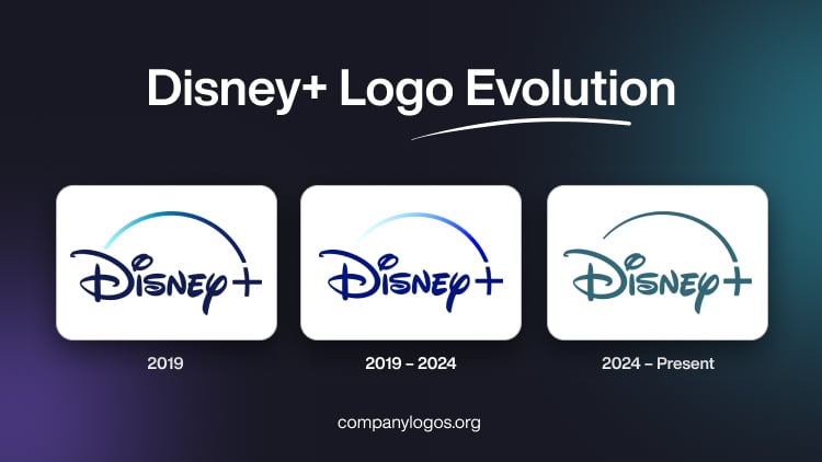
The original logo of Disney+ was a trial version, and it stayed with the company for a few months. It comprised the brand name in a dark blue colour and the “+” sign with a straight horizontal bar and a little arched vertical bar. The vertical bar in a deep navy-blue gradient colour was extended further in the form of an arched line. The arched line, or the arc, looked like the trail of a shooting star, similar to the animated variant of the emblem of the Walt Disney Company. However, it was more an abstraction and not exactly connected to the Walt Disney emblem.

(2019 – 2024)
In the first logo redesign by Trollback & Company, the “+” symbol was added in a modern sans-serif font. This was done to visually link the service to the digital streaming era and distinguish it from Disney’s traditional film and TV branding. The logo featured a swooping arc, which symbolised the magical “pixie dust”. It appears in Disney’s animated intros – arching over the wordmark and ending at the plus sign. This arc visually connects the logo to the opening sequences of Disney movies, where a star arcs over the castle.
The colour palette of the redesigned logo was primarily a deep royal blue background with white lettering. This was done to evoke a sense of premium quality and to align with Disney’s established visual identity.

(2024 – Present)
In March 2024, Disney+ unveiled a rebranded logo to coincide with the integration of Hulu content into the platform. Designed by Loyalkasper, the most noticeable update is the shift from the iconic dark blue background to a teal or seafoam colour. This new colour blends the legacy blue colour of Disney+ with Hulu’s signature green to signal the merger of the two streaming brands.
The core design – the Disney script, the plus sign, and the arc – remained largely unchanged to ensure brand continuity and recognisability. However, the arc and background now feature a subtle gradient inspired by the aurora borealis (northern lights), thereby adding a sense of depth and modernity. The new logo is often presented in a deep sea-green colour. This creates a clean, contemporary look that stands out on digital devices and app interfaces.

The Elements of the Disney+ Logo
Font
The wordmark of the Disney+ logo is crafted in a custom script typeface called the Waltograph. It is a bold, fluid script that is inspired by the stylised version of Walt Disney’s autograph used in the corporate logotype. Designed by Justin Callaghan and first released in 2000 (with updates leading to the Waltograph name in 2004), Waltograph draws influence from commercial fonts such as Tag Two and Subway. It features both uppercase and lowercase characters, ligatures, and alternates for versatility across various applications.
Colour
The colour scheme of Disney+’s logo is deep sea green, and it serves as a visual metaphor for creativity, imagination, and a sense of wonder. The colour conveys reliability and confidence, while the bright gradient accent injects energy, playfulness, and vibrancy into the logo. These colours make the logo both engaging and memorable. These reinforce the premium positioning of the brand and enhance its appeal across digital platforms.
Finally
The Disney+ logo and its iterations show the streaming platform’s journey – from its launch as a dedicated Disney streaming service to its current role as a unified hub for Disney and Hulu content. By blending tradition with innovation, the logo continues to evoke the magic of Disney while signalling the brand’s readiness for the future of entertainment.