Discovery is a US-based media company that owns the flagship Discovery Channel, along with several others. These include Animal Planet, Eurosport, Food Network, and Travel Channel. Established in 1994, Discovery has several divisions, such as TV broadcasting, sports, and education. Discovery is known for offering informative programming in the areas of science, nature, human adventures, and technology.
The Discovery logo has undergone several transformations since the channel’s inception. These iterations reflect changes in design trends and the brand’s evolving mission. The article explores the various logo changes associated with Discovery, among other details about the company.
The Genesis of the Discovery Logo (1985 – 1987)
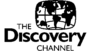
The first Discovery logo featured a black-and-white world map, with “THE Discovery CHANNEL” written in the Gill Sans MT font in three levels. The logo was set inside a rectangle with rounded sides, and it resembled a TV screen, which was a subtle hint of its medium of operation. The world map highlighted the channel’s ambition to explore and share global discoveries.
(1987 – 1995)
In 1987, the logo was redesigned in a monochrome colour palette. The focus shifted to the channel’s name, with “Discovery” written in the Aurora Bold Condensed font. The world map was replaced by a black semicircle. This symbol was interpreted either as a rising sun or the upper part of the image of Leonardo da Vinci’s Homo Vitruvius. In this logo iteration, the words “THE” and “CHANNEL” became less prominent, and the emphasis was on the word “Discovery.”

(1994 – 1995)
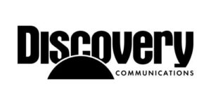
In the logo iteration of 1994, the words “THE” and “CHANNEL” as they appeared in the previous iteration were removed. At the same time, the bold, black wordmark “Discovery” was retained. To the right of the black semicircle, the word “Communications” in black uppercase but in a much smaller size was placed.
(1995 – 2000)
In 1995, the name was simplified to just “Discovery Channel” in purple. The black semicircle of the previous two logo iterations was replaced by the image of a three-dimensional globe. The globe image was painted in blue, white, and green to symbolise the global reach and focus of the channel’s worldwide exploration. The wordmark “Discovery” written in the Aurora Bold Condensed font and in a purple colour palette remained. The bottom of the logo had a thick blue horizontal line and the globe in the foreground.

(2000 – 2008)
The 2000 logo saw the colour palette shifted to blue and black, with the globe becoming lighter and more integrated. The word “CHANNEL” now appeared in white within a horizontally stretched blue rectangle beneath “Discovery” in a Helvetica typeface. This period reflected a blend of tradition and innovation, as it maintained the globe while introducing contemporary typography and colour changes.

(2000 – 2008)
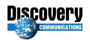
This logo iteration retained the previous design but replaced the word “CHANNEL” with “COMMUNICATIONS” in white.
(2008 – 2009)
This time around, the logo was redesigned by a Boston-based company called Viewpoint Creative. Here, the wordmark “Discovery” was written using a Bold Gotham typeface, instead of the classic Aurora Bold Condensed typeface earlier. Also, the second wordmark, “CHANNEL,” was written using a thin sans-serif typeface with wide spacing between the letters.
The horizontal blue line was removed, and the globe was placed in the bottom left corner of the letter “D.” In this logo, the “D-globe” could be used as a standalone icon in order to enhance the brand’s adaptability across platforms.

(2009 – 2013)
In 2009, the Discovery logo was further rebranded by Royale. Here, the logo was slightly modified by adding newer continents and making the wordmark “CHANNEL” a little bigger in size. Besides, the letters “c” and “o” were spaced apart, and the globe was detached from the letter “D.”
(2013 – 2016)
In 2013, the logo was further simplified by Radley Studios, wherein the letter “D” and the globe monogram became the primary visual identity. In terms of aesthetics, the letter “D” was given gradient effects and a silver outline to look three-dimensional and modern and to make the logo align with minimalist design trends. The detailed globe had continents, green forests, islands, blue oceans, and white clouds as visible elements.

(2016 – 2019)
The 2016 logo iteration featured a bold black “D” with the globe. The elements (the globe and the letter “D”) were encased within a black ring. This created a unified and encapsulated design. Also, the wordmark “Discovery” in a black Gotham font was retained, and the overall look was more focused and locally relevant.

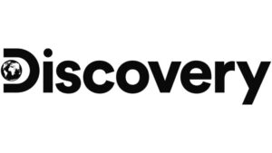
(2019 – Present)
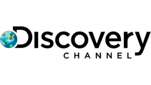
The latest logo, redesigned by Roger, a Los Angeles-based design agency, in 2019, modernised the “D-globe” monogram. Further, the globe was flattened and placed within the letter “D,” and the font of the wordmark “Discovery” was updated to Sharp Sans Extra Bold.
The Elements of the Discovery Logo
Font
The wordmark that forms a part of the Discovery logo has been designed using a circular black Sharp Sans Extra Bold typeface.
Colour
The colour palette used in the latest Discovery logo consists of black and white.
Finally
The journey of the Discovery logo shows the power of thoughtful design evolution. The various logo iterations balance heritage with innovation and always reflect the brand’s core mission, that is, to inspire curiosity and connect people with the wonders of our world.