Devialet is a premier French audio technology company known for merging cutting-edge engineering with luxurious product design. It was founded in 2007 in Paris and has since earned a global reputation for pushing the boundaries of high-fidelity sound through innovations that blend analogue purity with digital precision.
The breakthrough technologies developed by Devialet, such as its patented ADH® (Analogue Digital Hybrid) amplification and SAM® (Speaker Active Matching), have redefined what compact audio systems can achieve. The article delves into the evolution of the Devialet’s logo, among other details about the company.
The Genesis of the Devialet Logo (2007 – 2019)
The original Devialet logo comprised a graphical emblem and the wordmark in monochrome. The emblem was made of a stylised teardrop or droplet icon with the letter “D” in white inside and surrounded by a white circle. Below the emblem were mentioned the wordmarks “DEVIALET” and “Ingenierie Acoustique” in two levels and an all-caps sans-serif typeface.
(2019 – 2020)
In this iteration, the graphical emblem and the wordmark “Ingenierie Acoustique” were removed. The brand name in an all-caps modern sans-serif typeface in black with adequate spacing between letters remained.

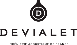
(2020 – Present)
In the current logo iteration, the teardrop icon is brought back with subtle changes. The icon symbolises acoustic pressure, a speaker’s diaphragm pulse, or even the first letter of the brand name. The brand name in uppercase and written in a sans-serif typeface follows the graphical icon below.

The Elements of the Devialet Logo
Font
The wordmark in the Devialet logo is written using a clean and modern sans serif typeface to convey the brand’s minimalism and high-tech identity. The font is similar to geometric sans-serif ones such as Avenir, Gotham, and Proxima Nova.
Colour
The Devialet logo is designed using a combination of black and white colours, which reflect simplicity, elegance, and timelessness.
Finally
The evolution of the Devialet logo reflects the brand’s journey from a bold audio disruptor to a refined icon of luxury engineering. The company has embraced minimalist and modernist design principles to show the precision and purity that define its audio technology. The Devialet logo stands as a visual embodiment of the brand’s commitment to merging cutting-edge acoustics with timeless design. The logo symbolises the heritage and forward-looking vision of the company in the world of premium audio.