Daikin is a world-renowned Japanese company that produces residential and industrial air conditioners, heating, and ventilation systems. Founded in 1924 by Akira Yamada, the company started as Osaka Kinzoku Kougyou and changed its name to Daikin Industries in 1963. The company also produces smart home solutions, which can be controlled using mobile apps. Besides, the key components used by the company, such as compressors and refrigerants, are produced by it to ensure strict quality control.
The Daikin logo has evolved alongside the company’s growth from a Japanese air conditioning pioneer to a global HVAC leader. This evolution reflects Daikin’s innovative drive and international presence. Its logo incorporates distinctive elements, colour schemes, and a carefully crafted logotype. The article delves into the evolution of the Daikin logo, among other details of the company.
The Genesis of the Daikin Logo (1924 – 1933) (Unavailable)
Daikin began in 1924 as Osaka Kinzoku Kogyosho (OKK) and was into manufacturing aircraft radiators and metal products in Osaka, Japan. In that period, it did not use any standardised modern logo, which reflected its industrial focus.
(1934 – 1963)
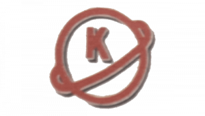
The corporate logo of the company (Osaka Kinsoli Kougyuo) was introduced in 1934. It featured a hollow circle with a thick red and silverish-grey outline. There was an orbit surrounding the circle diagonally of the same colour. The circle contained the letter “K” in its top half segment.
(1963 – 2004)
In 1963, the name of the company was changed to Daikin, which necessitated a change in its logo. The new logo featured a black triangle and a sky blue trapezium placed diagonally to the left with a little spacing between them. To its right appeared the italicised wordmark “DAIKIN” in uppercase and using a sans-serif typeface in a deep blue colour.

(2004 – Present)
The current logo does not allow for any spacing between the black triangle and blue trapezium forming the emblem to the left. At the same time, the letters to the right are bold and italicised in a light blue colour.
The Elements of the Daikin Logo
Font
The Daikin logotype in bold, italicised uppercase letters is written using a massive sans-serif typeface with straight glyphs and sharp angles. The similar typefaces are Univers 93 Extra Black Extended Oblique and Nuber Next Black Extended Italic.
Colour
The colour palette of the Daikin logo comprises blue, sky blue, and black, which evokes a sense of freshness and symbolises clean air. Here, if the blue colour is associated with innovation, dreams, and development, the black colour symbolises stability, robustness, and presence.
Finally
The Daikin logo is more about visual consistency rather than frequent redesigns. This stability has reinforced Daikin’s global brand presence as an innovator in air conditioning and HVAC. The colour and form of the logo embody the values of technology, trust, and advancement.