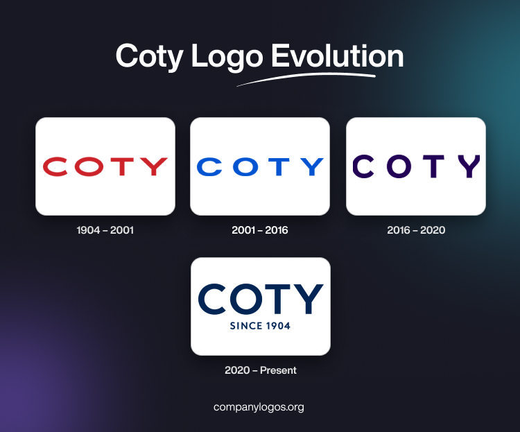
The famous cosmetics brand Coty Inc. was founded in 1904 in Paris by a young French perfumer named François Coty (born Joseph Marie François Spoturno). The logo of this brand has undergone a few changes, which reflect the company’s growth, changing values, and its commitment to innovation and inclusivity. The article explores the evolution of the Coty logo through various timelines.
The Genesis of the Coty Logo (1904 – 2001)
The original Coty logo was designed to evoke elegance and sophistication. Designed in 1904, the logo remained for nearly a century. The minimalist and slightly stretched logotype featured “COTY” in red uppercase and in a serif typeface. There was adequate spacing between the letters to ensure greater visibility.

(2001 – 2016)
The first logo change was carried out in 2001 by changing the typeface and colour of the logotype. The new design featured slightly compact letters in blue. However, the spacing between the letters was retained for enhanced visibility.

(2016 – 2020)
In 2016, Coty underwent one of its most significant rebranding efforts led by Workroom, a London-based branding consultancy. The new logo incorporated a bespoke font in deep purple with a curvy “Y”. It symbolised symmetry similar to butterfly wings—a motif chosen to represent change, beauty, and diversity. The butterfly-inspired design reflected Coty’s areas of specialisation: fragrance, hair care, and colour cosmetics.

(2020 – Present)
The logo has become an emblem of transformation within both the company and the beauty industry at large. It features the brand name in deep blue and in a bigger size. Below the brand name was mentioned its year of inception, “SINCE 1904”, in a smaller size, but in the same colour scheme.

The Elements of the Coty Logo
Font
The Coty logo features a bespoke typeface, which is minimalist and clean, with rounded edges that convey elegance and approachability.
The standout feature is the curvy “Y”, which resembles butterfly wings—a symbol of transformation, beauty, and diversity. This unique design element adds visual interest while reinforcing Coty’s focus on inclusivity and innovation.
Colour
The logo primarily uses vibrant colours in its modern iterations to reflect the diversity and creativity of the beauty industry. The logotypes appear in full-colour versions comprising red, blue, purple, and deep blue. These variations ensure adaptability across digital, print, and embroidery formats. The choice of colours in the Coty logo aligns with its mission to celebrate individuality and self-expression. Vibrant hues are often inspired by materials from its product portfolio, such as cosmetics and fragrances.
Finally
The various logo iterations of the cosmetics brand Coty represent its journey from a small fragrance house in Paris to a global beauty powerhouse. Each logo iteration reflects both aesthetic changes as well as deeper shifts in corporate values and consumer engagement strategies.