Making a perfect cup of coffee is no less than rocket science. Mocha, latte, or espresso, all these nectars with the same origin denote one thing only – one perfect cup of brewed excellence feels Italian.
The Costa Coffee logo celebrates this heritage with pride. Sit through the evolution journey of a company that became the “Nation’s Favourite” coffee shop of the UK, where everyone fancies tea.
1971 – 1995: Early Roastery Emblem
Sergio and Bruno Costa, two brothers from Parma, Italy, started a small roastery at Newport Street in London. They were solemnly determined to create and master unique coffee flavors that local taste buds crave.
Supplied to a few local eateries and delis at first, they later started selling roasted goodness at Costa’s own first coffee shop in 1987. The first Costa Coffee logo, launched in the UK, was symbolic and conveyed hip cafe culture.
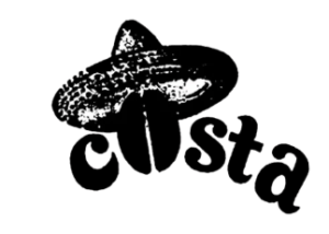
The old Costa Coffee logo had “Costa” written in a caricaturish and tumid font. The words seem freehand and customized rather than following any particular typeface. The designer used lowercase lettering except for ‘o’ – objectified as a hat-wearing coffee bean.
The words were also crescent-shaped to balance the big hat, a subtle yet not-so-subtle display of the logo’s Italian and black brew relation.
1995 – Present: Current Costa Coffee Logo
Soon, Costa Coffee made its place on the acquired tastes list of every Londoner. Thanks to the brand’s first acquisition with Whitebread (a British hospitality mogul), Costa was aspiring to cross UK boundaries and serve its coffee internationally.
This was also the time when the brandmark got refreshed. The new Costa Coffee logo is seen in a new font style and color palette.
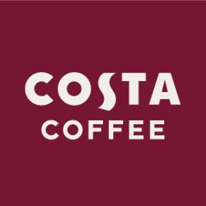
Both words follow a bold and geometric sans-serif font. The brand name “Costa” takes it up a notch by using some Roman script inspiration. The unique ‘S’ breaks the logo evenly and also illustrates the hot, wispy steam coming out from the “COFFEE” beneath.
The brand uses burgundy and white colors in the logo for Costa Coffee. A reversed color version of the font and backdrop also appears in different branding and promotional spaces.
Finally
Coffee has always held a place in people’s hearts and Costa Coffee’s dedication towards its products is clearly visible through its logo. Whether the logo of 1971 or the recent version, coffee has always been the main character.
In 1971, the coffee bean was depicted wearing a hat at the centre and was part of the Costa spelling. In 1995, the designers eliminated its extravagant features and embraced a simple and sophisticated design.
The logo history of Costa Coffee is proof that if any business wants to expand, it must stay true and wholeheartedly committed to its core.
Other Costa Coffee Logos
Costa has launched a series of logo variations to promote its different executive and business decisions, which include:
Costa Emblem Logo
Apart from the Costa Coffee symbol of 1995, we can see this seal-like logo on the Costa Coffee outlets. This doughnut-shaped symbol has the brand name written on the top and “coffee” at the bottom in a font similar to that of the 1995 version. The company’s year of origin is also imprinted on it from side to side.
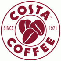
Inside this doughnut hole, three hearty-looking coffee beans overlap each other. This logo also follows the familiar color palette of burgundy and white in an alternate pattern.
Costa ‘Proud To Serve’ Logo
Costa “proud to serve” is a smart business initiative launched by the brand to attract other hospitality businesses like hotels, offices, hospitals, airports, colleges, etc. The idea is to make it easy for them to sell Costa products without actually taking the franchise or fully becoming part of the brand.
For this B2B program, Costa launched a fresh endorsement mark.

The logo consists of the Costa wordmark along with the initiative‘s tagline “proud to serve” in all caps, narrow and sharp condensed serif or slab-serif-influenced typeface.
The costa-containing lozenge is in burgundy-red, having hair-like projection around it, almost like the pili of a bacterial cell.
Another version of the same logo also exists that follows the opposite color pattern in lozenges.
Costa Express Logo
Costa Express, the cutting-edge vending machine for hot beverages, challenges the need of a barista for freshly ground espresso and creamy latte. Though human touch to the coffee is still irreplaceable, the modern vending machine is no less capable of creating lip-smacking coffees.
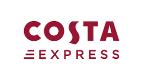
The logo for the Costa Express appears on the machine itself. It is quite simple and follows the same color pattern. The brand name also follows a Costa standardized typography. The addition of “express” beneath can be seen in an uppercase sans-serif typeface that has three parallel lines arranged in ascending order from top to bottom.
FAQs
1. What font is the Costa Coffee logo?
The Costa Coffee logo has a customized and exclusive font that is not tied to a single or particular typeface.
2. Why is Costa called Costa?
The name Costa comes from the family name of the founding brothers of Costa Coffee, Sergio and Bruno Costa.