CooperVision is a leading US-based global manufacturer of contact lenses. It is known for its commitment to innovation, eye health, and improving the quality of vision worldwide. It was founded in 1980 as part of The Cooper Companies, Inc., and has since grown into one of the top three contact lens companies in the world.
Based in Pleasanton, California, USA, CooperVision specialises in a wide range of lenses, which includes daily disposables, silicone hydrogel lenses, toric lenses for astigmatism, multifocal lenses for presbyopia, and advanced speciality lenses for complex vision needs. The company is also recognised as a pioneer in myopia management, with groundbreaking products such as the FDA-approved MiSight® 1 day contact lens for children.
The CooperVision logo has undergone one change over the decades. The logo iterations echo the growth of the company and its evolving brand philosophy. It shows how the brand grew from a traditional medical supplier to a vibrant global leader in contact lenses. The article delves into the evolution of the CooperVision logo, among other details of the company.
The Genesis of the CooperVision Logo (???? – 2011)
Not much is known about the timeline of the original logo. However, the design included the brand name written in custom typography in light blue. It aimed to create a “lens case” concept using the letters ‘C’ and double ‘o’. This was accompanied by a small, generic “eye” emblem at the end of the wordmark.
The eye emblem at the end of the brand name in white was enclosed within a blue square. The brand name and the emblem were accompanied by a tagline, “A CLEARER VISION”, in black uppercase with adequate spacing between the letters.

(2011 – Present)
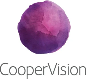
A major shift occurred in 2011 when CooperVision introduced a radically new logo. It was developed by the strategic branding firm Siegel + Gale and was designed to reflect both scientific precision and the vibrancy of everyday user experiences. The logo consists of multi-coloured watercolour circles paired with minimalist, contemporary sans-serif typography in light grey colour. This update symbolised a modern, inclusive perspective, which emphasised qualities such as “comfort”, “innovation”, and “global diversity”.
The watercolour style evokes the connection of the core product to water, which is critical for lens comfort. The varied colours express the broad spectrum of vision and reflect CooperVision’s presence in multiple markets worldwide. This abstract approach to logo design moved the brand closer to lifestyle sensibilities.
The Elements of the CooperVision Logo
Font
The wordmark in the CooperVision logo is written using a clean sans-serif typeface with rounded edges. The minimalist typography is contemporary and approachable and reflects the brand’s focus on comfort and trust in eye care.
Colour
The watercolour globe symbol in the logo is designed using a combination of several colours, such as violet, magenta, purple, and orange. The wordmark is written using a dark grey or black colour to convey professionalism and stability.
Finally
The logo journey of CooperVision exemplifies how a brand’s visual identity can evolve to balance scientific credibility with customer outreach. It remains relevant in a fast-changing, global marketplace.