ConsenSys is a leading blockchain technology company that builds software, infrastructure, and tools for the Ethereum ecosystem and the broader Web3 landscape. It was founded in 2014 by Joseph Lubin, who was one of the co-founders of Ethereum. Consensys, which originated as ConsenSys, an abbreviation of “Consensus Systems”, is based in Brooklyn, New York, and has become one of the most influential organisations driving blockchain adoption worldwide.
From its inception, ConsenSys has been dedicated to realising the vision of a decentralised, user-owned internet. It develops products that empower individuals, developers, and enterprises to build and interact with decentralised applications. Among its most recognised creations are MetaMask, the world’s most widely used Web3 wallet; Infura, a scalable blockchain infrastructure provider; and Truffle Suite, a leading developer framework for Ethereum smart contracts.
The Consensys logo has undergone one change since its inception. It reflects the company’s journey and evolution from a pioneering Ethereum software incubator to an influential blockchain and Web3 technology leader. The article explores the evolution of the Consensys logo, among other details of the company.
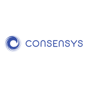
The Genesis of the Consensys Logo (2014 – 2023)
The original Consensys logo featured a dynamic swirl of blue dots forming a spiral to convey a sense of motion and fluidity. Here, each dot or circle symbolised individuals that comprised the Web3 ecosystem. It also represented the concept of consensus, wherein the dots or circles symbolised nodes forming agreement in a network. The spiral dot logo remained a recognisable visual identifier for Consensys as it expanded within the Ethereum and blockchain ecosystem. The wordmark “CONSENSYS” in uppercase was written using a clean and modern sans-serif typeface.
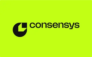
(2023 – Present)
The most radical change to the logo came in June 2023, when Consensys launched a new brand identity. Created in collaboration with Wolff Olins, the logo marked the first comprehensive rebranding. It was designed to position Consensys at the forefront of Web3 mainstream adoption.
The new logo features a graphical letter “c” that can be interpreted both as a two-dimensional symbol and a three-dimensional block extending upward. The colours of the logo are neon or lime green and black. The graphical element is accompanied by the brand name in uppercase using a modern, clean sans-serif typeface in black. Overall, the logo is set against a neon green background.
The Elements of the Consensys Logo
Font
The Consensys logotype uses a clean, custom sans-serif typeface in lowercase that is characterised by geometric precision and balanced spacing. The typeface is often identified with modernist and tech-focused brands.
Colour
The latest Consensys logo is designed in monochrome (black and white) and conveys maturity and inclusivity.
Finally
The evolution of the Consensys logo is a testament to the company’s journey, that is, how it evolved from a core technology incubator to a visionary leader in blockchain. The logo design inspires participation, ownership, and creativity in the development of Web3. It stands today as a visual mark as well as a representation of ConsenSys’s enduring commitment to building an open, decentralised future.