Comcast is a large US-based media and telecommunications company operating under the Xfinity brand. The company offers a range of services, which includes high-speed internet, mobile, landline, and cable television. It is also the owner of a string of movie studios, like NBCUniversal, besides television networks, and theme parks. It is also involved in creating content as well as distributing and delivering it across various channels.
The Comcast logo has undergone a few changes since the founding of the company. Each of these changes reflects the growth, evolving identity, and expanding media presence of the company. The article delves into the evolution of the Comcast logo, among other details of the company.
The Genesis of the Comcast Logo (1963 – 1969) (Unavailable)
The initial name of Comcast was American Cable Systems, which was established on June 28, 1963. However, there is no documented information about the logo of the company.
(1969 – 2000)
It was only in 1969 that American Cable Systems was re-incorporated as Comcast Corporation. Thereafter, the company introduced its first official logo. This design featured a strong, uppercase wordmark “COMCAST” in black, using a bold sans-serif typeface similar to Microgramma Std Bold Extended. To the left of the wordmark, the logo displayed an emblem. It was a stylised image of two interlocking “C”s within a solid black square. The design conveyed professionalism, stability, and strength and remained unchanged for over 30 years.

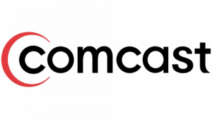
(2000 – 2007)
In 2000, Comcast modernised its visual identity to reflect its growing role in digital cable and internet services. The new logo featured the brand name in lowercase letters using a modified Futura typeface, which gave it a more approachable and contemporary look.
The emblem to the left was simplified to a red, stylised “C” that encircled the first letter of the wordmark. The use of red and black symbolised energy, power, and professionalism. Besides, it aligned with Comcast’s ambitions as a major media provider.
(2007 – 2012)
The 2007 update brought only minor changes. The wordmark became bolder and more geometric and was written using a sans-serif font similar to URW Geometric Arabe SemiBold. The red “C” emblem and the colour palette remained unchanged, which reinforced the already established brand identity of Comcast.

(2013 – 2024)
After acquiring a majority stake in NBCUniversal, the Comcast logo underwent a major transformation. The NBC peacock, with its six colourful, rainbow-coloured feathers, was placed above the Comcast wordmark. The word “COMCAST” appeared in a thin, elegant, all-caps sans-serif font, likely from the Intervogue family. The peacock emblem signified Comcast’s expanded reach into television, entertainment, and content production, while the modern wordmark projected expertise and style.

(2024 – Present)
The latest logo update further emphasises Comcast’s connection to NBCUniversal. The colourful NBC peacock sits prominently above a modern, sans-serif “COMCAST” wordmark. The text is clean, bold, and black and contrasts sharply with the vibrant peacock emblem above to ensure clarity and brand recognition.
This logo encapsulates Comcast’s dual identity, that is, tradition and heritage through the iconic NBC peacock. It also displays innovation through minimalist, contemporary typography. The rainbow colours of a peacock’s feathers symbolise the diversity and richness of Comcast’s programming and content. At the same time, the straightforward wordmark signals professionalism and modernity.

The Elements of the Comcast Logo
Font
The wordmark used in the Comcast logo uses a custom typeface, characterised by both serif and non-serif styles. The font is similar to fonts from the Comfortaa family, both light and regular.
Colour
The emblem used in the logo uses a rainbow colour pattern. The wordmark is written in black.
Finally
The Comcast logo evolved with the growth of the company. In other words, the various logo iterations reflect the transformation of the company from a regional cable operator to a global media and technology powerhouse. However, the logo variants continued to balance tradition and innovation, and sought to connect people with diverse content and services.