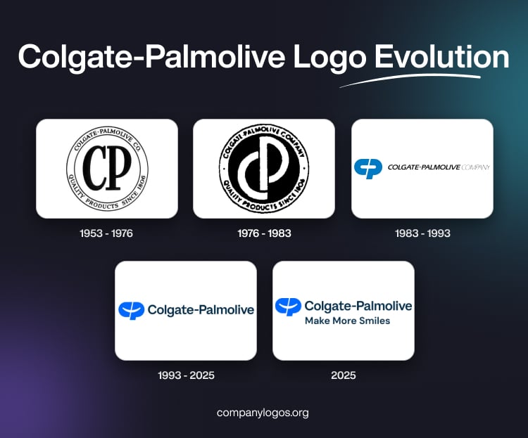
Colgate-Palmolive is a world-renowned FMCG brand that offers a wide range of consumer goods in the realm of oral care, personal care, pet nutrition, and home care. The Colgate part of the company was founded in 1806 as a soap and candle manufacturer, while the Palmolive part of the company was founded in 1917. The two came together in 1953 and collectively own more than fifty brands.
The Colgate-Palmolive logo is one of the most recognisable symbols in the global consumer goods industry. It reflects over two centuries of brand heritage, innovation, and adaptation. The evolution of the Colgate-Palmolive logo shows the journey of the US-based multinational company from a small New York soap and candle business to a worldwide leader in oral care and personal products. The article delves into the evolution of the Colgate-Palmolive logo over the years.
The Genesis of the Colgate-Palmolive Logo (1953 – 1976)
The original logo of the Colgate-Palmolive company features a large-sized monogram “CP” at the centre to represent the initials of the company. It was enclosed within a double-lined circle that showed the full name of the company in capitals in the upper part. The lower part showed “Quality Products Since 1806” in uppercase in the lower part. The logo was designed in monochrome to suggest timelessness. The contrast of black against a white background stood for clarity and integrity.

(1976 – 1983)
The logo iteration of 1976 retained the “CP” monogram but with a twist. The letters “C” and “P” looked overlapped and more geometric in white against a black background. Like earlier, the double-lined circle contained the full name of the company in the upper part and the rest in the lower part in black, bold capitals.

(1983 – 1993)
The 1983 logo was a departure from the past, as the encompassing double-lined circle was removed. The “CP” monogram was redesigned to look sleek and minimalistic. The letters “C” and “P” in vibrant look to have formed a broken ellipse separated by a thin white gap, which resembles a “+” sign. This symbolises positive changes, prosperity, and innovation.
Designed by Lou Luscher for Wallace-Church Associates, the logotype to the right of the monogram showed the full name of the company in uppercase. Written using a modified Eras typeface, the “COLGATE-PALMOLIVE” part in italics was mentioned in bold to highlight the brand. Incidentally, the word “COMPANY” was mentioned in the form of a blurred sketch.

(1993 – 2025)
The current logo is designed by Joe Finocchiaro and shows subtle differences with its previous variant. For instance, the size of the “CP” monogram is slightly reduced and the colour palette is a lighter shade of blue. On the other hand, the logotype to the right, “COLGATE-PALMOLIVE” in bold italics, does not feature the word “COMPANY”.

(2025)
Colgate-Palmolive has redesigned its logo in August 2025 and added a new tagline as well. The redesign has been done to reflect the company’s aim to serve as a caring and innovative growth company that is reimagining a healthier future for everyone (people and pets), and our planet. While the new logo has retained the core elements of the previous logo to honour its legacy, it employs a vibrant shade of blue optimised for the digital age.
Further, it has reworked the white space between the letters “C” and “P” to create a “smile” to symbolise the company’s purpose. A tagline, “Make More Smiles”, has been added, exhorting the company to advance its purpose and remember the positive impact it creates through its brands, the innovative solutions it creates, and the communities it serves.

The Elements of the Colgate-Palmolive Logo
Font
The wordmark in the Colgate-Palmolive logo is written using a slanted, modern, and bold sans-serif typeface. The typeface is similar to Syntax Next Pro Heavy Italic and Rolphie 11 Ultra Expd Italic. The “CP” monogram too appears to be written using a heavily italicised sans-serif typeface.
Colour
The “CP” monogram appears in a vibrant blue colour palette to symbolise freshness and trust. The full logotype is written using a black font to convey efficiency and straightforwardness.
Finally
The Colgate-Palmolive logo and its variants are a testament to the brand’s ability to adapt while remaining true to its core values. Each redesign reflects both the design sensibilities of its era and the company’s unwavering commitment to quality, innovation, and consumer trust.