A circle is one of the most fascinating shapes in the world. It has no sides, and simultaneously has infinite ones. A shape so versatile that it is widely used by many brands for their logos.
From beverage and automotive to technology and fashion, the shape’s wider adaptability makes it the apple of the brand’s eye.
In this article, we’ll explore how brands leverage the versatility of circular logos to shape their brand identity.
1. BMW
BMW is one of the most well-known circular logos. Throughout its logo evolution, one thing that remained the same was its shape. It has become the BMW brand identity mark.
The latest logo for BMW was introduced in 2025. It has a design with two circles. The inner circle is divided into four parts, colored in blue and white. Each quadrant is placed opposite its counterpart.
The circle made from these parts is covered by a ring. Designers used BMW Helvetica for the font style. The white wordmark also appears in chrome when used on cars. This logo slightly differs from its 2020 version, which has the inner circular outline.
2. Volkswagen
Volkswagen is another renowned car brand with a famous circular logo. The logo shows the brand’s history of over 80 years. The newest Volkswagen logo was introduced in 2019, which has a simpler and more modern look.
The circular logo has the letters “V” and “W” arranged such that the vertex of V lies on the apex of W, making the logo balanced. This flat 2-D design was created for easy digital use.
The logo’s sans-serif lettering with an outline in deep blue color looks clean, and the logo feels modern yet connected to Volkswagen’s history.
Steffen Knapp, director of Volkswagen Passenger Cars in India, introduced the logo by emphasizing that, “The new brand design marks the start of a new era for Volkswagen. Globally, the brand has committed itself towards being carbon neutral by 2050. This comprehensive rebranding is the logical consequence of our brand’s strategic reorientation.”
3. LG
LG is a brand that’s very familiar to all of us, and its famous winking red smiley-face logo is hard to forget. The logo was first introduced in 1995. It features playful yet memorable mark in a rotund circular form with the brand’s initials, “L” and “G,” in a friendly face.
The design is heavily influenced by history-related symbols. It took cues from a relic called the “Smile of Silla.” The logo shows five core concepts: world, future, youth, humanity, and technology. These express LG’s philosophy of “creating value for customers” and “promoting people-oriented management.”
The curve of the letter ‘G’ forms the outline of the face, while the minimal “L” becomes the nose, positioned to the right of a dot that serves as the eye. All these elements are rendered in a white gradient against a Heritage Red (#A50034) circular background.
In 2015, LG reintroduced its logo with a new font, LG Smart. This custom font replaced Helvetica Black, which the brand had used in its logo since 1995. The brand applies the same logo font to its slogan, “Life’s Good.”
LG explained that the letters in the “face of the future” convey goal orientation, focus, and optimism. Meanwhile, the asymmetric blank space within the circular form conveys its creativity and adaptation characteristics.
4. Pepsi
A question that we all don’t wanna answer is, Pepsi or Coca-Cola?
Pepsi is a brand that has put a lot of effort into staying fresh and relevant. Over the course of 125 years, Pepsi enticed customers through its vivid branding and visual identity. As the world shifted from physical to virtual, Pepsi unlocked avenues. It unveiled a brand identity in 2023. The logo is designed to work across physical and digital spaces.
Pepsi describes this logo as “Timely and Timeless.” The legendary tri-color roundel, often referred to as ‘The Pepsi Globe’, now features a solid black wordmark set in a modern, custom typeface. The logo appears bigger, the words bolder, and the colors red and blue more vibrant.
A notable addition is the sleek jet-black ring encircling the logo, creating a defined outline that enhances contrast and presence across screens. Explaining the intent behind the redesign, Mauro Porcini, Pepsi’s Chief Design Officer, shared:
“We design our brands to tell a compelling and holistic story. Pepsi is a shining example of a brand that has consistently reinvented itself over 125 years to remain a part of pop culture and a part of people’s lives.”
5. Mastercard
Want to learn color theory? Just pull out your Mastercard – it perfectly demonstrates what happens when red and yellow come together.
The Mastercard logo has the most distinctive circular mark. The interlocking circles symbolize the brand’s history of over 50 years and represent its oath to help customers reach for “priceless possibilities.”
In 2019, Mastercard refreshed its logo by removing the wordmark that previously sat across the overlapping circles. The updated design has colors Mastercard Red (#EB001B) and Mastercard Yellow (#F79E1B) intersect in equal proportion, forming Mastercard Orange (#FF5F00) at their overlap.
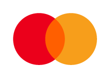
Together, these colors express the brand’s energy, confidence, and optimism for the future.
Raja Rajamannar, Chief Marketing and Communications Officer at Mastercard, emphasized the rationale behind the change by stating, “With more than 80 percent of people spontaneously recognizing the Mastercard Symbol without the word ‘Mastercard,’ we felt ready to take this next step in our brand evolution. We are proud of our rich brand heritage and are excited to see the iconic circles standing on their own.”
6. Nissan
Nissan’s brand identity is deeply tied to the heavenly orb, the Sun.
Founded in Japan, widely known as the Land of the Rising Sun, the company’s name literally means “sun product” or “birth of the sun.” Even Nissan’s founding philosophy states, “If you have a strong, determined belief, it can even penetrate the sun.”
Its sun-shaped logo continues to project the same symbolism.
The bold, geometric custom typography in the “Nissan Typeface” penetrates the disc-shaped ring, dividing it equally. The “S” letters introduce a necessary softness and sense of flexibility without disrupting the logo’s overall visual flow.
Nissan refreshed its well-known logo to make it more appealing and better suited to its digital presence. The brand debuted the updated mark on the Nissan Ariya, its first electric crossover. In electric vehicles, the Nissan logo appears in illuminated form when powered on.
7. Toyota
Okay! I’ll admit it, the Toyota logo isn’t a perfect circle, but an ellipse. The current Toyota logo is an iteration of the version first launched in 1989 that denotes the brand’s progressiveness and reliability.
The three elliptical shapes are arranged to convey a particular meaning. Inside the bigger ellipse, each of the two ovals that cross over each other denotes the heart of the company and customers individually, which overlap to convey trust and mutual benefit.
Additionally, the collective shape formed by the junction also represents the brand’s moniker ‘T’ and the steering wheel. Meanwhile, the largest oval that contains both ovoids indicates that Toyota is expanding its technology and influence across the globe.
The selected minimal design highlights Toyota’s future-driven innovation. The 2-D dark grey subtle structurization channels modernity with clarity. Dropping the wordmark reflects the brand’s maturity and ability to communicate its persona without text, online or offline.
8. Chrome
The Chrome symbol has long been embedded in our minds, making it one of the most famous circular logos that exists today. Its colors, and especially its shape, are so familiar that we can recall them as easily as the lyrics of a favorite song.
Google’s designers have consistently refined the logo in a way that keeps it visually connected to its earlier versions, ensuring it always feels familiar. Following the trend of minimalism and modernization, the Chrome logo underwent a redesign in 2022.
The minor modifications include the elimination of the shadows, which gave the previous logo a 3D effect, and re-proportioning the size of the blue nucleus, making the logo fresh without any major changes.
9. Slack
Slack’s logo is another strong example of a circle-inspired design. The 2019 logo for the business messaging app is an evolved version of the previous hashtag logo.
The brand felt the need to change the logo because its multiple hues created inconsistency and made it appear uneven, especially when placed on diverse backdrops. A logo should express the brand’s self-perception and the image it aims to project to the world, and the previous Slack logo wasn’t doing a great job.
Hence, a coherent logo came into existence. Slack’s in-house design team, Michael Bierut and team from Pentagram, updated the octathrope with a distinctive look.
Created on a 19*19 grid, the logo is mainly made up of two prominent shapes, a speech bubble and a speech lozenge (a rectangular shape with curved edges).
Four sets of these shape pairs are arranged in a tic-tac-toe–shaped silhouette. These sets are further distinguished by different colors: Blue (36C5F0), yellow (ECB22E), green (2EB67D), and red (E01E5A). The brandmark is also visible alongside the circular motif in a black, lowercase Hellix Bold typeface.
10. Audi
A diehard motorhead can easily recognize the Audi 4-ring logo from miles away. These linked rings probably attract more attention than Chinese linking rings.
The new Audi logo, revealed in 2016, combined post-modern style with a legacy that goes back a century. The 3-D design lost its depth and shine, transforming into a simple logo that appears in black on a white background.
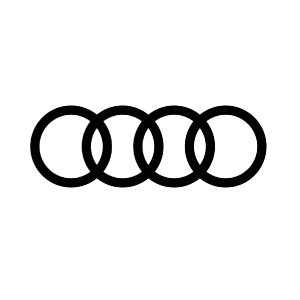
The ring width of this popular circular logo can also vary, a feature created for communication media. Later in 2022, the logo debuted on the Audi Q8 e-tron’s grille as a minimalist flat car badge.
11. AT&T
Looking at the history of the American Telephone and Telegraph Company and finding out that revolutionary inventor Alexander Graham Bell was its founding father, the company’s worldly logo makes sense to us.
Like many brands, AT&T’s current logo, launched in 2015, transitioned to a simplified, flattened design. Creative director Darrin Crescenz and designer Forest Young at Interbrand (New York) redesigned it to maintain a 3-D effect. The smooth and refined curves of the stripes created a 3-D illusion.
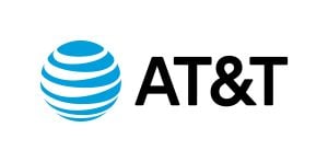
They also reversed the globe’s color scheme and introduced a brighter, non-oily, pastel-like gradient. Young decided to bring back the capital lettering for the brand name. All this combined gives a refurbished look to the AT&T Globe logo without any major changes.
12. Pinterest
Pinterest is a place to discover things that match your style. The Pinterest logo got a makeover when the popular pinmark “P” took the spotlight in 2011.
You’ll notice that the ‘P’ lettermark is slightly tilted towards the right. Although this is the primary logo, the brand also uses its name, ‘Pinterest,’ along with the symbol on its website and marketing materials.
13. Spotify
Spotify is a popular app amongst hardcore music and podcast lovers. Its circular logo contains three arches arranged in an ascending width format from bottom to top. Apparently, these three arches represent the spreading sound waves.
Besides this, the brand introduced a new custom font called Spotify Mix in 2024. This font style is a modern take on the classic sans-serif typeface, written in a bold, title case. Both the circular design and the wordmark are in a neon green color.
14. Target
The retail giant Target always hits a bullseye with its logo. It first launched the popular symbol in 1968, which has represented the brand identity ever since.
An inner white ring and an outer red ring form the paper face-inspired logo, centred by a solid red circle. The company renewed the literal target-looking logo in 2018, keeping the bullseye mark consistent.
15. Starbucks
The famous beverage brand has made a name for itself around the world thanks to its unique coffee and other drinks. The Starbucks logo is one of the main reasons the brand sticks in our minds.
Terry Heckler designed Starbucks’ original green-colored siren logo in 1971. In the latest 2011 redesign, the two-tailed siren appeared to be zoomed in. She is holding both her tails in her hands, her hair flowing downward, and wearing a crown.
The current logo also omits the brand’s name. As Starbucks started providing products beyond coffee, the siren became popular enough to be recognized on its own.
16. PhonePe
Since the brand’s inception in 2015, the PhonePe logo has remained unchanged. The logo of the online payment app comprises a purple circle inside which “Pe” is written in Hindi script.
The designers rendered the brand name in a Gilroy-inspired customized sans-serif typeface. They used a darker and lacquered gradient of purple for the circle and the wordmark.

17. ABC
The American Broadcasting Company launched its new logo in 2021. The redesign dropped the 3-D glossy shadowy effect from the black circular background and adopted a simpler and contemporary jet-black roundel to place the network’s initials.
The network worked along with creative studio Trollbäck to reimagine the emblem. The basic style of the new logo looks quite similar to the 1962 iteration created by designer Paul Rand.
The size reduction of spherically designed words is also evident. The lowercase ‘abc’ looks harmonious and identical. The ‘a’ and ‘b’ look like an inverted version of each other.
This statement of the president of content marketing of Hulu and Disney General Entertainment, Shannon Ryan, justified the 2021 ABC logo change: “We felt it was time to evolve the overall look of the network to make it more vibrant, modern, and fresh.”
18. Bacardi
The circular crest surrounding the renowned bat has become the face of Bacardi. The celebrated spirit company has been using this symbol since the time of its origin. The wordmark and the iconic bat were preserved in the 2013 update, which continues to be used to this day.
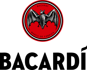
Interestingly, the new bat icon was selected from the 1900 and 1931 versions. The bat is precisely a Cuban fruit bat, giving homage to the brand’s roots.
The bat was also chosen to be on the logo as their colony was discovered by Doña Amalia, the spouse of Bacardi’s founder, Don Facundo, in the rafters of the first BACARDÍ distillery. She interprets bats as a symbol of good health, family unity, and good fortune.
This bat is placed on a circular red background and sandwiched between the brand name and “Macra De Fabrica,” which means “trademark” in Portuguese. The bat is also encircled by a thin white ring that has black borders.
Below the emblem, the wordmark used is classic serif and roman style typeface. The uppercase lettering, except for the distinctive “i” that flame-like accent represents the enthusiasm of Emilio Bacardi.
19. Reddit
In 2023, the discussion-based social media platform got a renewed logo. Snoo, the one-antennaed avatar, was updated into a 3D form, making it appear more lifelike. The Reddit mascot is now visible in a circular conversation bubble.
Neighbouring Snoo’s head, the brand name is also present in lowercase in a new wordmark, Reddit Display typeface. The name, along with the conversation bubble surrounding Snoo are rendered in OrangeRed.
20. Chanel
The classic Chanel logo was created by the matron Coco Chanel herself in 1925. Today, the logo defines luxury and refined taste. It exudes high-end fashion. Most brands change their logos several times to keep up with trends. However, Chanel created a relevant and evergreen logo at its first attempt that remains timeless and fresh throughout the years.
The two mirror “C”s are intertwined proportionally. The minimal, clean, and clear letterforms resonate with Coco’s ideology of “ less is more.” The logo is rendered in black, which is a color of substantial essence for the brand. The two “C”s act as initials for the Chanel designer whose nickname was Coco.
Finally
A circle is one of the most widely used shapes in semiotics. This simple form offers highly versatile applications.
In automobile logos such as Audi, BMW, Toyota, Volkswagen, and Nissan, the circle effectively conveys distinct brand identities through different adaptations. For example, the shape represents Nissan’s sun, the core identities of BMW, and Volkswagen. It also carries Toyota’s sense of warmth and embrace, and Audi’s origins.
This versatility extends beyond the automotive industry. Circular logos used by Pepsi, Chrome, MasterCard, LG, and Slack demonstrate the shape’s ingenuity. Moreover, designers often associate the most symmetrical shape with the golden ratio, which is also presented through circular arrangements.
To sum up, companies favor the circle as a logo because, like its inherent properties, the shape feels complete yet infinite, a form rich with potential.
FAQs
1. Which brand has a circle logo?
Brands like BMW, Audi, Pepsi, Mastercard, etc. have a circle in their logo.
2. Which brand logo has four circles?
Automobile brand Audi is notably known as a brand with four circles. The Audi logo is composed of four interlocked rings arranged horizontally.
3. Which brand has a black circular logo?
The ABC network (American Broadcasting Company) has a black circular logo.
4. Which clothing brand has a circle logo?
The logo for Chanel, or the house of Chanel, has two “C”s in mirror image orientation, which looks like a circular logo.