What’s red, yellow, green around, and blue in the middle?
No, not a bird.
You all have this on your phone. This is where your entire search behavior resides.
BINGO! You got it right, it’s the famous Chrome logo.
This logo has now become the visual identity of the web browser. Let’s have a look at the equally vibrant history of the Google Chrome logo.
2008-2011: An Orbic Beginning
The earliest version of Chrome was developed by a team of ex-Microsoft web developers, led by current Alphabet Inc. CEO, Sundar Pichai.
On 2nd September 2008, its beta version was publicized for Microsoft Windows. Later, the full version came into existence on 11th December 2008, competing with Microsoft Internet Explorer, Netscape, and Mozilla in this browsing war.
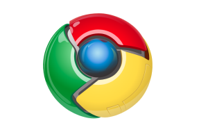
The Google Chrome logo of 2008 was like a 3-D spheroid. The logo had a metallic shine and projects a mechanical imagery. This orb-like logo was divided into 3 equal sections, which were in red, yellow, and green colors, respectively.
These sections were shaped with 3-dimensional angled edges and surrounded a blue, luminous round section.
There were accusations and assumptions that Google copied the logo color palette from Microsoft, and its design from the Japanese anime Pokémon.
At first glance, the logo design of Chrome does look similar to a Poké Ball, a Windows Vista logo, or a Firefox logo.
But there was no valid proof for it. The color scheme it followed was obtained from the Google logo, signifying Chrome’s association with Google. And the choice of shape was merely coincidental.
2011-2014: A Beaming Insignia
In 2011, Google launched Chrome Web Store with the release of Google Chrome 9.0. By November, Chrome outpaced Firefox in terms of worldwide usage with 160 million active users.
This leads to its first major rebranding. The new Chrome symbol did not have any 3-D impression. The color scheme was similar to the old Google Chrome logo. It was non-lustrous, yet the gradient was bright with slight shadows around the edges of red, yellow, and green arms.
This flatter redesign made the logo visually consistent and undistorted for different screen sizes.
Steve Rura, the 2011 Chrome logo designer, clarified the real meaning of the Chrome logo.
He said, “Since Chrome is all about making your web experience as easy and clutter-free as possible, we refreshed the Chrome icon to better represent these sentiments. A simpler icon embodies the Chrome spirit – to make the web quicker, lighter, and easier for all.”
2014-2022: A Well-Rounded Chrome Emblem
Chrome’s growth was exponential with its 360-degree approach for enhancing user experience through regular updates with dynamic features.
Which was why the 2014 Google Chrome logo was also refined. The design was moderately similar to its 2011 iteration. This Chrome symbol followed the same color scheme, with a prevalence of shadow effects around the arms’ edges, but both had become slightly undersaturated.
Another visual difference was the color area ratio of the middle circular part. The area ratio of blue had decreased slightly, and the white outline had thickened a bit.
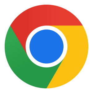
2022 – Present: A Simplified Chrome Logo
In 2022, Chrome hit another milestone with the launch of Chrome 100, the first three-digit version of Google’s browser, which shows its continuous scuffle for perfection. This scuffle evolved Chrome and made it the world’s most popular web browser, with over 3.2 billion people using it worldwide.
With this new growth in reach and user base, the Chrome logo design has also evolved.
Like fresher gradients taking place of the old shadow format. This new gradient also fits well with other icons of the brand, like Gmail and Drive. The color palette becomes vibrant again with its increasing appeal. The size increment of the blue disc in the middle is another familiar addition to the logo.
Finally
The evolution of the Chrome logo tells us about the journey and the ambition of a tech brand to develop an adept web browser.
When Chrome was first launched, people like college students were getting internet exposure, which was why the logo was more flashy and robotic; an apt logo to convey the meaning of a web browser to the users.
As the newer and better version of the web browser arrived, the Google Chrome symbol also changed accordingly to support the scalability and Chrome’s visual representation.
In these four versions, one thing that remained the same was the spherical shape and the same colors. A mere insignia that had become the famous logo for Google Chrome.
FAQs
1. What does the recent logo of Google Chrome look like?
The recent logo of Google Chrome is circular in shape, with colors like red, green, and yellow swirling around a blue circle, which is separated from them by a white outline.
2. Who designed the Chrome logo?
The original Google Chrome logo was redesigned by Steve Rura in 2011. He was part of the Google design team at that time. This later simplification of the 2011 logo was done by Elvin Hu in 2022.
3. Does Chrome have a new logo?
Yes. In February 2022, Google Chrome issued its new logo with a brighter color contrast and quality.
4. What are the four colors of Google?
The Google Chrome logo consists of four primary colors: red, green, yellow, and blue.