China Unicom is one of the largest state-owned telecommunications providers in China and a Fortune Global 500 company. Founded in 1994, it serves hundreds of millions of users across mobile, broadband, cloud, and IoT. Further, it is a pioneer in 3G, 4G, and 5G networks. The China Unicom logo is one of the most distinctive and culturally inspired corporate emblems in the global telecommunications industry.
At its core is the iconic “endless knot”, which is a traditional Chinese symbol of eternity, interconnection, and harmony. The logo reflects the heritage and forward-looking vision of the company. Over time, this logo has come to represent a communications network as well as the values of unity, innovation, and reliability that the company stands for.
The Genesis of the China Unicom Logo (1994 – 2006)
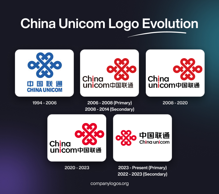
The original China Unicom logo featured the iconic “Endless Knot” in blue, derived from “Pan-chang”—one of the Eight Auspicious Symbols. These symbols are used across Chinese and Tibetan material culture to signify continuity, interconnection, longevity, and good fortune. Below the emblem was written the brand name in Chinese and English. The English text in uppercase was rendered in blue using a sans-serif typeface.

(2006 – 2008) (Primary) (2008 – 2014) (Secondary)
On 28 March 2006, China Unicom unveiled a new iteration of the logo. The entangled knot turned China-red, and the bilingual wordmark switched to ink-black to the bottom left. However, the two “i”s in the brand name were rendered in red to underscore “connection”.

(2008 – 2020)
In 2008, China Unicom and China Netcom Corporation merged, thereby necessitating a change in the logo. So, the 2008 logo iteration retained the previous logo and its elements but adjusted the typography. It adopted the China Netcom Chinese character style.

(2020 – 2023)
The 2020 logo iteration brightened the corporate red while keeping the rest of the elements intact. In fact, as per community trackers and CSR materials from that year, the logo change mentioned only the colour rather than a structure.

(2023 – Present) (Primary) (2022 – 2023) (Secondary)
The current logo shows the endless knots emblem to the left in vibrant red and the logotype to the right in black. So, the change was not substantial but only about the positioning of the emblem with respect to the text.

The Elements of the China Unicom Logo
Font
The “China Unicom” text is set in a custom sans-serif typeface, which is clean, geometric, and modern. Among the characteristics of the font are two lowercase “i”s. These are designed to look visually aligned to reinforce the brand’s theme of connection.
Colour
The colour palette of the China Unicom logo comprises red and black. The vivid red colour is used for the “endless knot” emblem. In Chinese culture, red represents prosperity, vitality, luck, and strength. So, for China Unicom, it conveys energy, passion, and connectivity.
The English wordmark and the Chinese characters in the logo are rendered in black. The colour gives the logo a professional, authoritative, and modern feel. It balances the liveliness of red with seriousness and clarity.
Finally
The evolution of the China Unicom logo reflects a balance between cultural heritage and modern innovation. Since its introduction in 1994, the endless knot has remained a powerful emblem of connectivity, continuity, and harmony. It has become one of the most enduring and recognisable logos in China’s telecom industry.
The consistency shown by China Unicom in its logo design has allowed it to build a strong brand identity rooted in tradition while staying relevant in an ever-changing digital era. The logo, besides representing a telecom provider, also embodies the company’s role in linking people, technology, and the future.