Cartoon Network is a popular American cable television channel that is dedicated to offering animated entertainment. It has a huge following around the world, especially among children, since its inception in 1992. Over the years, the network’s logo has undergone several iterations, wherein each iteration reflects the evolution of the brand and its identity. The logo of Cartoon Network has played a key role in establishing the network’s image and resonates with viewers across generations. The article delves into the journey of the Cartoon Network logo over the years, among other details.
The Genesis of the Cartoon Network Logo (1991 – 1992)
The original Cartoon Network logo was designed by J.J. Sedelmaier Productions and it featured two concentric circles with black outlines. The brand name in uppercase was written along the circumference of the circles in a custom serif typeface. Interestingly, the brand name was shown in letters with their outlines only. However, this logo was earmarked for pre-launch only.

(1992 – 2004)
The first official logo of Cartoon Network was introduced in 1992. It was designed by a team of animators and graphic designers, such as Corey McPherson Nash, Hatmaker, Primal Screen, Tom Pomposello, and DESIGNefx. The logo featured a bold, modern sans-serif font set against a black and white checkerboard background. The use of the checkerboard pattern reflected the network’s role in showcasing classic animated shows. It evokes a sense of nostalgia and timelessness.
The bold typography of the logo in uppercase letters conveyed a sense of confidence and authority and helped capture the attention of viewers instantly. The black-and-white colour scheme provided a clean and striking contrast and allowed the logo to stand out amidst competition. The logo was made of fourteen miniature blocks that formed a rectangle of dimensions 7 x 2 cm.

(2004 – 2010)
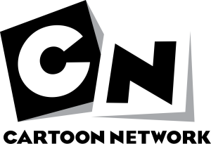
In 2004, Cartoon Network underwent a rebranding effort. It introduced a new logo that marked a shift towards a more minimalistic approach. The second logo featured the letters “C” and “N” to represent the brand name in a square frame. This sleek and modern design was the result of a collaboration between Cartoon Network and a Sydney-based graphic design company, Animal Logic Studio. In this iteration, the geometric shapes were placed above each other to make them appear at different heights. And thanks to the grey shadows on the sides, the cubes looked to be three-dimensional and tilted sideways. The backgrounds of the letters differed, with “C” having a black one and “N” having a white one.
The simplicity of the new logo allowed it to integrate seamlessly with various graphic elements and animations. It provided a versatile canvas for creative expression. The square frame added a sense of structure and stability to the logo. And the letters “C” and “N” maintained a strong connection to the network’s identity.

(2010 – Present)
In 2010, Cartoon Network unveiled its current logo. It was a testament to the network’s ability to adapt and evolve. This time, the network partnered with a design and animation company, Brand New School. This was done to create a logo that reflected the network’s shift from mostly animated programming to a mix of animated and live-action content.
The current logo features a straightforward and basic design. Here, the letters “C” and “N” are written in a custom typeface called “CN Bold,” created by the network itself. This minimalistic approach allows the logo to complement a wide range of visual styles and genres. It ensured the creation of a cohesive brand identity across the diverse programming lineup of the network.
The logo’s simplicity notwithstanding, it can be easily adapted to different colour schemes, backgrounds, and animation styles. This flexibility has enabled Cartoon Network to maintain a consistent brand presence while embracing new creative directions and audience preferences.

The Elements of the Cartoon Network Logo
Symbol
The current iteration of the Cartoon Network logo has the cube symbol, as seen in its previous avatar. However, it does not have any 3D effect unlike its predecessor. The logo adopts a flat design to showcase the letters C and N in white and black, respectively. These are placed within a black square and a white square. There is a notable change in the shape of the letters, while the font remains unchanged.
Shape
Introduced in 2004, the current logo consists of two squares, where each contains one initial of the network and is accompanied by the full name of the company below. The logo redesign exercise was a collaborative effort between the in-house designers of Cartoon Network and Animal Logic Studio, a distinguished Australian graphic design firm. The original Cartoon Network logo featured a checkerboard pattern comprising seven by two squares in black and white.
Font
The company name and initials are mentioned in the distinctive, playful custom font of the network, which has become a hallmark of the company since its inception.
Colour
The Cartoon Network’s logo appears in a black-and-white colour palette. Here, the colour black symbolises the qualities of courage, determination, excellence, and prestige. At the same time, the colour white symbolises purity, kindness, and a positive outlook.
Finally
Over the years, the Cartoon Network logo has undergone several changes to reflect the evolution and growth of the network. Be it the bold and nostalgic original design or the sleek and minimalistic current iteration, each logo iteration has played a key role in shaping the brand identity of the network.
The logo reflects the network’s ability to adapt and stay relevant in an ever-changing media landscape. Through its various iterations, the Cartoon Network logo has consistently complemented the vibrant and imaginative world of animated entertainment. It has captured the essence of the colourful and diverse programming offered by the network.