Capgemini is a global leader in consulting, technology services, and digital transformation. It is known for helping organisations harness the power of innovation to adapt and thrive in a rapidly evolving digital world. The company was founded in 1967 by Serge Kampf in Grenoble, France, and it has since grown into one of the most respected IT and business services firms globally.
Capgemini operates in over 50 countries and boasts a diverse workforce that exceeds 350,000 professionals. The company specialises in cloud computing, artificial intelligence, cyber security, data analytics, and enterprise software solutions. It serves clients across a slew of industries, such as finance, retail, energy, automotive, and telecommunications. The article delves into the logo evolution of Capgemini, among other details, of the company.
The Genesis of the Capgemini Logo (1967 – 1996)
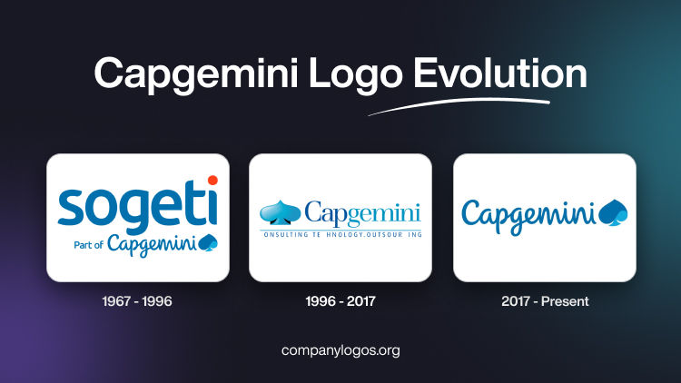
The forerunner of Capgemini used to be a company called Sogeti (Societe pour la Gestion de l’Enterprise et le Traitement de l’Information) that was founded in 1967. Its logo was displayed on two levels. For instance, the top had the then company name “Sogeti” in a big, bold, geometric, and rounded sans-serif typeface in deep blue to convey precision and formality. The dot over the letter “i” was displayed in bright red to symbolise dynamism.
The second level showed the wordmarks “Part of” and “Capgemini” alongside the symbol of the “ace of spades” in two shades of blue. The wordmark “Part of” in a title case was written in a sans-serif typeface, while “Capgemini” was handwritten to convey approachability.

(1996 – 2017)
In 1996, the company acquired two entities, CAP and GEMINI, to form Capgemini. The resultant logo was divided into three parts. The first part was the “ace of spades” emblem, followed by the wordmark in a sans-serif typeface. The separate entities “Cap” and “Gemini” were written in separate colour shades (deep blue and light blue). The company slogan was mentioned in a classic bold sans-serif typeface below a thin blue underline. The slogan represented the expertise of the company in the fields of “CONSULTING”, “TECHNOLOGY”, and “OUTSOURCING”.

(2017 – Present)
The designer of the latest logo was BrandPie, and its logo was unveiled in 2017. The logo consisted of the wordmark “Capgemini” in a handwritten style in deep blue. To its right is the symbol of an “ace of spades” in two different shades of blue (a deep navy blue and a bright turquoise blue).

The Elements of the Capgemini Logo
Font
The various wordmarks used in the Capgemini logo over the years have used different bold sans serif typefaces. The latest wordmark used a cursive script to appear more human and approachable.
Colour
The colour palette of the Capgemini logo consists of two shades of blue (a deep navy blue and a bright turquoise blue) since the colour represents expertise, trust, and technology.
Finally
The Capgemini logo and its changes over the years reflect how the company transformed itself from a regional IT services startup to a global leader in digital transformation. The logo was originally inspired by a tarot symbol that represented intuition and strategic thinking. In fact, the spade became a defining feature of the brand and symbolised intelligence, innovation, and forward-thinking solutions. The logo captures the essence of a brand that continually adapts while staying true to its core values.