Cambridge Audio is a renowned British audio brand that is known for its high-fidelity sound systems, innovative engineering, and minimalist design philosophy. It was founded in 1968 in Cambridge, England, and has since built a legacy of delivering pure, uncoloured sound that stays true to the artist’s intent.
From amplifiers and DACs to wireless speakers and streaming devices, Cambridge Audio’s products blend classic British craftsmanship with cutting-edge technology. It is driven by its motto “Great British Sound” and continues to set benchmarks in the world of premium audio. It offers music lovers an authentic and immersive listening experience. The article describes the evolution of the Cambridge Audio logo, among other details about the company.
The Genesis of the Cambridge Audio Logo (1968 – 19??)
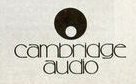
The initial Cambridge Audio logo comprised a circular graphical emblem and the wordmark. The graphical emblem had two circles, one big one in black and the other small one on the inside in white. The symbolism of the circular emblem seems to be inspired by the user experience of adjusting volume on the audio equipment produced by the brand.
The wordmark or brand name below was written in lowercase monochrome in a classic serif typeface resembling Camelia or Geramond. The logo style conveyed a sense of heritage and technical reliability. The thin letters of the wordmark were characterised by large, rounded circular strokes.
(19?? – 2025)
In 1994, Cambridge Audio was acquired by Audio Partnership. The logo of the brand around the period arguably featured the circular emblem to the left and the brand name “CAMBRIDGE AUDIO” to the right. The typeface used to execute the brand name was a modern yet classic sans-serif in grey.

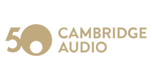
(2018) (50th Anniversary Logo)
The 50th anniversary logo paired the circular graphical emblem with “5” followed by the brand name in uppercase and executed using a classic sans-serif typeface.
(2025 – Present)
The current branding was created by Cambridge Audio in partnership with an award-winning branding agency in the UK called “Only”. The branding sought to reflect the heritage of Cambridge Audio while being futuristic and inspired by music. It continued with the circular graphical motif, while the typeface was changed to a clean, modern, and sleek sans-serif typeface in uppercase.
In fact, the typography was changed to a precision oriented sans-serif, Sohne Breit, from Klim Type Foundry. Interestingly, the word “AUDIO” was removed, which made the logo more dynamic, concise, and compact.

The Elements of the Cambridge Audio Logo
Font
The wordmark of the Cambridge Audio logo is executed using a clean, modern, and sleek sans-serif typeface, which is similar to the Helvetica Neue or a custom geometric typeface. Written in uppercase, the letterforms used in the wordmark convey approachability and elegance.
Colour
The colour palette used in the Cambridge Audio logo consists of black, white, or dark grey. The colours symbolise sophistication, purity, and technical excellence.
Finally
The Cambridge Audio logo has evolved alongside the brand’s pursuit of engineering excellence and its deep-rooted passion for music. The most recent rebrand was designed to reflect the company’s heritage. It also introduced a contemporary, culturally resonant identity that connects with both long-time fans and new listeners.