Burrow is a short-animated film made by Pixar Animation Studios that is known for great storytelling and innovation. It has been part of the SparkShorts series and was released in 2020. Burrow marked a significant departure from Pixar’s traditional 3D animation style, for it embraced a 2D aesthetic inspired by classic storybook illustrations. While the short film itself garnered widespread acclaim, its logo also played an important role in establishing its identity and connection to Pixar’s broader brand. The article delves into the Burrow logo and various other facets of the short film.
The Genesis of the Burrow Logo Design (2020 – Present)
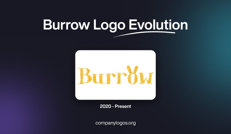
The logo for the short film Burrow by Pixar Animation Studios reflects the film’s unique artistic approach and theme. And contrary to the typical logos of Pixar, which often feature sleek typography or 3D elements, the Burrow logo embraces simplicity and warmth with its usage of a yellow earthy tone. It features a hand-drawn wordmark “Burrow” that reflects the 2D animation style of the film. The design evokes a nostalgic, storybook-like charm. It aligns with the short’s focus on cosy subterranean environments and interconnected communities.

Connection to Pixar’s Brand Identity
Pixar’s SparkShorts programme aims to foster creativity among emerging directors. It allows them to explore unconventional styles and techniques. The Burrow logo exemplifies this ethos by breaking away from Pixar’s polished 3D branding and embracing a more experimental visual language. Its distinctiveness reinforces Pixar’s commitment to diversity in storytelling while maintaining subtle ties to its overarching brand.
The Elements of the Burrow Logo
Font
The wordmark for the Burrow logo is written in a hand-drawn font that is whimsical yet understated. It conveys a sense of intimacy and approachability.
Colour
The logo is dominated by a yellowish earthy tone to reflect the naturalistic setting of underground burrows.
Finally
The Burrow logo reflects Pixar’s adaptability and willingness to experiment with artistic styles that complement individual projects. By embracing simplicity and warmth, the logo successfully captures the essence of Burrow and makes it an integral part of the film’s identity.