Burberry is a world-renowned British luxury fashion house celebrated for its timeless style, craftsmanship, and innovation. Founded in 1856 by Thomas Burberry, the brand began with a mission to create functional outerwear suited to the unpredictable British climate. Over the decades, Burberry has grown into a global symbol of elegance and resilience.
With its deep roots in British heritage and its strong ties to exploration, military history, and cinema, Burberry has established itself as much more than a fashion brand. The history and evolution of the Burberry logo reflects the brand’s heritage, values, and adaptability to changing fashion trends. This article explores the fascinating journey of the evolution of the Burberry logo, among other details of the company.
The Genesis of the Burberry Logo (1901 – 1968)
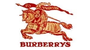
The first recognizable Burberry logo emerged in 1901 and it showcased a red emblem comprising an equestrian knight astride a horse. The knight held a shield bearing the Latin word “Prorsum” to signify “forward” in English. Positioned above the brand name in a bold serif font in uppercase, this emblem encapsulated Burberry’s heritage and its ties to the British aristocracy.
Also, the equestrian motif held special significance. It reflected Burberry’s origins as a manufacturer of outdoor apparel for hunters and sports enthusiasts. Besides its connection to the British aristocracy, the emblematic motif reflected the brand’s connection to the British countryside and its association with outdoor activities.
(1968 – 1999)
In 1968, the redesigned logo featured the brand name in title case using a sans-serif font. The equestrian emblem became smaller and showed only a black silhouette. The wordmark in a title case was written using a serif typeface. Below it appeared the tagline “OF LONDON” written using the same serif typeface as the brand name above.

(1999 – 2018)
In 1999, Burberry underwent another logo transformation. The updated design balanced the sizes of the emblem and the wordmark to look professional and classy. The equestrian rider of the emblem was shown in black and white, while the wordmark in all capitals appeared in a sans-serif font. The letters of the wordmark had sleek lines and thin pointed serifs. The word “OF” was removed from the tagline, which showed only “LONDON” in uppercase, albeit in a smaller size.

(2018 – 2023)
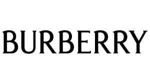
In 2018, the new logo was designed by Peter Saville who removed the equestrian knight and the word “London”. The new logo with a modern look featured only the wordmark written in a simplified sans-serif typeface in black.

(2023 – Present)
In the 2023 iteration of the Burberry logo, the typeface takes a bold departure from its predecessors. The minimalism of recent years gives way to a fanciful and elegant font that commands attention. The logo featured subtle flairs, playful serifs, and slightly flared bold bars. Now rendered in sleek black, the refined wordmark in uppercase letters conveys a more feminine and spirited aura. The font is similar to Valeson Condensed Regular and Moonllys Regular.
The Elements of the Burberry Logo
Symbol
The renowned “equestrian knight” Burberry logo stands out as one of the most iconic symbols in the world of fashion. The visual identity of Burberry encapsulates an image of a horse rider carrying a shield. While the shield represents protection, the equestrian element conveys a sense of grandeur, pride, and purity.
Font
The present Burberry wordmark is rendered in uppercase letters, and employs a modern sans-serif font. It is similar to the Urania Extra Bold typeface designed by Dieter Hofrichter.
Colour
The inclusion of black in the logo symbolizes the elegance, durability, and strength inherent in Burberry’s products.
Finally
The evolution of the Burberry logo reflects the brand’s ability to adapt to changing times while staying true to its heritage. From the early days of the equestrian knight symbolizing outdoor adventure to the modern, sleek designs of today, each iteration of the logo tells a story of Burberry’s journey through the fashion landscape.