The BT Group is renowned as one of the oldest and most influential telecommunications companies in the world. Established in the United Kingdom in 1969 as Post Office Telephones, the company offers a multitude of products and services, such as mobile telephony, digital TV, IT and network services, and internet products, among others. The company changed its name to British Telecom in 1981 and to BT in 1991.
Its visual identity is deeply tied to its legacy, technological innovation, and shifting market dynamics. Over time, the various logo iterations undertaken by the BT Group reflect the company’s strategies, aspirations, and the rapidly evolving communications landscape. The article delves into the various logo iterations brought out by the BT Group, among other details of the company.
The Genesis of the BT Group Logo (1969 – 1975)
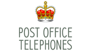
The year 1969 saw the establishment of the Post Office Telecommunications as a division of the General Post Office. The division used to be called Post Office Telephones due to its mandate of managing telephone services.
The initial BT logo featured a crown emblem and a wordmark “POST OFFICE” and “TELEPHONES” in two levels using a strict sans-serif typeface in grey uppercase. The crown emblem in orange and red represented the British roots of the company, given that the Post Office was established by King Charles II in 1660. Additionally, the logo embodied a sense of authority and reliability befitting a public institution.
(1975 – 1981)
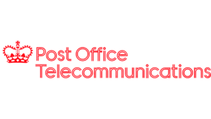
In the 1975 logo iteration, subtle refinements to the original logo were introduced. While most elements of the original emblem remained, the typography became slightly modernised. The crown in a red and white colour palette appeared to the left of the wordmark rendered using an outlined sans-serif typeface in a title case.
(1981 – 1991)
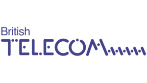
The 1981 rebrand was more than a visual refresh. In fact, it was a fundamental shift corresponding with the emergence of British Telecom as a separate entity from the Post Office. The new logo showcased a custom nameplate with “British” and “Telecom” in two levels. The upper level showed the word “British” in a thin sans-serif typeface, while the lower-level word “Telecom” in uppercase had five diagonal lines and five dots after the letter “M”.
The nameplate was shown in purple to symbolise creativity and balance. Also, the stylised letter “T” had two dots replacing the right portion of its horizontal bar, while the middle bar of the letter “E” was replaced with a dot.
(1991 – 1999)
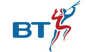
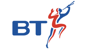
In 1991, the logo in red and blue saw a departure from earlier designs with the introduction of the Piper logo, which was incidentally conceived by the famed design house Wolff Olins. This abstract emblem depicted a stylised human figure playing a flute.
The Piper was meant to convey creativity, innovation, and a more human brand image. This era also coincided with the widespread association of “BT” as the company’s shorthand. It saw reinforced efforts to connect emotionally with consumers during a time of rapid market change and product expansion.
(1999 – 2003)
From 1999, the logo underwent a subtle change. It blended elements from the Piper emblem with more contemporary styling. It was meant to bridge the gap between its existing heritage and its emerging identity as a leader in telecoms and new technologies.
(2003 – 2019)
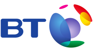
The new millennium brought about the iconic Connected World logo in 2003. It featured the “BT” wordmark in a sans-serif typeface with rounded corners paired with a multi-coloured globe of abstract shapes. This vibrant and future-focused design represented BT’s emerging global reach and digital capabilities. It signalled BT’s evolution from a traditional telecom provider into a multifaceted digital powerhouse. The logo’s energetic palette and flowing shapes were meant to communicate innovation and digital transformation.
(2019 – Present)
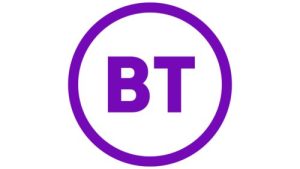
In May 2019, BT introduced its current logo, a minimalist design with the letters “BT” set within a simple, bold circle. This stripped-back identity was strategically chosen for timelessness, flexibility, and clarity across both digital and physical platforms.
The focus on indigo as the core brand colour was supported by pink accents and a distinct “Portal” brand motif. It underlines BT’s role at the gateway to modern technology. This minimalist change was not just a visual update but marked BT’s transition from a “plain old telephone company” to a modern technology brand.
The Elements of the BT Group Logo
Font
The wordmark in the BT Group logo is written using a bold sans-serif typeface with clean lines and distinct edges and corners. The typefaces closest to it are Neogram Heavy and Heading Pro.
Colour
The colours used in designing the BT Group logo include blue, red, and purple. The red colour symbolises the English crown and its patronising of the company; blue speaks of technological advancements in communications. Finally, purple relates to development and its influence on people.
Finally
The BT Group’s logo iterations are more than mere symbols. They reflect shifts in British culture, advancements in technology, and changes in the company’s strategic direction. Besides, the logos showcase the journey of the company over the years to become one of the behemoths in global telecommunications.