Skip to content
Home » Famous logos » The History and Evolution of the Broadcom Logo

The History and Evolution of the Broadcom Logo

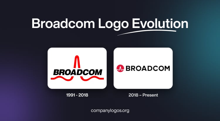
Broadcom Logo Evolution

Broadcom is a US-based semiconductor company that specialises in data storage systems, wireless and broadband communications, production of chips, information security, analogue systems, and fibre optics.

The history and evolution of the Broadcom logo shows the transformation of the company from a pioneering semiconductor startup to a global technology powerhouse. This article takes a look at the evolution of the Broadcom logo, among other details of the company.

The Genesis of the Broadcom Logo (1991 – 2018)

The first logo for Broadband Telecom was designed by Stacey Nicholas (then wife of co-founder Henry Nicholas), who drew inspiration from the mathematical sine function. It is a waveform that is the key in processing digital signals. This choice was deeply meaningful, for it connected the brand visually to its core expertise in high-speed, broadband communications.

The logo featured a bold wordmark “BROADCOM” in a black sans-serif typeface where a dynamic red sine wave starting from beneath the logo reaches upwards of the letter “A.” Thereupon, it bends down to the letter “D” to reach the other side of the wordmark. This added a sense of movement and agility. The use of the sine wave could be interpreted as a symbol of data transmission and connectivity. Also, the colour palette of red and black symbolised authority and innovation.

Broadcom Logo (1991 - 2018)

(2018 – Present)

A major turning point came in 2016 when Avago Technologies acquired Broadcom and adopted the Broadcom name for the merged entity. In 2018, the company unveiled a refreshed logo, which featured the “BROADCOM” text in bold, black capitals. And to the left of the wordmark is placed a red circular background containing a white sine wave.

This represents fluidity, connectivity, and the transmission of data, key themes for a company at the heart of global communications infrastructure. The circular emblem in the new logo evokes unity, completeness, and global reach. At the same time, it preserved visual links to its predecessor for strong brand continuity.

Broadcom Logo (2018 - Present)

The Elements of the Broadcom Logo

Font

The font used to write the wordmark for the Broadcom logo is based on its legibility. Written in uppercase letters, the typeface conveys authority, good quality, and stability.

Colour

The colour palette to design the Broadcom logo includes a combination of red, black, and white. Here, the colour red signifies the speed of data transmission.

The History of Broadcom

Broadcom was founded in 1961 as a semiconductor division within Hewlett-Packard (HP). Known as HP Associates, the division pioneered innovations throughout the 1960s and 1970s. These included the first commercial LED billboards and standardised digital communications hardware. In 1999, HP spun off its semiconductor and electronic measurement businesses into Agilent Technologies.

This offshoot took a new turn in 2005 when private equity firms KKR and Silver Lake Partners acquired Agilent’s semiconductor products group for $2.66 billion. This led to the creation of Avago Technologies, with centres in San Jose, California, and Singapore. Mr. Hock Tan, who would become instrumental in shaping Broadcom’s future, was appointed CEO in 2006.

Meanwhile, a separate entrepreneurial venture was underway on the other side of the tech world. In 1991, Henry Samueli and Henry Nicholas, a professor-student duo from UCLA, founded Broadcom Corporation in Los Angeles. It was meant to focus on semiconductor solutions to support high-speed, broadband communication, an area that was set to become critical as the internet era flourished.

Taking the company public on NASDAQ in 1998, Broadcom quickly earned a reputation for innovation, especially in Wi-Fi, Bluetooth, and Ethernet technologies. Besides, it saw rapid growth fuelled by key acquisitions. By the early 2010s, Broadcom was recognised as one of the world’s top semiconductor vendors.

A major turning point came in 2016 when Avago Technologies acquired Broadcom Corporation for $37 billion. It adopted the Broadcom name due to its greater brand strength and market recognition. This merger combined Avago’s specialised semiconductor portfolio with Broadcom’s leadership in connectivity. This created a diversified global technology powerhouse now known as Broadcom Inc.

With Hock Tan at the helm, the company became famous for its aggressive acquisition strategy. In this pursuit, it targeted market-dominant firms and, after integrating them efficiently, drove operational profitability. Regulatory scrutiny and competitive debate did not go unnoticed.

Starting in 2018, Broadcom boldly expanded beyond hardware and ventured into enterprise software with its $18.9 billion acquisition of CA Technologies. This was followed by acquiring Symantec’s Enterprise Security division for $10.7 billion in 2019. Broadcom’s ambitions culminated in the 2023 mega-acquisition of VMware, which was reportedly valued between $61 and $69 billion. This was one of the largest technology deals in history, which firmly established the company as a chipmaker as well as a leader in global technology infrastructure.

Broadcom Inc. is a multifaceted technology giant with deep roots in both engineering innovation and networking. It serves key markets such as data centres, networking, wireless and broadband access, enterprise software, and cybersecurity. Its chips and software form the foundation of the world’s internet, telecom, and cloud systems.

Interesting Facts About Broadcom

  • Broadcom was founded in 1991 by Henry Samueli and Henry Nicholas in the latter’s Redondo Beach condominium in California. From humble beginnings, it quickly became a dominant force in chip manufacturing.
  • The name “Broadcom” is a shortened form of “broadband communications.” It signalled the early focus of the company on broadband networking and wireless technologies.
  • In 2016, Avago Technologies acquired Broadcom Corporation in a deal worth $37 billion. It was one of the largest tech mergers at the time. Interestingly, the combined company retained the Broadcom name due to its strong brand value.
  • Though Avago was originally a Singapore-based company, it was re-domiciled in the United States after the merger and now operates as Broadcom Inc., based in San Jose, California.
  • Broadcom’s technology powers a wide range of products and sectors. These include smartphones (Wi-Fi and Bluetooth chips), data centres and cloud infrastructure, set-top boxes, networking and telecom equipment, and enterprise software and cybersecurity.
  • Broadcom is known for its aggressive acquisition strategy. Some of its biggest buys include CA Technologies in 2018 for $18.9 billion, Symantec’s enterprise security business in 2019 for $10.7 billion, and VMware in 2023 for $69 billion. These acquisitions expanded its presence far beyond semiconductors into software and enterprise IT.
  • Broadcom was instrumental in developing and commercialising Wi-Fi and Bluetooth chipsets. Its chips are used in millions of smartphones, routers, and laptops worldwide.
  • Despite being called Broadcom, the company trades on NASDAQ under the symbol AVGO, which is a reference to its predecessor, Avago Technologies.
  • Broadcom operates under a fabless model, which means it designs chips but outsources manufacturing to companies like TSMC. This lets Broadcom focus on design and innovation while leveraging external foundries for production.
  • Broadcom is consistently ranked among the top 10 semiconductor companies in the world by revenue and profitability. It competes with giants like Intel, Qualcomm, and NVIDIA.
  • Avago, which acquired Broadcom, was originally part of Hewlett-Packard’s semiconductor division. Its heritage can be traced to Bell Labs, the legendary innovation lab that also gave rise to technologies like the transistor and laser.
  • Broadcom’s red sine wave logo is a reference to electronic signals and broadband communications. It’s been a recognisable element since the inception of the company.

Finally

The Broadcom logo has evolved from a simple technical mark to a globally recognised emblem of innovation and stability. Its most distinctive feature, the red sine wave, has persisted as a powerful symbol of connectivity, technology, and transformation. The Broadcom logo and its evolution reflect the company’s strategic growth, adaptability, and an enduring commitment to cutting-edge innovation.

Leave a Reply

Your email address will not be published. Required fields are marked *