Brave Software, Inc. is a technology company that is best known for developing the Brave browser. The browser is privacy-focused and blocks ads and trackers by default while offering faster browsing and enhanced user control. It was founded in 2015 by Brendan Eich in San Francisco, who was the creator of JavaScript and co-founder of Mozilla. He, along with Brian Bondy, set out to challenge the traditional online advertising model by prioritising user privacy and security.
The company has also pioneered the use of blockchain in digital advertising through its Basic Attention Token (BAT). It rewards users for opting into ads and supports publishers in a more transparent and fair way. The evolution of the Brave logo tells a compelling story of brand development and design philosophy. The article delves into the various logo iterations, among other details of the company.
The Genesis of the Brave Logo (2016 – 2017)
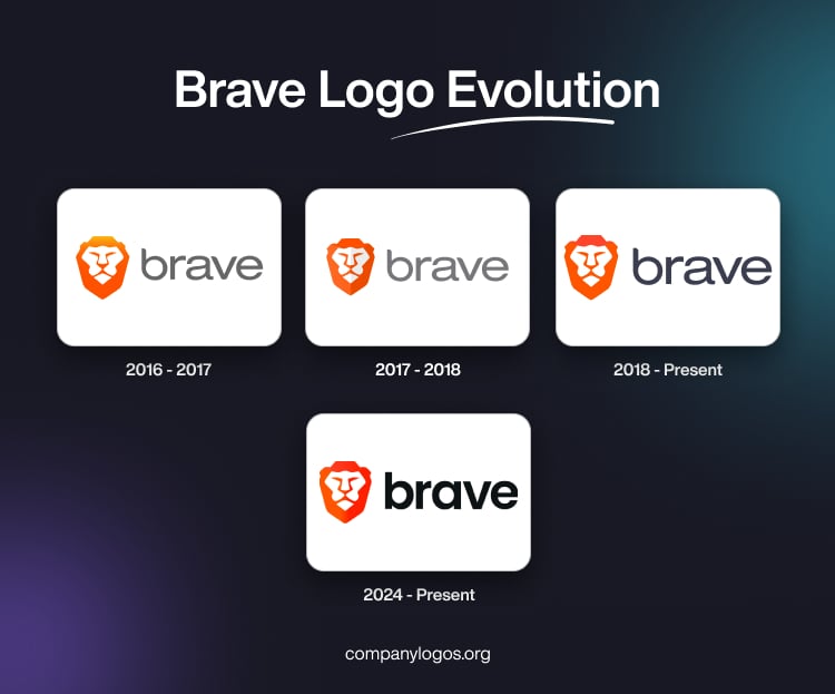
The first official release of the Brave browser came in 2016, wherein it featured a stylised lion’s head emblem and the brand name. The illustration of the lion head emblem was rendered in an orange-white colour palette, while the brand name was written in lowercase in grey. The letters written in a geometric sans-serif typeface were characterised by sharp cuts at their ends.

(2017 – 2018)
The year 2017 saw the refinement of the earlier logo, with the colours of the lion head emblem and brand name made a tad lighter.

(2018 – Present)
The 2018 logo iteration retains the stylised lion’s head emblem in vibrant orange tones as the leitmotif. It embodies the core brand values of courage, strength, and protection. The lion symbolism aligns perfectly with the browser’s mission to “brave” the challenges of online privacy and security.
The design continues with the geometric and angular approach to the typeface that conveys both modernity and strength. The orange colour palette projects energy and warmth while maintaining high visibility across different contexts.

(2024 – Present)
The latest logo uses a Poppins Semibold typeface to render the logotype, alongside the familiar lion head emblem. The combination creates a memorable visual identity that conveys confidence and security for the users while browsing.

The Elements of the Brave Logo
Font
The Brave wordmark uses a clean and modern sans-serif font that emphasises simplicity and readability. The combination of the sharp, geometric typeface with the vibrant orange lion icon creates a strong, memorable visual identity that communicates both security and confidence in browsing.
Colour
The Brave logo primarily uses a vivid orange colour, which conveys energy, boldness, and innovation. Orange also helps the Brave brand stand out among other browser logos. This distinction is due to the fact that other logos often use cooler tones like blue (Google Chrome, Microsoft Edge, Firefox). Alongside orange, the logo sometimes incorporates white accents for contrast and clarity, particularly in digital formats.
Finally
The evolution of the Brave logo reflects the journey of the company with respect to growth, refinement, and clarity in its mission. Be it the earlier designs or the more modern and polished versions, the logo has consistently maintained the symbolic lion’s head. It represents courage, protection, and strength. The simplified and bolder designs highlight Brave’s focus on privacy, security, and user empowerment. It ensures the logo is memorable and adaptable across digital platforms.