Bowers & Wilkins, or B&W, is a renowned British audio company known for its high-fidelity loudspeakers and innovative sound technologies. It was founded in 1966 by John Bowers in Worthing, West Sussex, England, and has, over the years, built a lasting reputation for precision engineering, acoustic excellence, and premium design.
Over the decades, Bowers & Wilkins has become a benchmark in the world of high-end audio. Besides, it is known for supplying loudspeakers for professional studios, luxury automobiles, and discerning home audio enthusiasts worldwide. The article explores the evolution of the Bowers & Wilkins logo, among other details of the company.
The Genesis of the Bowers & Wilkins Logo (1966 – ????)
The initial logo featured a serif wordmark, which also doubled as a signage. The serif wordmark in black uppercase was displayed in two layers along with a small-sized “AND” squeezed in between.
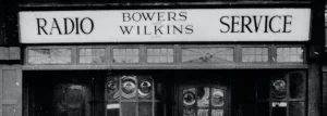
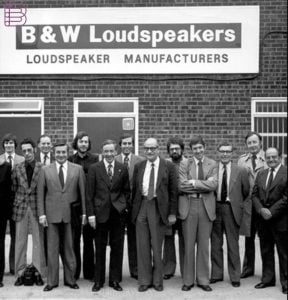
In the initial period, Bowers & Wilkins used to run a small electronics and radio shop selling loudspeakers. So, besides the full brand name, the loudspeakers used to feature the brand name as “B&W Loudspeakers” in white against a black or grey rectangular background.
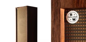
There was also a monogram of the abbreviation “B&W” introduced for products. It featured a black circle with a thin outline containing the bold cap letters “B” and “W” in the top left and bottom right, respectively. The letter “B” was followed by a small 5-pointed star to the right, while the letter “W” was preceded by the star to the left. The letters were separated in the middle by two parallel wavy lines with “&” positioned at the centre. The background of the circle was plain white for better contrast and greater visibility.
(2013 – ????)
During this period the full brand name in a title case was accompanied by the abbreviated “B&W” executed in a bold and black uppercase typography.

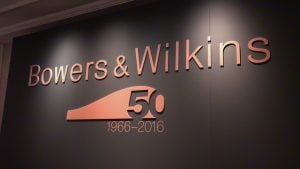
50th Anniversary Logo (2016)
In 2016, the company designed a stylish logo to celebrate its 50th anniversary. It featured the brand name above in a title case using the modern sans-serif typeface, followed by a carved-out “50” from a stylised geometric element with a bulge.
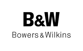
(2017 – Present)
The current Bowers & Wilkins logo features the full brand name in a title case. The minimalist logotype in monochrome is executed using a clean and modern sans-serif typeface in black. The “&” sign is used as a distinctive visual connector between the two words.

The Elements of the Bowers & Wilkins Logo
Font
The Bowers & Wilkins logo uses a minimalist, clean, and modern sans-serif typeface that emphasises clarity and balance. The font is similar to Helvetica Neue or a geometric sans-serif typeface, known for its neutral and elegant character.
Colour
The Bowers & Wilkins logo is designed using a colour scheme that comprises black, white, or grey. Here, black symbolises authority, quality, and timelessness, while white or grey variants are used for minimalist and contemporary branding contexts.
Finally
The evolution of the Bowers & Wilkins logo showcases the journey of the brand from a small British workshop to a global symbol of acoustic excellence. Over the years, the company has embraced subtle refinements rather than drastic redesigns. It has maintained a consistent visual identity that reflects precision, sophistication, and trust. Just as its speakers deliver sound in its purest form, the B&W logo communicates a sense of understated elegance and technological excellence.