Beyerdynamic is a renowned German audio equipment manufacturer known for its precision-engineered headphones, microphones, and conference systems. It was founded in 1924 by Eugen Beyer in Berlin. In the initial period, the company used to produce cinema loudspeakers during the early days of sound film.
Over the years, the company introduced iconic products, such as the DT 48 (1937), the world’s first dynamic headphone, and the M 160 ribbon microphone. In no time, Beyerdynamic set industry benchmarks for clarity, durability, and acoustic fidelity. It evolved into one of the most respected names in professional and consumer audio.
The company logo has undergone a few changes since its introduction in 1924. It began with a straightforward text of the founder’s name to stylised product-era emblems. The article delves into the evolution of the Beyerdynamic logo, among other details of the company.
The Genesis of the Beyerdynamic Logo (1924 – 1960)
The original logo depicted the wordmark “BEYER” in a thin, geometric sans-serif typeface in grey. The letter “Y” is characterised by its wide vertical bars, and the overall logo did not feature any graphical element.

(1960s)
The 1960 iteration featured the wordmark “BEYER” in a bold and black avatar of its previous form. It was enclosed within a horizontal-oriented rectangle with a thin outline.

(1960s – 1970)
The 1960 logo featured the full name of its founder “EUGEN BEYER”, in white against a black rectangular background.

(1970s – 1980)
The next logo iteration of 1970 showed the company name that exists today, “BEYER DYNAMIC”. The name was enclosed within a rectangular frame with a thin outline. The wide geometric letters of a sans-serif typeface reflected the style of the previous wordmarks.

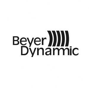
(1980s)
The 1980 logo was a bit different from the previous iterations. It featured the company at two levels in a sans-serif typeface. Depicted in a title case, the word “Beyer” was followed by four closed parentheses in black, depicting the propagation of sound waves. The wordmark “Dynamic” was written below and was slightly aligned to the right.
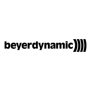
(Mid 1980s – 1990)
In the mid-1980s, the logo featured the company name “beyerdynamic” in white and in a single line in lowercase. It was followed by the parenthesis in white. The overall logo was set against a black rectangular background.

(1990s – 2018)
In the beginning of the 1990s, the logo was almost the replica of the previous version, but with the colour palette reversed.
(2018)
The 2018 logo did away with the graphical element and depicted only the wordmark “beyerdynamic” in a minimalist, geometric sans-serif typeface in black.

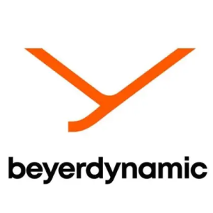
(2019 – Today)
The current logo was introduced in 2018 as part of a rebrand, and it featured a sleek, minimalist, and lowercase wordmark in a new sans-serif typeface called MONT in shades of grey and black. Alongside the wordmark appears the graphical “Y” signet in orange, where it symbolises the values and legacy of the company.

The Elements of the Beyerdynamic Logo
Font
The current Beyerdynamic logo uses a custom geometric sans-serif typeface inspired by MONT, designed by Fontfabric. The clean, minimalist typeface in lowercase represents modernity, accessibility, and the company’s focus on innovation. Besides, the rounded letterforms and uniform stroke width convey precision and balance.
Colour
The Beyerdynamic logo is designed using a refined colour palette featuring neutral greys, black, and a vibrant accent orange. The orange accent serves as a visual highlight in marketing materials and digital interfaces and represents creativity, energy, and emotional connection with sound.
Finally
The Beyerdynamic logo and its various iterations are a visual journey that reflects the company’s continuous innovation and enduring respect for its heritage. Thus, what began as straightforward wordmarks in the 1920s to emphasise the founder’s name and technical craftsmanship transformed into the bold introduction of the sound-wave emblem in the late 20th century. Each logo design shows the brand’s growth and expanding influence in professional audio.