Belmond is a global luxury hospitality brand renowned for its collection of iconic hotels, trains, river cruises, and safari lodges. Based in London, UK, the company began its journey in 1976 as a provider of luxury rail travel. The company holds a strong presence in Europe and both North and South Americas. Belmond owns a few subsidiaries that are reputed as well. These include the Belmond Hotel Cipriani in Venice, Hotel Splendido in Portofino, and the Belmond Andean Explorer train in Peru. At present, Belmond is owned by the luxury goods brand, LVMH Moët Hennessy Louis Vuitton.
The Belmond logo has evolved over time in tandem with its strategic transformations and expansion into new markets. The logo encapsulates the brand’s philosophy, heritage, and its vision for the future of luxury travel. The article explores the evolution of the Belmond logo, among other details of the company.
The Genesis of the Belmond Logo (2014 – 20??)
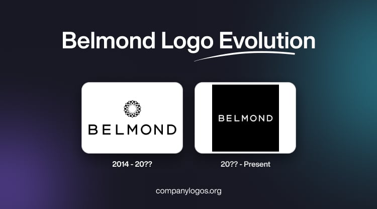
In 2014, Belmond was rebranded from Orient-Express Hotels Ltd. The initial Belmond logo featured a graphical emblem and the brand name below. The graphical emblem conveyed sophistication and timelessness and consisted of a thick black circular ring woven with circular white patterns. The wordmark below was rendered in black uppercase using a sans-serif typeface. This modern, clean, and sophisticated logo reflected the brand’s ambition to appeal to a new generation of luxury travellers.

(20?? – Present)
The current logo stands as a symbol of modern luxury rooted in heritage. It is characterised by a minimalist, elegant wordmark in uppercase monochrome (black-and-white) using a sans-serif typeface. Interestingly, it does not have any graphical emblem, unlike its predecessor.

The Elements of the Belmond Logo
Font
The Belmond logo features a minimalist, elegant wordmark that reflects the brand’s commitment to sophistication and timeless luxury. The official typeface used in the Belmond logo is a custom-designed sans-serif font, which is clean, modern, and highly legible. This font was chosen to convey a sense of understated elegance and contemporary appeal. Further, it aligned with Belmond’s identity as a curator of refined travel experiences.
Colour
The primary colour of the Belmond logo is black, which underscores the brand’s values of luxury, sophistication, and timelessness. The use of pure black ensures maximum contrast and versatility across both digital and print applications.
Finally
The Belmond logo shows the current status of the company as a global curator of luxury experiences. Through strategic rebranding, thoughtful design, and a deep respect for heritage, Belmond has crafted a visual identity that resonates with discerning travellers worldwide. The logo remains an enduring symbol of elegance, adventure, and the art of living well.