Beiersdorf AG is a German multinational consumer goods conglomerate dealing in personal care, skincare, and adhesive products. Owner of popular brands such as Nivea, Hansaplast, La Prairie, and Eucerin, Beiersdorf AG was founded in 1882 by Paul C. Beiersdorf. The logo of the company has evolved over the years and represents the journey of the brand in terms of achieving innovation, quality control, and catering to consumer preferences. The article explores the various logo changes of the brand since it came into existence.
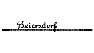
The Genesis of the Beiersdorf AG Logo (1935 – 1968)
The original logo consisted of the brand name written in style by hand. The word “Beiersdorf” was placed above a long thick black stripe, which contained two wordmarks, namely, “P. BEIERSDORF & CO. A: G. HAMBURG 30” and “EIDELSTEDTS RWEG 48”.
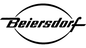
(1968 – 1992)
In the 1968 logo variant, the brand name was placed within two arc-shaped thick black lines at the top and bottom. The edges of the lines touch the uppercase letter “B” at the beginning and the lowercase letter “f” at the end. Interestingly, both these letters had extended bars.
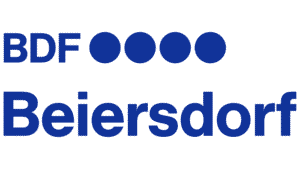
(1992 – 2014)
The 1992 variant featured the abbreviation “BDF” followed by four large dots in blue. Beneath these elements was placed the full name of the company, also in blue.
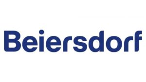
(2014 – Present)
The current logo was conceived in 2014, and it did away with the abbreviation and the four dots. The logo comprised the brand name “Beiersdorf” in a Helvetica Neue Heavy sans-serif typeface with rounded edges in blue.
The Elements of the Beiersdorf AG Logo
Font
The Beiersdorf AG logo uses a Helvetica Neue Heavy sans-serif typeface.
Colour
The Beiersdorf AG logo uses a minimalist colour palette of blue and white.
Finally
The Beiersdorf AG logo and its variants over the years show the transformation of the company from a small pharmacy laboratory to a global leader in personal care and medical products. Its logo was rooted in medical symbolism and then evolved to the modern, division-representing corporate design. The Beiersdorf logos have reflected both its heritage and its forward-looking vision. The enduring NIVEA logo stands as a testament to the power of consistent branding in building global trust and recognition.