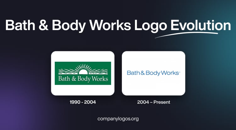
Bath & Body Works is a USA-based cosmetics brand that sells a wide range of products, such as body care cosmetics, bath and shower hygienic products, and fragrances. Headquartered in New Albany, Ohio, the company came into existence in 1990 in New Albany, Ohio. The aim of the company is to revolutionise the personal care industry through unique scents and luxurious products. Its logo did not change much and mirrors the unprecedented growth of the company over the years. The article explores the two logos representing the company over the years, among other details.
The Genesis of the Bath & Body Works Logo (1990 – 2004)
In its earliest years, the brand’s visual identity was crafted to evoke freshness, relaxation, and a connection to nature. The original logo featured a verdant green background with a semi-circular motif in white. It resembled the rising sun or radiant horizon—surrounded by stylised wave-like patterns.
The brand name, “Bath & Body Works”, appeared in an elegant white sans-serif typeface, with the ampersand (“&”) seamlessly connecting “Bath” and “Body Works”. This design, with its serene green palette, underscored the brand’s commitment to wellness and nature-inspired products.

(2004 – Present)
In 2004, Bath & Body Works unveiled a new logo that remains in use today. The redesign replaced the original natural motif with a more modern, type-based approach. The updated logo features slender, sans-serif typography, which looks similar to the Avant-Garde Gothic Book Cyrillic family. Each character of the logo is finely cut and delicately spaced.
The ampersand continues to play a central role, for it maintains the sense of unity between “Bath” and “Body Works”. The colour palette shifted to a blend of sky blue and white to evoke purity, trustworthiness, and clarity. This clean, contemporary look reflects the brand’s focus on quality and its aspiration to be easily identifiable and memorable.

The Elements of the Bath & Body Works Logo
Font
The wordmark forming the Bath & Body Works logo is written using a light sans-serif typeface. The typeface has similarities to the Avant-Garde Gothic Book Cyrillic category. Here, the thin letters of the wordmark are placed at a certain distance from each other. Besides, the words appear to be separate and not merged.
Colour
The colour palette used by the Bath & Body Works logo is sky blue and white. The colour combination creates a sense of reliability and cleanliness and reflects the brand’s concept.
Finally
The Bath & Body Works logo has evolved from a nature-inspired design to a sleek, modern wordmark that emphasises clarity, unity, and approachability. The logo evolution reflects the growth of the brand from a single Ohio store to a global leader in personal care and home fragrance.