Audio-Technica is a globally recognised Japanese company that specialises in producing high-performance audio equipment. Founded in Tokyo in 1962 by Hideo Matsushita, the company began with phonograph cartridges and quickly expanded into microphones, headphones, wireless systems, and professional audio gear.
Audio-Technica serves both consumers and professionals, with products ranging from studio-grade microphones and monitor headphones to turntables and wireless solutions. Its logo has remained consistent throughout the existence of the company. The article delves into the various logo iterations of the company, among other details.
The Genesis of the Audio-Technica Logo (1962 – 1964)
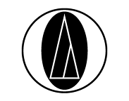
The original logo of Audio-Technica traces its origins to the founding of the company in 1962. Often referred to as “the meatball”, the logo comprised a circle representing the vinyl phonograph record, while the two uneven triangles represented the phonographic needle as well as the letter “A” for the brand name “Audio-Technica”. Importantly, the space between the circle and the points of the triangle is quite narrow, which highlights the degree of precision engineering used by the company.

(Around 1963)
The first logo change comprising only the logomark was subtle, as the original design was retained in its entirety. It was only the size of the white triangles that was tweaked a little.

(Around 1964)
Around 1964, the size of the smaller triangle was increased in proportion to the bigger one.

(1964)
In the 1964 iteration, the black circle was made smaller into an oval shape behind the white-lined triangles. All the above elements were further encircled with a black outline.
(Around 1965)
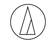
In the 1965 logo iteration, the black oval was removed altogether, leaving only the outlines of the triangles and the outside circle.
(Around 1969)
The logo around this period had the lines of the emblem comprising the circle and the twin triangles turned bold and thicker.

(1974 – Present)
The current logo traces its introduction to 1974, when the graphical emblem was made thinner. The brand name in bold lowercase was written alongside using a Univers Next Pro Regular typeface.

The Elements of the Audio-Technica Logo
Symbol
The graphical emblem in the Audio-Technica logo is made up of a circle denoting a vinyl record, two inner triangles denoting a groove and stylus, and negative space
Font
The wordmark in the Audio-Technica logo is executed using a clean, lowercase, sans-serif Univers Next Pro Regular typeface.
Colour
The Audio-Technica logo is designed using black, grey, and white colours to convey elegance and clarity.
Finally
The Audio-Technica logo is an example of design consistency that has stood the test of time. Since its introduction in the 1960s, the circular emblem, representing a phonograph record, the groove, and the stylus, has remained at the heart of the company’s visual identity.
Unlike many brands that undergo frequent redesigns, Audio-Technica has chosen to refine rather than reinvent without straying from the original concept. The Audio-Technica logo is a visual bridge between past and present. It links the company’s vinyl-era origins to its role at the forefront of today’s audio innovation.