Asko is a globally recognised premium home appliance brand from Sweden. It was founded by Karl-Erik Andersson, also known as the inventor of the washing machine, in 1950. The company has been known for innovation and design excellence for over seven decades. The company’s high-quality product range includes dish washers, washing machines, dryers, kitchen hoods, ovens, stoves, and refrigerators.
In fact, Asko is best known for producing exceptional, high-quality home appliances that combine cutting-edge technology with sleek Swedish aesthetics. In this article, we delve into the fascinating history and evolution of the Asko logo. It is the visual identity of the company and represents the brand’s commitment to quality and sustainability.
The Genesis and Evolution of the Asko Logo (1950 – 2006)
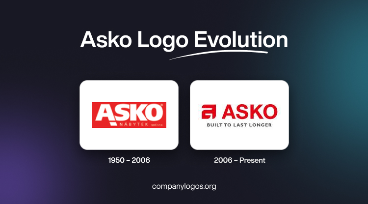
The original Asko logo was introduced in 1950. It comprised a simple and elegant wordmark in uppercase letters, wherein the name of the company was written using a clean, sans-serif typeface. This minimalist design showed the focus of the brand on functionality and efficiency. These were the characteristics that would define Asko appliances. The wordmark of the logo, “ASKO,” was written in white and set against a red background. And just below the right leg of the letter “A” was a solid square-shaped graphic in white. In the decades that followed, the Asko logo was refined by modernising the design without disturbing its core essence.

(2006 – Present)
The most significant evolution of the logo occurred in 2006. It was then the brand unveiled a sleek and contemporary logo that captured the essence of the Scandinavian design principles. The current Asko logo features a bold, minimalist wordmark in a deep, rich shade of red, which evokes a sense of confidence and sophistication. The wordmark in uppercase features the name of the company and a graphic representing the character “A” preceding it.
The clean lines and geometric shape of the logo represent the brand’s adherence to precision engineering and cutting-edge technology. The simplicity and elegance of the Asko logo reflect the company’s dedication to creating top-quality home appliances and other accessories.

The Elements of the Asko Logo
Font
The Asko logo features a clean and stable wordmark written in uppercase and set in a modern, geometric sans-serif typeface. The wordmark features the name of the company. Also, the characters of the logo are characterised by straight and precise cuts to give the logo a crisp and contemporary appearance. The closest font that matches the typeface used in this emblem is Neue Helvetica Georgian 75 Bold or M Ying Hei PRC W7. Both of these fonts capture the sleek and minimalist essence of the logo.
Colour
The colour palette of Asko’s visual identity is a deep and rich shade of red. The wordmark, however, is featured in white. The colour palette offers a sense of calm and sophistication. Besides, it evokes passion and excellence at the same time. The choice of this vivid yet elegant colour underlines the commitment of Asko to provide customer comfort. It, thus, positions the brand as one that prioritises the well-being and satisfaction of its consumers.
Finally
The evolution of the Asko logo is a remarkable journey that reflects the growth and pursuit of excellence of the company. Each iteration of the logo showed the core values of Asko and reflected the company’s attributes of innovation, sustainability, and uncompromising quality. The Asko logo remains a powerful symbol that represents the values and aspirations of the company.