Remember Uma Thurman’s yellow sneakers with black stripes in the Kill Bill showdown?
Interestingly, those shoes were custom-designed by Onitsuka Tiger, a predecessor of Asics. Today, Asics shoes carry those stripes as a badge of honor and heritage.
The history of Asics’ corporate logo is no less fascinating. Let’s delve into the evolution of the Asics logo, a symbol that became the brand’s distinctive identity.
1977 – 1987: The First Asics Logo
In 1977, Japanese sporting goods company ONITSUKA Co. unified with two other athletic merchandise brands, GTO Co., Ltd., and JELENK Co., Ltd. to become ASICS Corporation.
Fascinatingly, ASICS is short for “Anima Sana In Corpore Sano.” It’s a Latin phrase coined by the ancient Roman satirist Juvenal, which means “a sound mind in a sound body.”
Designers Herb Lubalin and Alan Pekolick created the first ASICS logo that looks clean and visually harmonious.
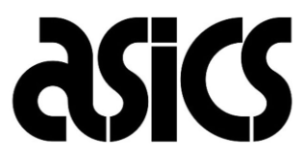
This black Asics logo had the brand’s name written in uppercase, except for the words ‘a’ and ‘i.’ This lowercase ‘a’ would later become a unique identifier of the brand. Despite mixed capitalization, the letters felt cohesive, thanks to consistent proportions and symmetry.
The bold sans-serif typeface was written in a freehand style, almost resembling the curves of a running track, each space depicting a hurdle.
Similarly, a variant of this old Asics logo in a cobalt blue gradient brings character to the logo.

1987 – 1992: Slimmed-Down Symbol
To mark its 10-year milestone, the company relaunched its well-known typographical logo with some tweaks. The bold sans-serif typeface and the rhythmic flow between the characters remained consistent.
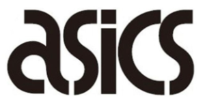
The difference arises when we consider the overall thickness of the letterforms, which became sleeker, refining the strokes.
An alternate version of the skimmed Asics company logo was also present in a lighter blue gradient. To conclude, it won’t be wrong if I say that this was the thinner, better-looking twin of the earlier version.
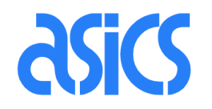
1992 – 2007: An Artsy Insignia
Remember, I told you that the lowercase ‘a’ will become a brand identifier? Well, now it was its time to shine. Along with the characteristic serpentine typeface, an equally stylized lowercase ‘a’ was added to the emblem.
This ‘a’ looked like an air trail left behind by a swift, athletic movement. And that’s exactly what the brand’s intention was behind incorporating that pattern.
An alternate version appeared in vibrant blue with a similar bold sans-serif typeface and rounded letterforms.

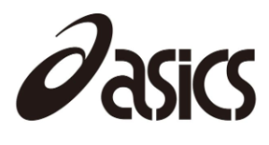
2007 – Present: A Mark of Simplicity
Asics rebranded its logo for the fourth time in 2007. This time, it replaced its topsy-turvy typography with an orderly and geometrically framed bold sans-serif typeface. Meanwhile, the italicization maintains the font’s edginess.
Alongside this, all words became capitalized except for ‘a’. What remained the same were the swooshy insignia of the brand’s initial, and a familiar color with a slightly updated hue – “midnight blue” for fonts.
This provides better visibility to the logo without making it chaotic and straining our eyes.
An auxiliary logo of this version incorporated the brand’s philosophy as a tagline below its name in a similar color and typeface. Unlike the main wordmark, the tagline “sound mind, sound body” appeared without bold emphasis.
Finally
Throughout its four iterations, the famous footwear brand stayed true to its origins. However, it did introduce changes in the formatting of the wordmark during the 80s.
The first major rebrand came in the year 1992 when the stylized ‘a’ was added before the branded wordmark and has stayed there ever since.
Other Asics Logos
Alongside its corporate logo, Asics also introduced several emblems over the years to identify and promote its various product lines, applications, and collaborations.
Let’s go through them:
“Tiger Stripes” or “Mexico Line” On Shoes
These stripes were first used in 1966 by the Onisutka tiger in its LIMBER UP Leather BK training shoe. They later came into the limelight in the 1968 Mexico Olympics, hence the other name, Mexico line.
These lines are the combination of two parallel stripes intersecting with two curved lines that taper at the end.
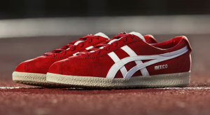
These lines were created to provide stability and durability, therefore fulfilling a functional purpose. Like Reebok’s stripes or Nike’s swoosh, the tiger stripes on shoes have become Asics’ defining feature.
Asics FrontRunner Logo
Asics started the FrontRunner project in 2010, with the hope of creating a community that could connect runners of all ages across the globe through a shared love of running.
The community explores different terrains and trails across 32 countries, driven by a belief that physical movement has a good effect on our mind and body.
The Asics FrontRunner logo consists of the company’s emblem with ‘FRONTRUNNER’ displayed in bold, all caps, and geometric sans-serif typeface.
Asics Runkeeper Logo
In 2008, Asics launched its fitness app under the name Asics Runkeeper. The mobile app helps users track their steps, prepare a training regime, and monitor their journey.
The primary Asics Runkeeper logo retains the wordmark introduced in 2007, paired with the addition of the “Runkeeper” lettermark set in an italicized sans-serif typeface in title case.
The indigo rendered logo distinguishes it from the brand’s core corporate blue. An alternate version of the logo appears in a white color palette.
There is also a stacked version of the Asics Runkeeper symbol in indigo, as you can see below:
For fully committed run junkies, the app also provides its paid services under the name Asics Runkeeper Go. This section offers a more personalized experience with added guidance and insight from a designated running coach.
The logo for this premium section does not feature the brand’s name. Instead, the word “Go” appears in the title case within a right-pointing arrow, positioned next to the app’s name. The ASICS logo is also present, reinforcing the brand identity.
The logo adopted an indigo color scheme, complemented by a white variation that supports consistent visibility across platforms.
Asics FUJITRAIL Logo
Asics launched its athleisure apparel under the name FUJITRAIL, inspired by Mount Fuji, Japan’s iconic volcano.
On clothing, the FUJITRAIL logo appears as a single, continuous outline of snow-capped Mount Fuji, subtly integrated with a trail motif.
A similarly styled brand name and the Mount Fuji coordinates (35° 21′ 38″ N, 138° 43′ 55″ E) also appear.
FAQs
1. What does the Asics logo look like?
The Asics logo contains the brand’s initials as a graphic emblem with its name. The font is a geometric, italicized, bold sans-serif typeface and colored in midnight blue.
2. Why do Onitsuka Tiger and Asics have the same logo?
The 1949-founded Onitsuka Tiger is one of the predecessor brands of Asics. The striped logo got its famous name “tiger stripes” from the brand itself, which is visible in both Asics and Onitsuka shoes.
3. Does the Asics logo have some meaning?
The name “ASICS” in the logo is an abbreviation of the Latin phrase “Anima Sana In Corpore Sano”, which means a sound mind in a sound body. This ideology still defines the brand today.