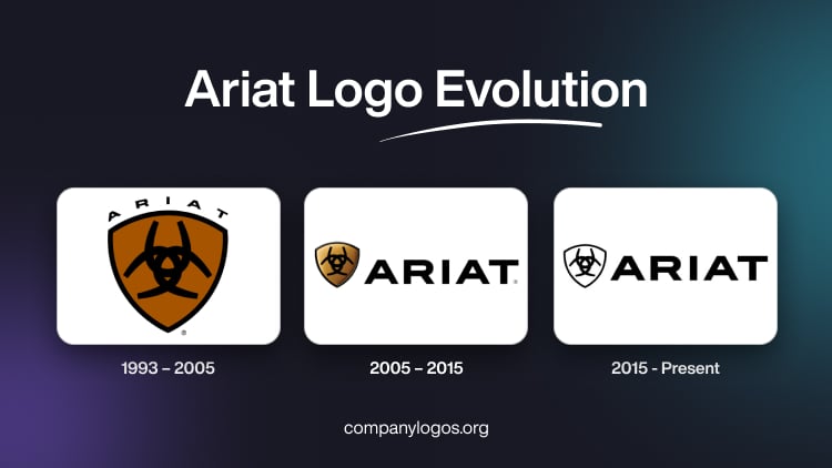
Ariat stands as a globally recognized American footwear and apparel brand that crafts products transcending international borders. While drawing inspiration from equestrian sports, the company’s designs extend beyond riding-specific footwear. Ariat has gained acclaim for producing shoes and apparel synonymous with exceptional quality, stylish aesthetics, and practicality, catering to the needs of both men and women.
The Ariat logo, known for its timeless elegance and representation of quality, has undergone a fascinating journey from its inception to the present day. This article explores how the logo has evolved to reflect the brand’s commitment to innovation, craftsmanship, and authenticity.
The Genesis of the Ariat Logo (1993 – 2005)
The earliest Ariat logo was simple yet powerful. It reflected the brand’s commitment to authenticity and craftsmanship. The initial design featured a stylized representation of a horse, thus embodying the brand’s strong association with equestrian pursuits. The early logo incorporated classic typography and earthy tones, and created a visual identity that resonated with the brand’s roots.

(2005 – 2015)
As Ariat expanded its product line beyond footwear to include apparel and accessories, the logo underwent subtle transformations to reflect the brand’s evolution. The emphasis on innovation became more pronounced, with elements symbolising advanced technology and performance. The horse motif remained a constant, which symbolised both the brand’s equestrian heritage and its forward-looking approach to product development.

(2015 – Present)
Ariat underwent a significant rebranding effort by aligning its visual identity with its growing global presence. The logo underwent a sleek and modern redesign that featured a refined horse icon with clean lines and a contemporary aesthetic. The typography was updated to convey a sense of sophistication and modernity. It reflected Ariat’s commitment to staying at the forefront of the industry.

The Elements of the Ariat Logo
Font
The primary logo of the Ariat emblem features a striking and robust lettering style. The bold and brutal design utilises a heavy modern sans-serif font, where uppercase characters exude a sense of solidity and strength. The font used in this insignia closely resembles Organetto Extra Bold Semi Ext or ITC Blair Pro Bold, possibly with some minor modifications.
Colour
In terms of the colour palette defining the Ariat visual identity, it revolves around the classic combination of black and white. This minimalistic yet elegant choice remains timeless and progressive, consistently evoking a sense of excellence and professionalism. The utilisation of black and white contributes to a sleek and contemporary aesthetic, reinforcing the brand’s commitment to a sophisticated and enduring visual representation.
Finally
The history and evolution of the Ariat logo tell a compelling story of a brand that started with a commitment to quality craftsmanship and innovation. From its humble beginnings in the equestrian world to its current status as a global leader in outdoor and performance footwear and apparel, Ariat’s logo has been a visual ambassador for the brand’s values.