Ever come across the “Japan is living in 2050” meme?
Funny! But true. Japan is pioneering in every field, not just in technology but in fitness as well.
This led me to an interesting fact: the energy drink we know of today was first conceptualized in Japan in the 1960s. It created a new market of health-centric beverages in Japan. Coca-Cola seized that opportunity with the introduction of Aquarius in 1983.
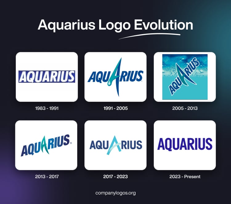
As Aquarius achieved international recognition. Its logo evolved as well, matching the brand’s vision. This article tells the evolutionary tale of the Aquarius logo.
1983-1991: Launched With Energy
In 1983, Coca-Cola entered the booming Japanese sports drink market with Aquarius. It was launched as a grapefruit-flavored isotonic drink competing with Pocari Sweat, another Japanese energy drink brand. The Japanese sports drink Aquarius was rich in electrolytes and amino acids, yet refreshing in taste, unlike the overly salty taste of its contender.
The 1983 Aquarius drink logo was simple but fairly impactful. The brand name was written in uppercase letters against a rectangular blue background. The fonts were bold with a slight hint of italic. The font type is a rough sans-serif typeface with a hand-drawn brush style display.
1991-2005: Thirst-Quenching Aquarius Logo
After reigning over the Japanese sports drink market, the company strategized to launch Aquarius in other countries. Which is why it was heavily promoted by giving away free samples in sporting events, resulting in Aquarius drink becoming the official drink of the Barcelona Summer Olympics in 1992, the first of its many such partnerships.
This time, they took leverage over creativity and introduced a fanciful insignia. They eliminated the rigid blue backdrop. Instead, the words were in deep blue. The font type of the rest of the texts was bold, italicised, and geometric sans-serif.
Except for the enlarged second A, which is also the centre of attention of this symbol. Its one stem was designed in a “3-D trickling water droplet” way. While the other stem was long and arched. The droplet-shaped stem of the second A was presented in teal.
This became the baseline for all future iterations of the Aquarius drink logo.
2005-2013: A Refreshing Symbol
In the 2000s, Aquarius was extending its boundaries from Asia to Latin America with its flavor choices accustomed for regional taste buds. As it was entering new territories, the next step to make an impression was a redesign.
In 2005, it had some major changes in its emblem, such as the diagonal placement of the lettermark and the white outline on each text. The Aqaurius logo text was a sans-serif display typeface.
The droplet-like impression of the second A was now removed. But its enlarged and arched structure remained, followed by the same color scheme. The backdrop was divided into two zone half teal-aqua and half blue, with a dewy texture.
2013-2017: An Enriching Aquarius Logo
Along with the expansion, Aquarius was also focused on improving its marketing strategies and building a powerful social media presence. The brand carefully designed its influencing tactic to display itself as an enriching drink. As a result, Aquarius became a popular name in the functional beverage trend.
The 2013 Aquarius logo removed the background and the white outline from the inscription. The wordmark was placed in a similar diagonal manner with the same core focus on A.
The color palette also remained the same, but with a change in color placement. Both arms of the enlarged A were in monochromatic teal, and the color gradient faded slightly as we moved outward to inward alphabetically from both ends.
A custom bold sans-serif with some hint of fonts such as ITC Avant Garde Gothic or Gotham Condensed was used for the logo text.
2017-2023: A Power-Packed Aquarius Symbol
Aquarius broadened its horizons from a seasonal drink to a drink for any occasion. In 2019, Coca-Cola launched Aquarius sports drink in the UK and promoted it as a functional water for performance support. Aquarius catered to a larger segment, which was why it had to be eye-catching.
This time, the logo ditched its funkiness and adopted a bolder and more professional approach. The emphasis on the second A was still prevalent, but it lost its association with teal. Instead, it was distinguished in a light blue (sky blue) from the rest of the words, which had a deeper blue color.
2023 – Present: Rebranding Rehydration
The 6th rebranding of the Aquarius Logo defined its intention of how it wanted to present itself. With products like Aquarius Zero, which contains zero sugar and offers hydration while maintaining electrolyte balance. It was clear that now Aquarius wants become an alternative to universal water.

Similarly, the logo has also become coherent. There is a uniformity in the lettering, font type, and color palette. The font type is bold, condensed sans-serif with geometric similarities to typefaces such as Gotham Condensed Bold or Futura Extra Bold, and the color is deep blue, which falls near an indigo gradient.
Finally
Just like the sunshine, Aquarius rises in the land of the rising sun and spreads across the continents, revitalising with its nutrient-enriched products. As the brand expanded, its iconography also changed.
The Aquarius logo of 1983 shows its humble beginning. The iterations that range from 1991 to 2017 showcased Aquarius cool and refreshing aqua origin. It was later changes in logo (2017- Present) that reformulated its identity as a brand, while still carrying on featuring its hydrating nature.
FAQs
1. What color scheme does the Aquarius drink logo use?
The Aquarius logo always has some gradient of blue (mainly) and white in its color scheme. This was done to show the product’s qualities of refreshment, hydration, and coolness. The white elements gives clean, purer perspective to the logo.
2. What design concept does the Aquarius drink logo follow?
The color choices and font placement of the very first Aquarius logo design were very similar to those of its competitor, Pocari Sweat. This was done to show Aquarius falls under the category of energy drinks. The early designs expressed the hydrating quality of the product loudly, but recent iterations shifted towards a more sophisticated and minimalist style.
3. Who owns Aquarius Drinks?
The Japanese sports drink brand Aquarius is owned and operated by Coca-Cola. It originated in 1983 as a hydrating sports drink.