American Tower Corporation (ATC) was founded in 1995 as a subsidiary of American Radio Systems before being spun off as an independent company in 1998. The company’s business model centred on shared telecommunications infrastructure, which allows multiple wireless carriers to lease space on its towers. This reduces costs and facilitates the rapid expansion of network coverage in the burgeoning cellular industry. The American Tower logo has changed only once since its inception in 1995. The following article delves into the evolution of the American Tower logo, among other details of the company.
The Genesis of the American Tower Logo (1995 – 2005)
The original American Tower logo comprises an emblem and the brand name in a red and black colour scheme. The emblem is made of the letter “A”, symbolising the telecommunications tower, but without the horizontal bar in the middle. The vertical legs of the emblem are coloured black and red from left to right. Below the emblem is placed the brand name in bold uppercase. Written in a sans-serif typeface, the first letter of the brand name is similar to the letter “A” that forms the emblem.

(2005 – Present)
The 2005 logo iteration is almost a replica of the original logo, but without the stylish letter “A” of the previous logo. Instead, the first letter “A” is written in the normal typeface with its vertical bar intact.
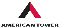
The Elements of the American Tower Logo
Font
The American Tower logo uses a sleek, sans-serif font to display its wordmark. The font conveys a contemporary, clean, and professional aesthetic. In the logo, the word “AMERICAN” appears above the larger, bolder word “TOWER” to emphasise the company’s name clearly and efficiently. The font is modern, highly readable, and flexible for digital and print applications. This choice reinforces the company’s image as an innovative and technology-driven leader in communications infrastructure.
Colour
The colour palette of the American Tower logo comprises red and black. Here, the colour red represents energy, dynamism, and leadership, qualities that are central to the company’s role in powering mobile and broadcast connectivity worldwide. On the other hand, black provides contrast, authority, and a sense of stability.
Finally
The evolution of the American Tower logo shows the transformation of the company from a U.S.-focused wireless infrastructure provider into a global leader in digital connectivity. While the core visual identity has remained stable, that is, anchored in the motif of a tower, the logo has modernised through incremental updates to reflect innovation, international reach, and technological progress.